Once in this blog I explained how to make pie chart and donut plot with ggplot2. In this post, I will extend the topic by introducing ggpubr package, which has nifty function to facilitate a hustle free process of plotting publication quality figures. I will show you how you can use the function from this package to make a pie chart and donut chart with additional function to polish the charts from ggplot2 (Wickham 2016). First, we need to load the tidyverse package that will assist to process, manipulate and visualize the data (Wickham 2017). I prefer load packages using the require(), but you can use the library function, which does similar task.
require(tidyverse)Data
A pie chart need a series of data representing counts or proportions of different groups. Like the previous post, we download the daily logs of R version downloads with different operating systems. We use cranlog package (Csárdi 2019) to obtain logs of R download for various operating system in the last thirty days from today.
rdown = cranlogs::cran_downloads(packages = "R",
                                 from = lubridate::today()-30,
                                 to = lubridate::today()) %>%
  mutate(os = replace(os, os=="src", "Linux"),
         os = replace(os, os=="osx", "Mac"),
         os = replace(os, os=="win", "Windows"))

rdown %>% sample_n(size = 10)
date version os count
1 2020-04-06 3.4.3 Linux 3
2 2020-03-18 2.15.2 Mac 3
3 2020-03-18 3.4.0 Windows 1
4 2020-03-31 3.0.0 Mac 2
5 2020-04-12 3.5.0 Windows 2
6 2020-04-08 3.0.1 Mac 3
7 2020-03-22 3.4.3 Windows 4
8 2020-03-30 3.3.3 Mac 68
9 2020-03-21 2.13.2 Windows 1
10 2020-03-24 3.6.0 Mac 3To understand the R version download, we first ask the question, Are R downloads differs over weekdays and operating system? Here we want to understand whether there are days of week with more downloads than others and if there are which operating system has more downloads. We can answer this question by simply extract days of week using the wday function from lubridate package (Grolemund and Wickham 2011) and then group the compute the frequency of downloads based on the week day and operating system. Data without type of operating system were omitted from the dataset.The chunk below illustrate the code of lines used to prepare the data to answer the question asked above.
weeday.logs = rdown %>%
  mutate(day = lubridate::wday(date, abbr = TRUE, label = TRUE)) %>%
  group_by(os,day) %>%
  count() %>%
  ungroup() %>%
  filter(os != "NA")
Figure 1 shows the frequency of R downloads over week days at three different operating systems. We notice that while Windows and Linux download patterns are very close over the week days, the downloads from Mac operating system is higher than those from Windows and Linux operating system over all the days of the week. This suggest that Mac users downloaded more R from CRAN than any other operating system over the last 30 days.
weeday.logs%>%
  ggplot()+
  geom_col(aes(x = day, y = n, fill = os), position = position_dodge(.9))+
  ggsci::scale_fill_jama(name = "Operating \nSystem")+
  ggpubr::theme_pubclean()+
  theme(axis.title.x = element_blank(), legend.position = "right",
        legend.key = element_blank())+
  coord_cartesian(expand = FALSE)+
  scale_y_continuous(breaks = seq(50,260,50))+
  scale_x_discrete(limits = c("Mon", "Tue", "Wed", "Thu", "Fri", "Sat", "Sun"))+
  labs(y = "Number of downloads")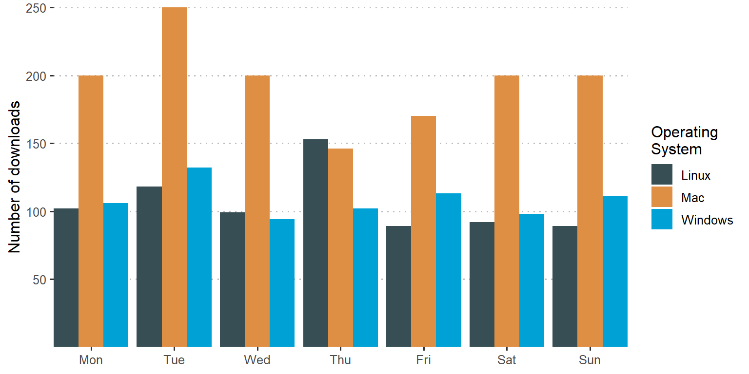
Figure 1: Week day R downloads across multiple operating systems
Then we might be interested the percentage of dominance of Mac in downloading R as compared to Linux and Windows Operating Systems. To be able to address this issue, we need first to compute the frequency of downloads for each operating system. The combination of group_by and count functions from dplyr (Wickham et al. 2018) package helps us getting the frequencies of operating systems downloads. Once we computed the frequency, we can transform them into fraction and change into percentage. To be able to label, we stitch the percentage values and the operating system into a variable called label using the paste function. The chunk below highlight the key steps.
os = rdown %>% group_by(os) %>%
  count() %>%
  ungroup() %>%
  filter(os != "NA") %>%
  mutate(percentage = n/sum(n)*100) %>%
  mutate_if(is.numeric, round, digits = 0) %>%
  mutate(label = paste(os,"\n","(", percentage, "% ",")", sep = ""))
Pie and donut chart
Although ggplot does a decent way to plot both the pie and donut plot, Alboukadel Kassambara (2020) developed a ggpubr package, which extend some functions of ggplot2. Some of the function of ggpubr are ggpie and ggdonutchart, which have some arguments to pass on and generate a pie and donut plot directly. These function works well with other ggplot2 functions and other tidyverse functions. The code below illustrate how to make figure 2 using the ggpie function.
ggpubr::ggpie(data = os, x = "n", label = "label", color = "white",
                     lab.font = "white",fill = "os",lab.pos = "in",
                     orientation = "horizontal", lab.adjust = 100)+
  ggsci::scale_fill_jama()+
  theme(legend.position = "none")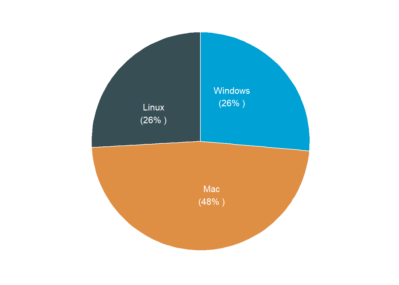
Figure 2: Pie chart from ggpubr package
Also the code below show how to use ggdonutchart function to generate a donut plot shown in figure 3.
 ggpubr::ggdonutchart(data = os, x = "n", label = "label", color = "white",
                     lab.font = "white",fill = "os",lab.pos = "in",
                     orientation = "horizontal")+
  ggsci::scale_fill_jama()+
  theme(legend.position = "none")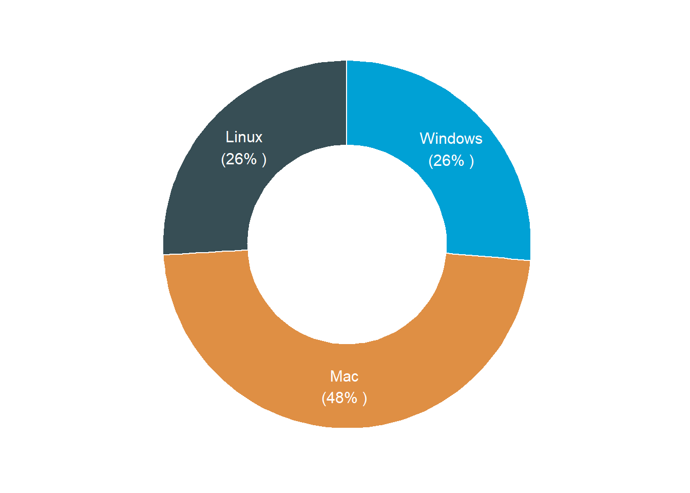
Figure 3: Pie chart from ggpubr package
Remarks
Although the post use cranlog package to download the logs of R across multiple operating system, but the this post mainly focus on using functions from ggpubr package to plot pie and donut chart. Until now I hope you have seen how easy to make pie and donut chart in R by combining ggplot2 and ggpubr functions. I hope you wont be troubled anymore with how you should arrange the label in either pie or donut chart when using the ggpubr package, as it does well labeling the pieces. Figure 4 and 5 are bonus plots in this post made with plotly package. I have included the code for generating these plots in this post. Check for coming posts that explain making interactive plots with plotly package (Sievert 2018)
plotly::plot_ly(data = os,
                labels = ~label,
                values = ~n,
                type = 'pie',
                textinfo='label+percent',
                showlegend = FALSE) %>%
plotly::layout(title = 'Percentage of R downloads by Operating System',
         xaxis = list(showgrid = FALSE, zeroline = FALSE, showticklabels = FALSE),
         yaxis = list(showgrid = FALSE, zeroline = FALSE, showticklabels = FALSE))
Figure 4: Pie chart from plotly package
plotly::plot_ly(data = os,
                labels = ~label,
                values = ~n,
                type = 'pie', hole = 0.6,
                textinfo='label+percent',
                showlegend = FALSE) %>%
plotly::layout(title = 'Percentage of R downloads by Operating System',
         xaxis = list(showgrid = FALSE, zeroline = FALSE, showticklabels = FALSE),
         yaxis = list(showgrid = FALSE, zeroline = FALSE, showticklabels = FALSE))
Figure 5: Donut chart from plotly package
References
Csárdi, Gábor. 2019. Cranlogs: Download Logs from the ’Rstudio’ ’Cran’ Mirror. https://CRAN.R-project.org/package=cranlogs.
Grolemund, Garrett, and Hadley Wickham. 2011. “Dates and Times Made Easy with lubridate.” Journal of Statistical Software 40 (3): 1–25. http://www.jstatsoft.org/v40/i03/.
Kassambara, Alboukadel. 2020. Ggpubr: ’Ggplot2’ Based Publication Ready Plots. https://CRAN.R-project.org/package=ggpubr.
Sievert, Carson. 2018. Plotly for R. https://plotly-r.com.
Wickham, Hadley. 2016. Ggplot2: Elegant Graphics for Data Analysis. Springer-Verlag New York. http://ggplot2.org.
———. 2017. Tidyverse: Easily Install and Load the ’Tidyverse’. https://CRAN.R-project.org/package=tidyverse.
Wickham, Hadley, Romain François, Lionel Henry, and Kirill Müller. 2018. Dplyr: A Grammar of Data Manipulation. https://CRAN.R-project.org/package=dplyr.