Introduction
ggplot2 packaged for R developed by Hadley Wickham (2016) provides powerful functions for plotting high quality graphs in R.This package has many functions for creating plots among them are pies and donut charts. Pie charts are widely used for showing proportions of mutually–exclusive categories. A pie chart is a circular graphic divided into slices to illustrate numerical proportion of the categorial variable. In a pie chart, the length of each slice is equivalent to the counts or proportion of that slice.
require(tidyverse)Data
A pie chart need a series of data representing counts or proportions of different groups. For this post we use the package cranlogs to download daily logs of different R version from the Rstudio CRAN Mirror (Csárdi 2019). We obtained all R downloads made in 2018.
rdown = cranlogs::cran_downloads(packages = "R",
                                 from = "2018-01-01",
to = "2018-12-31")| Date | Version | OS | Count |
|---|---|---|---|
| 2018-02-28 | 3.4.1 | src | 5 |
| 2018-02-12 | 3.3.2 | win | 1 |
| 2018-07-05 | 3.4.0 | src | 2 |
| 2018-08-12 | 3.4.1 | osx | 1 |
| 2018-05-25 | 2.11.0 | src | 2 |
| 2018-12-26 | 3.3.0 | src | 1 |
| 2018-06-27 | 3.4.1 | win | 2 |
| 2018-05-02 | latest | osx | 61 |
| 2018-04-30 | 3.4.4 | win | 12 |
| 2018-02-15 | 3.4.0 | osx | 3 |
To have a glimpse of the R version download, we first ask the question, Are R downloads differs over time and operating system? To address this question, we need first to remove downloads that does contain information of the operating system from the dataset. Then we group the dowloads based on the month and create a sequence of time spaning from January to December and make it repeat based on the frequency of the operating systems. The chunk below illustrate the code of lines used to prepare the data to answer the question asked above.
rdown.group = rdown %>%
  filter(os != "NA") %>%
  group_by(month, os) %>% count() %>%
  ungroup() %>%
  mutate(date = seq(lubridate::dmy(010118), lubridate::dmy(11218),
                    by = "month") %>% rep(each = 3))
When we plotted the computed of variation, we notice that the dowloads from the three operating system varies over time, with the minimum nmber in January that reaches maximum in November. The pattern of variation is almost similar over the period with the minimum downloads observed in windows operating system (Figure 1)
  ggplot(data = rdown.group,
         aes(x = date, y = n, col = os))+
    geom_path(size = 1.2) +
    scale_x_date(date_breaks = "1 month", date_labels = "%b") +
    scale_color_discrete(name = "Operating\nSystem")+
    scale_y_continuous(breaks = seq(100,1000,100)) +
    labs(x = NULL, y = "Frequency of Downloads")+
    theme(legend.key = element_blank(), legend.key.width = unit(1.4, "cm"), legend.key.height = unit(0.45, "cm"),
          legend.text = element_text(size = 11), legend.position = c(.12,.8))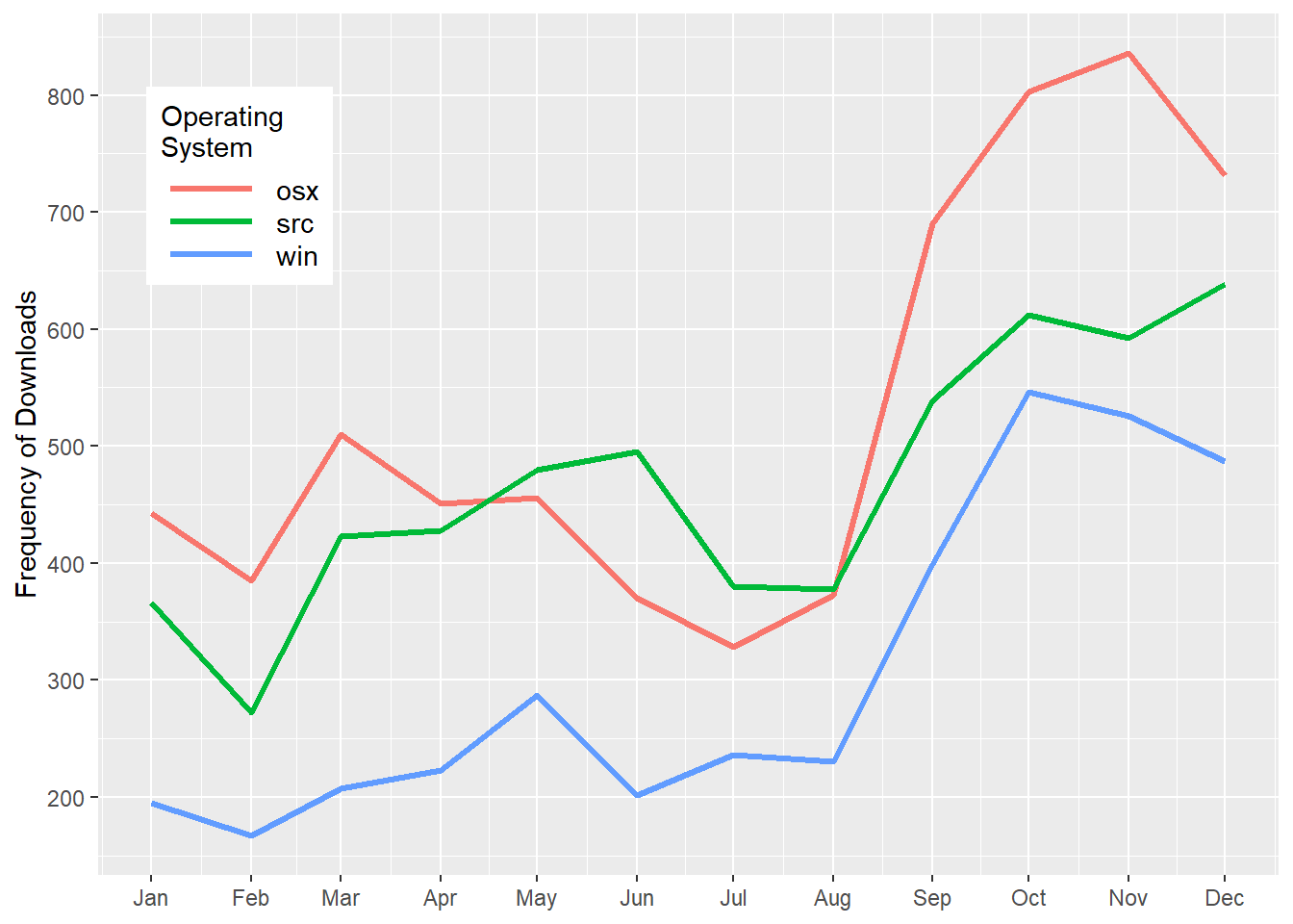
Figure 1: Variation of R downloads from different operating systems over a period of twelve months
To make a pie chart, we will first compute the percentage of each operating system. Once we have the percentage, we create the label position value using the cumsum() function as cumsum(percentage)-0.5*percentage).and arrange the os in descending order. Note the order in the chunk, you must ungroup() before you arrange the os and then mutate the percentage and position of the labels.
rdown.os = rdown %>%
  filter(os != "NA") %>%
  group_by(os) %>%
  count() %>%
  ungroup()%>%
  arrange(desc(os)) %>%
  mutate(percentage = round(n/sum(n),4)*100,
         lab.pos = cumsum(percentage)-.5*percentage)
Pie Chart
We then plot the pie chart with geom_bar() and then convert the bar into pie with the coord_polar() function. The code block below was used to make a pie chart shown in figure 2
ggplot(data = rdown.os,
       aes(x = "", y = percentage, fill = os))+
  geom_bar(stat = "identity")+
  coord_polar("y", start = 200) +
  geom_text(aes(y = lab.pos, label = paste(percentage,"%", sep = "")), col = "white") +
  theme_void() +
  scale_fill_brewer(palette = "Dark2")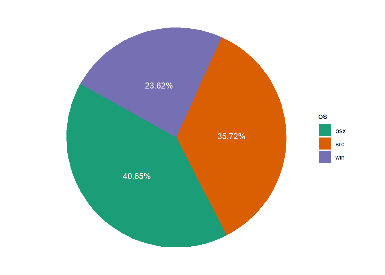
Figure 2: Pie chart
###Donut chart
A donut chart is lighter version of pie chart with a hole at the center. Categorical data are often be better understood in donut chart rather than in a pie chart. Like a pie chart, a donut chart is made from geom_bar() and coord_polar(). But, unlike the pie chart, to make a donut plot we must specify the x = 2 in aes() and add the xlim() as code in chunk below show that was used to plot figure 3.
ggplot(data = rdown.os,
       aes(x = 2, y = percentage, fill = os))+
  geom_bar(stat = "identity")+
  coord_polar("y", start = 200) +
  geom_text(aes(y = lab.pos, label = paste(percentage,"%", sep = "")), col = "white") +
  theme_void() +
  scale_fill_brewer(palette = "Dark2")+
  xlim(.2,2.5)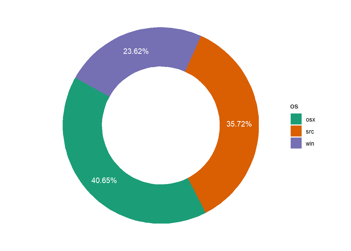
Figure 3: Donut chart
References
Csárdi, Gábor. 2019. Cranlogs: Download Logs from the ’Rstudio’ ’Cran’ Mirror. https://CRAN.R-project.org/package=cranlogs.
Wickham, Hadley. 2016. Ggplot2: Elegant Graphics for Data Analysis. Springer-Verlag New York. http://ggplot2.org.