Programming language R is a favored environment for working with data. And tidyverse has become a ubiquitous ecosystem that—Most R users use it’s tools for daily routine (Wickham 2017). One of the package of tidyverse is the ggplot2, which use the Grammar of Graphics to make plots. You can visually explore any data in the same way as you think with ggplot2. In this post, I will show you the advantages of using heatmap to visualize data in ggplot2. One important feature of heatmap is the intensity of color in a 2–dimension that that contains X and Y and Z variables. This is very useful when you want to show a general view of your variables.
load the packages
We first load some packages that we will depend on their function in this post. These packages includes;
require(tidyverse)
require(oce)
require(lubridate)
Study area
This study was conducted in the coastal waters of Tanzania within the Pemba Channel. The study area lays between longitude 39° 6’ and 39° 20’ E and latitude 4° 45’ S and 5° 7’ S (Figure 1). Three transects were sampled, including: Mwaboza to the north, Vyeru at the center and Sahare to the south. The study area was selected because to its high small pelagic fishery, which is presumed to be linked with the occurrence of upwelling-that supplies cooler and nutrient rich water to the Pemba system favoring increased phytoplankton biomass along the area.

Figure 1: A Map showing the area extent that MODIS data where acquireed
load and tidy the dataset
Once we have defined the study area and map it, we need to load the data into the session. The chunk below shows lines of code used to plot this map. We used the function `read_csv
files = dir("./extracted/", pattern = "pp_", full.names = TRUE,
            include.dirs = TRUE, recursive = T)

sites = c("EEZ", "Mafia", "Pemba", "Zanzibar")
Primary productivity
There are four sites—The exclusive economic zone (EEZ) and three channels of Pemba, Zanzibar and Mafia. Each site has three files—primary productivity, chlorophyll-a and sea surface temperature—making a total of twelve files. Processing each files is rather tedious! Its also inefficient—because repeating reading the files is boring and sometimes the mind can drop off to sleep more easily if you are not focusing on the process. Thankfully, most programming languages have what is called a for loop , which repeats reading the files over and over until it finish all the fires in the working directory. So using the loop actually save us from writing hundred codes. The chunk below show the for loop that was used to read excell files from the directory that store primary productivity values.
pp = list()
for (i in 1:length(files)){

pp[[i]] = files[i] %>% readxl::read_excel()%>%
  rename(date = 1, year = 2, pp = 3) %>%
  mutate(month = month(date),
         day = 15,
         site = sites[i],
         date = make_date(year = year, month = month, day = day)) %>%
  arrange(date)
}
We then bind the list of data frame in the file into a single data frame with the bind_row() function of dplyr package (Wickham et al. 2018).
pp = pp %>% bind_rows()The whole tidy dataset is shown in table below; I have added the function that allows you to download this dataset into your working directory as comma–separated, Excel or PDF file. You can also copy or print the dataset. To follow up this post, I argue you to download this file and store in your working directory. But mind you that the dataset is already cleaned and structured in long format.
Figure 2: Monthly Primary productivity of the four sites
pemba.pp = pp %>% filter(site == "Pemba")Visualization
Now we have tied the dataset in the right structure, we can start exploring the data. The first thing that comes to my mind is to draw a line plot that show primary production over the twelve months as shown in figure 3
ggplot(data = pemba.pp,
       aes(x = month, y = pp, col = year %>% as.character()))+
  geom_line() +
  theme(legend.key = element_blank())+
  scale_color_discrete(name = "Year") +
  scale_x_continuous(breaks = seq(1,12,2),
                     labels = c("Jan", "Mar", "May", "Jul", "Sep", "Nov")) +
  scale_y_continuous() +
  labs(x = "", y = expression(Primary~productivity~(Cm^{-3}~yr^{-1})))
Figure 3: Multiple lines showing monthly primary productiviey variation
Notice the clustering of lines! It is difficult to grasp anything in the figure 3. Alternative, we can use the facet_wrap to make multiple plot for each year showing the variation of primary productivity over a period of twelve months as shown in figure 4.
ggplot(data = pemba.pp,
       aes(x = month, y = pp))+
  geom_line() +
  theme(legend.key = element_blank())+
  # scale_color_discrete(name = "Year") +
  scale_x_continuous(breaks = seq(1,12,2),
                     labels = c("Jan", "Mar", "May", "Jul", "Sep", "Nov")) +
  scale_y_continuous() +
  labs(x = "", y = expression(Primary~productivity~(Cm^{-3}~yr^{-1})))+
  facet_wrap(~year %>% as.character())
Figure 4: Multiple plots of primary productivity over a year.
This plot is better, but yet, it would be good to have in one figure. This information can visualized better when plotted as heatmap using geom_raster() from ggplot2 (Wickham 2016). The lines of codes used to generate heatmap shown in figure 5 are highlighted in code chunk below;
ggplot() +
  geom_raster(data = pemba.pp, aes(y = month, x = year, fill = pp))+
  scale_x_continuous(breaks = seq(2004,2019,2))+
  scale_y_reverse(breaks = seq(1,12,1),
                     labels = c("Jan","Feb", "Mar","Apr", "May","Jun",
                                "Jul","Aug", "Sep","Oct", "Nov", "Dec"))+
  coord_equal(expand = FALSE)+
  guides(fill = guide_colorbar(title = expression(Primary~productivity~(Cm^{-3}~yr^{-1})),
                               title.position = "right", raster = FALSE,nbin = 12,
                               title.theme = element_text(angle = 90),
                               title.hjust = 0.5,
                               direction = "vertical",
                               reverse = T,
                               barwidth = unit(.4, "cm"),
                               barheight = unit(8, "cm")))+
  scale_fill_viridis_c(na.value = NA, direction = 1)+
  labs(x = "", y = "")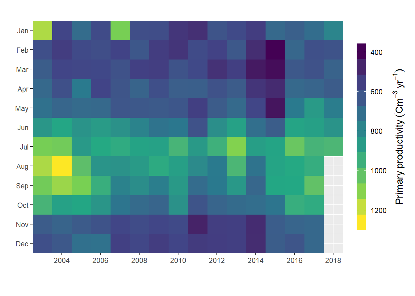
Figure 5: Heatmap plotted with ggplot2 package
We have figure 5 created with geom_raster() function and plot nice the heatmap, but looks pixilated. This function works better if you have data points with high density. But if we want to creat polygon of contour commonly refered as filled contour, then geom_raster() would not allow us to do that, and ggplot2 lack a function that can do that job. Fortunate, Elio Campitelli (2019) developed metR package that has some nifty geom to extend the capability of ggplot2. One of these geom is the geom_fill_contour(), which make some manipulation of the data to ensure all contours are closed. Figure 6 was generated using the chunk below;
ggplot() +
  metR::geom_contour_fill(data = pemba.pp,
                          aes(y = month, x = year, z = pp),
                          bins = 12, na.fill = TRUE)+
  scale_x_continuous(breaks = seq(2004,2019,2))+
  scale_y_reverse(breaks = seq(1,12,1),
                     labels = c("Jan","Feb", "Mar","Apr", "May","Jun",
                                "Jul","Aug", "Sep","Oct", "Nov", "Dec"))+
  coord_equal(expand = FALSE)+
  guides(fill = guide_colorbar(title = expression(Primary~productivity~(Cm^{-3}~yr^{-1})),
                               title.position = "right",
                               title.theme = element_text(angle = 90),
                               title.hjust = 0.5,
                               direction = "vertical",
                               reverse = T,
                               barwidth = unit(.4, "cm"),
                               barheight = unit(7.5, "cm")))+
  labs(x = "", y = "", title = "")+
  scale_fill_gradientn(colours = oce::oce.colorsViridis(120))
Figure 6: filled contour heatmap generated with metR package
Conclusion
In this post we have seen the power of choosing the right figure to present the data. We saw how to make draw change of primary productivity over a period of twelve month. The line plot in figure 3 and 4 showed the same patterns of high high primary production between June and September. Similar pattern was also clear with heatmap (Figure 5 and 6. However, unlike line plots in figure figure 3 and 4, heatmap plots in figure heatmap (Figure 5 and 6 showed the high productivity month and how these months expand or shrink over the study period.
References
Campitelli, Elio. 2019. MetR: Tools for Easier Analysis of Meteorological Fields. https://CRAN.R-project.org/package=metR.
Wickham, Hadley. 2016. Ggplot2: Elegant Graphics for Data Analysis. Springer-Verlag New York. http://ggplot2.org.
———. 2017. “Package Tidyverse.” Easily Install and Load the ‘Tidyverse.
Wickham, Hadley, Romain François, Lionel Henry, and Kirill Müller. 2018. Dplyr: A Grammar of Data Manipulation. https://CRAN.R-project.org/package=dplyr.