In the previously post, I covered how to read and convert netCDF files directly into R and convert to data frames. The approach is simple and straight forward but there flaws in this approach. One main setback of this approach is its inability to read maltiple matrix in an array from a netcdf file. This inability end up obtain a data frame from the of the first matrice of an array dropping out other matrix.
This post aimed to extend the approach and overcome the challenges inherited in the previous post. In this post I will take you through the process of converting a netcdf files into a tabular form widely known as data frame. I have divided this post into three main steps. First, I will show you how to read the metadata contained in the netCDF file, explore the data stored in it and glimpse their internal structures. Second, I will illustrate how to extract the data and Last, we sill finish with the transformation of the data and organize them as data frames.
We will use the geostrophic current and sea surface height dataset from AVISO. The dataset was extracted from http://opendap.aviso.altimetry.fr/thredds/dodsC/dataset-duacs-nrt-over30d-global-allsat-madt-uv. This dataset provides gridded values of zonal (u) and meridional (v) velocity component. There are several packages in CRAN that read and write netCDF files. I prefer the ncdf4 packages because it provide tools and functions to access the netCDF files (Pierce, 2017).
require(ncdf4)
require(tidyverse)
require(ncdump)
require(sf)
Understand the metadata
We first explore the metadata of the file with the with the NetCDF() function from ncdump package.
metadata = ncdump::NetCDF("E:/MatlabWorking/Altimetry/old staff/wio_geostrophic_uv_july_2015.nc")In summary, the metadata contains information about the netCDF file. One group of the data in the file include vector format variables like longitude, latitude and time as vector (table 1)
| Id | Type | Length |
|---|---|---|
| 0 | time | 31 |
| 1 | lat | 420 |
| 2 | lon | 401 |
The second group of the data in the metadata are array of velocity. The array contained the zonal velocity (U) and meridional velocity (V) as matrix (table 2). Because this is the daily data, each matrice represent a single day.We can view the information about the file by printing the uv file in the console.
| Variable | Name | Unit |
|---|---|---|
| v | meridional component | m/s |
| u | zonal component | m/s |
Extract the variable
Once we have identified the variables contained in the netCDF file, we use the nc_open() function to read the the file and assign it with uv name.
uv = nc_open("E:/MatlabWorking/Altimetry/old staff/wio_geostrophic_uv_july_2015.nc")
ssh = nc_open("E:/MatlabWorking/Altimetry/old staff/wio_ssh_july_2015.nc")
Once we have the file in the console, we are ready to extract the vector and array from the file. We can do this with ncvar_get()function.
## spatial components
lon = ncvar_get(uv, "lon")
lat = ncvar_get(uv, "lat")
## temporal component
time = ncvar_get(uv, "time")

## geogstrophic current
u = ncvar_get(uv, "u")
v = ncvar_get(uv, "v")

## sea surface height
adt = ncvar_get(ssh, "adt")
Printing the time we realized that time is the julian days but we do know the starting of the date. However, in the metadata provide information of the beginning data that we can use to transform this julian day into gregorian calendar that we are familiar with.
time [1] 23922 23923 23924 23925 23926 23927 23928 23929 23930 23931 23932
[12] 23933 23934 23935 23936 23937 23938 23939 23940 23941 23942 23943
[23] 23944 23945 23946 23947 23948 23949 23950 23951 23952We can transform this days into the calender once we know the original date that AVISO used. Looking on the metadata we spotted that the original date for the calender was assigned as julian_day_unit: days since 1950-01-01 00:00:00. Here comes another challenges, the time is in Julian but the original date is in gregorian format. Therefore, we need to standardize the time to a common format. We first convert the origin time—1950-01-01 00:00:00 to julian day. Once the original time is in the same with the vector time file—julian format, we can add them up and convert from the julian to gregorian calender.
# convert time original (to) to julian
to = insol::JDymd(year = 1950, month = 1, day = 1)

# add the original time to the extracted time
jd = to+time

#convert the julian day to gregorian calender
date = insol::JD(jd, inverse = TRUE)
The converted julian days are summarized in table 3 which show the julian number, julian day and the calender (gregorian date). We notice that our data were acquired from 2015-07-01 15:00:00 to 2015-07-31 15:00:00.
| Number time | Julian Day | Gregorian Day |
|---|---|---|
| 23922 | 2457205 | 2015-07-01 15:00:00 |
| 23923 | 2457206 | 2015-07-02 15:00:00 |
| 23924 | 2457207 | 2015-07-03 15:00:00 |
| 23925 | 2457208 | 2015-07-04 15:00:00 |
| 23926 | 2457209 | 2015-07-05 15:00:00 |
| 23927 | 2457210 | 2015-07-06 15:00:00 |
| 23928 | 2457211 | 2015-07-07 15:00:00 |
| 23929 | 2457212 | 2015-07-08 15:00:00 |
| 23930 | 2457213 | 2015-07-09 15:00:00 |
| 23931 | 2457214 | 2015-07-10 15:00:00 |
| 23932 | 2457215 | 2015-07-11 15:00:00 |
| 23933 | 2457216 | 2015-07-12 15:00:00 |
| 23934 | 2457217 | 2015-07-13 15:00:00 |
| 23935 | 2457218 | 2015-07-14 15:00:00 |
| 23936 | 2457219 | 2015-07-15 15:00:00 |
| 23937 | 2457220 | 2015-07-16 15:00:00 |
| 23938 | 2457221 | 2015-07-17 15:00:00 |
| 23939 | 2457222 | 2015-07-18 15:00:00 |
| 23940 | 2457223 | 2015-07-19 15:00:00 |
| 23941 | 2457224 | 2015-07-20 15:00:00 |
| 23942 | 2457225 | 2015-07-21 15:00:00 |
| 23943 | 2457226 | 2015-07-22 15:00:00 |
| 23944 | 2457227 | 2015-07-23 15:00:00 |
| 23945 | 2457228 | 2015-07-24 15:00:00 |
| 23946 | 2457229 | 2015-07-25 15:00:00 |
| 23947 | 2457230 | 2015-07-26 15:00:00 |
| 23948 | 2457231 | 2015-07-27 15:00:00 |
| 23949 | 2457232 | 2015-07-28 15:00:00 |
| 23950 | 2457233 | 2015-07-29 15:00:00 |
| 23951 | 2457234 | 2015-07-30 15:00:00 |
| 23952 | 2457235 | 2015-07-31 15:00:00 |
Transform to data frame
The final step is the transformation of matrix in arrays into data frame. Because there are thirty one matrix in each array—u,v, and adt, we chained the process in the loop as shown in the chunk below. I will not repeate the looping process in this post, If you cant follow the code in the chunk, I recommend you to read previous post that have sufficient information about how to loop and iterate repetitive process.
## zonal component

u.df = NULL

for (i in 1:length(date)) {

 ua = data.frame(lon,u[,,i] %>% as.data.frame())%>%
   as.tibble() %>%
   gather(key = "key", value = "u", 2:421) %>%
   mutate(time = date[i], lat = rep(lat, each = 401)) %>% select(time, lon,lat, u)

 u.df = u.df %>% bind_rows(ua)

}


## meridional compoent

v.df = NULL

for (i in 1:length(date)) {

 va = data.frame(lon, v[,,i] %>% as.data.frame())%>%
   as.tibble() %>%
   gather(key = "key", value = "v", 2:421) %>%
   mutate(time = date[i], lat = rep(lat, each = 401)) %>% select(time, lon,lat, v)

 v.df = v.df %>% bind_rows(va)
}


## sea surface height
adt.df = NULL

for (i in 1:length(date)) {

 adta = data.frame(lon,adt[,,i] %>% as.data.frame())%>%
   as.tibble() %>%
   gather(key = "key", value = "adt", 2:421) %>%
   mutate(time = date[i], lat = rep(lat, each = 401)) %>% select(time, lon,lat, adt)

 adt.df = adt.df %>% bind_rows(adta)
}
Stitching the data
Once the geostrophic current (zonala and meridional) and the sea surface height anomaly data frame have been created, was combined and organized in a consistency format that makes analysis and plotting easy.
aviso = data.frame(u.df, v.df, adt.df) %>%
  select(time, lon,lat, u, v, adt) %>%
  as.tibble() %>%
  mutate(day = lubridate::yday(time))

aviso$time = as.Date(aviso$time)
aviso$day = as.integer(aviso$day)
Table 4 is the random sample of twelve observations showing the information of geostrophic current and sea surface height within the tropical Indian Ocean for thirty one days in July 2015.
| Date | Longitude | Latitude | U | V | adt |
|---|---|---|---|---|---|
| 2015-07-26 | 44.125 | -12.875 | 0.0546 | -0.1242 | 0.9840 |
| 2015-07-21 | 54.375 | 15.375 | 0.5472 | -0.2257 | 0.5611 |
| 2015-07-18 | 88.125 | -21.625 | 0.0125 | -0.0697 | 0.9063 |
| 2015-07-22 | 61.625 | -27.875 | 0.4760 | -0.3041 | 0.9771 |
| 2015-07-20 | 95.875 | -43.125 | 0.0723 | -0.0194 | 0.5580 |
| 2015-07-06 | 73.875 | -5.625 | 0.0361 | 0.0265 | 0.8138 |
| 2015-07-01 | 50.375 | 15.875 | NA | NA | NA |
| 2015-07-24 | 54.625 | -73.125 | NA | NA | NA |
| 2015-07-18 | 52.375 | -21.875 | 0.0052 | -0.0676 | 1.0600 |
| 2015-07-21 | 85.125 | -5.875 | -0.1964 | 0.0458 | 0.9191 |
| 2015-07-10 | 93.125 | -15.875 | -0.0773 | -0.0544 | 0.9476 |
| 2015-07-23 | 85.125 | -31.125 | 0.0584 | -0.0154 | 0.7786 |
Visualize—Mapping the SSH
We have come long way from reading the data from the local machine into R’s environment, extract the variables and transform them into data frame. But the subtle information we are looking from this dataset are still hidden and we ought to uncover them. One way of understanding the data is through visualization. Visualizing data may range from common static exploratory data analysis plots to dynamic, interactive data visualizations in web browsers. R offers control over many aesthetic aspects of plots, but we will stick on ggplot2 developed by Hadley Wickham (2016) because it provide new ways to visualize and communicate data. Figure 1 for example show the sea surface height anomaly in the tropical Indian Ocean. We can easily spot region with higher and lower sea surface height anomaly. We see a region with high sea surface anomaly in the Mozambique channel and low sea surface height anomaly between latitude 8\(^\circ\)S and 4\(^\circ\)S and longitude 488\(^\circ\)E and 548\(^\circ\)E.
ggplot()+
  geom_raster(data = aviso %>%
                filter(day == 190 & between(lon,38.5,54.5) & between(lat,-15,-.5)),
              aes(x = lon, y = lat, fill = adt), interpolate = TRUE)+
  geom_sf(data = spData::world, fill = "grey85", col = 1)+
  coord_sf(xlim = c(39,53.5), ylim = c(-14.5,-1.5))+
  scale_fill_gradientn(name = "SSH\n(m)", colours = oce::oceColorsPalette(120))+
  labs(title = "", x = "", y = "")+
  theme_bw()+
  theme(axis.text = element_text(size = 11, colour = 1),
        legend.key.height = unit(1.5, "cm"))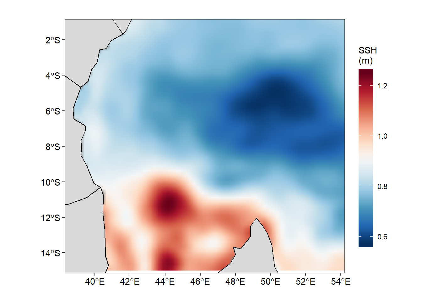
Figure 1: Sea Surface Height Anomaly in the Tropical Indian Ocean Region as of 2015-07-01
If we want to check how the sea surface height anaomaly changes over the month of July 2015, then we ought to produce figure 1 for each day and obtain a total of 31 maps. Then visualize one after the other. That also wont save much and we will still miss the information as they are hidden in the table. Beside, we can animate them and make smooth transition of these maps. Thanks to Thomas Pedersen and David Robinson (2017)for developing a gganimate that transorm static plot of ggplot2 into animation. With few line of codes, we transformed static map in figure 1 into animated figure 2, which shown a seamless change of sea surface height in the area.
require(gganimate)

fig2 = ggplot()+
  geom_raster(data = aviso %>% filter(between(lon,38.5,60.5) & between(lat,-23,2)),
              aes(x = lon, y = lat, fill = adt), interpolate = TRUE)+
  geom_sf(data = spData::world, fill = "grey85", col = 1)+
  coord_sf(xlim = c(39.5,58), ylim = c(-21.5,0.5))+
  scale_fill_gradientn(name = "SSH\n(m)", colours = oce::oceColorsPalette(120))+
  labs(title = "", x = "", y = "")+
  theme_bw()+
  theme(axis.text = element_text(size = 11, colour = 1),
        legend.key.height = unit(1.5, "cm"))+
  labs(title = 'Date: {frame_time}') +
  transition_time(time) +
  ease_aes('linear')

 animate(fig2)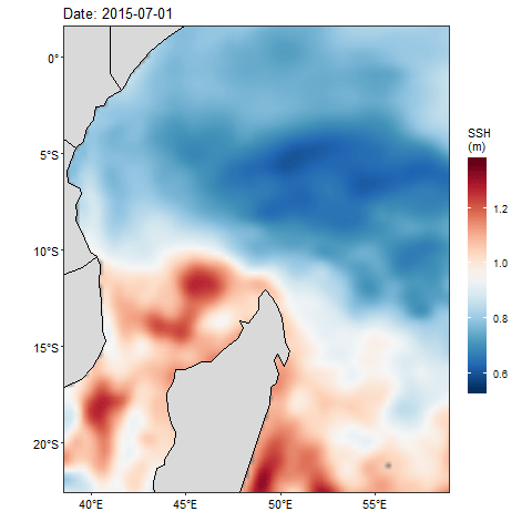
Figure 2: Animation of Sea Surface Height Anomaly in the tropical Indian Ocean from July 1 to July 31, 2015
There are times we need to overlay geostrophic field that show speed and direction on the sea surfae height anomaly. Unfortunately, the density of the geostrophic often make the plot messy. Therefore, in the next post, we will reduce the density by creating equal size grid and then calculate the average velocity of the zonal (U) and meridional (V) velocity in each grid.
Cited literature
Pedersen, T. L., & Robinson, D. (2017). Gganimate: A grammar of animated graphics. Retrieved from http://github.com/thomasp85/gganimate
Pierce, D. (2017). Ncdf4: Interface to unidata netCDF (version 4 or earlier) format data files. Retrieved from https://CRAN.R-project.org/package=ncdf4
Wickham, H. (2016). Ggplot2: Elegant graphics for data analysis. Springer-Verlag New York. Retrieved from http://ggplot2.org