setwd("E:/Data Manipulation/xtractomatic")Introduction
The increasing popularity of ggplot2 package (Wickham, 2016) had made many people becomes familiar with art of grammer of graphics of static plots. But, most of environmental data are static but rather changes both with time and space. Therefore, animated plots are effective way to communicate these dind of data.
Pedersen & Robinson (2017) developed gganimate package that extends the grammar of graphic as implemented with ggplot2 with animations. It has several classes and geoms that once added change static plots from ggplot2 into animations. in this post I show some example of how to animate geospatial data. I will use oceanographic data of wind vector from quikscat, sea surface temperature and chlorophyll from MODIS. I will draw static plots with ggplot2 and create animation these plots with gganimate package package.
You can install gganimatepackage from github using the devtools package. If you havent install the package in your machine, you simply uncomment the chunk below to install it
# devtools::install_github("thomasp85/gganimate")Before we start, let’s load the R packages that we will use.
require(xtractomatic)
require(tidyverse)
require(oce)
require(lubridate)
require(gganimate)
require(sf)
First example: Quiksat Wind data
Quiksate contain satellite wind data for all world oceans at 0.125 degree spatial resolution. We can download the wind data using the extractomatic package. I will straight to the process and skip the detail of extracting these data, If you can follow in this post, I recommend to look at ascat processin in R for more detail. The the dataset id, spatial and time bounds were passed in the extracto_3D() function as argument to extract and download quikscat data based. Because we want the vector wind fields, the zonal and meridional data were download separately.
## zonal compoent
wind_x = xtracto_3D(dtype = "qsux101day",
                    xpos = c(38.85, 40),
                    ypos = c(-6.8, -4.5),
                    tpos = c("2000-01-01", "2008-12-31"))
# meridional component
wind_y = xtracto_3D(dtype = "qsuy101day",
                    xpos = c(38.85, 40),
                    ypos = c(-6.8, -4.5),
                    tpos = c("2000-01-01", "2008-12-31"))
## Extract
longitude = wind_x$longitude
latitude = wind_x$latitude
time = wind_x$time %>% as.Date()
# eastward velocity (zonal)
u = wind_x$data
# northward velocity (meridional)
v = wind_y$data

# calculate wind velocity
velocity = sqrt(u^2 + v^2)
Tranform array to data frame
Data frame is the principle data storage in R. Because the wind vector data are in array format, they were transformed to data frame first and then organize in the structure that make analysis and plotting much easier. Because there are several matrix that are in array, I used a for() loop function to iterate the process.
n.lon = length(longitude)
n.lat = length(latitude)+1

u.all = NULL

## zonal from array to data frame

for (i in 1:length(time)){
      u.df = data.frame(longitude, u[,,i] %>% as.data.frame()) %>%
        gather(key = "key" , value = "u", 2:n.lat) %>%
        mutate(latitude = rep(latitude, each = n.lon), date = time[i]) %>%
        select(date,longitude, latitude, u)%>%
        as.tibble()

    u.all = u.all %>% bind_rows(u.df)
}

## zonal from array to data frame
v.all = NULL

for (i in 1:length(time)){
      v.df = data.frame(longitude, v[,,i] %>% as.data.frame()) %>%
        gather(key = "key" , value = "v", 2:n.lat) %>%
        mutate(latitude = rep(latitude, each = n.lon), date = time[i]) %>%
        select(date,longitude, latitude, v)%>%
        as.tibble()

    v.all = v.all %>% bind_rows(v.df)
}


## velocity from array to data frame
velocity.all = NULL

for (i in 1:length(time)){
      velocity.df = data.frame(longitude, velocity[,,i] %>% as.data.frame()) %>%
        gather(key = "key" , value = "velocity", 2:n.lat) %>%
        mutate(latitude = rep(latitude, each = n.lon), date = time[i]) %>%
        select(date,longitude, latitude, velocity)%>%
        as.tibble()

    velocity.all = velocity.all %>% bind_rows(velocity.df)
}
Tidying the data frame
Tidying means getting data into the right form in order to feed it into the visualization and modeling stages. This typically requires a large amount of reshaping and transforming of your data—widely known *tidying.The wind vector data was manipulated and created new variables using tidy (@ Wickham & Henry, 2018) and dplyr (Wickham, François, Henry, & Müller, 2018) packages. Table 1 show the fifteen random sample of the wind vector within Zanzibar and Pemba channel from Quikscat collected between January 01, 2000 to December 31, 2008.
wind = data.frame(u.all, v.all$v, velocity.all$velocity) %>%
  mutate(day = yday(date) %>%as.integer(),
         week = week(date) %>%as.integer(),  month = month(date) %>%as.integer(),
         year = year(date) %>%as.integer()) %>%
  select(date,day, week, month, year,longitude,latitude, u,
v = v.all.v, velocity = velocity.all.velocity)| date | day | week | month | year | longitude | latitude | u | v | velocity |
|---|---|---|---|---|---|---|---|---|---|
| 2001-05-23 | 143 | 21 | 5 | 2001 | 39.875 | -6.375 | -0.4263 | 6.3317 | 6.3460 |
| 2001-06-30 | 181 | 26 | 6 | 2001 | 39.750 | -6.250 | -2.2709 | 6.7108 | 7.0847 |
| 2002-03-12 | 71 | 11 | 3 | 2002 | 40.000 | -4.750 | -3.7493 | -4.0693 | 5.5332 |
| 2003-09-12 | 255 | 37 | 9 | 2003 | 39.750 | -5.625 | 3.7976 | 2.9117 | 4.7854 |
| 2004-09-19 | 263 | 38 | 9 | 2004 | 40.000 | -6.375 | -0.5166 | 2.7614 | 2.8093 |
| 2005-05-27 | 147 | 21 | 5 | 2005 | 40.000 | -4.500 | 2.3335 | 7.0677 | 7.4430 |
| 2006-02-07 | 38 | 6 | 2 | 2006 | 40.000 | -6.125 | -1.3033 | -3.9765 | 4.1846 |
| 2006-06-06 | 157 | 23 | 6 | 2006 | 39.625 | -5.875 | -1.4763 | 9.3252 | 9.4414 |
| 2006-08-14 | 226 | 33 | 8 | 2006 | 40.000 | -6.750 | -2.9396 | 6.4971 | 7.1312 |
| 2007-08-18 | 230 | 33 | 8 | 2007 | 39.625 | -5.750 | 2.1020 | 6.1118 | 6.4632 |
| 2008-01-14 | 14 | 2 | 1 | 2008 | 40.000 | -5.625 | -3.0702 | -1.4840 | 3.4101 |
| 2008-09-19 | 263 | 38 | 9 | 2008 | 39.750 | -5.875 | -2.3978 | 1.1733 | 2.6695 |
group_by() and summarise() were piped to compute the monthly mean of zonal (u) meridional (v) and velocity wind speed for each month between January 2000 to December 2008.
wind.month = wind %>%
  group_by(longitude, latitude, month) %>%
  summarise(u = median(u, na.rm = TRUE),
            v = median(v, na.rm = TRUE),
            velocity = median(velocity, na.rm = TRUE))
Development of Monsoon Winds
Animation of time-series data provide new insights that static plots hides. For example, figure 1 is static plot show the monsoon season climatological median of wind vector. Figure 1a is wind vector for February representing the northeast monsoon season and figure 1b is for August representing the southeast monsoon season.
feb = ggplot() +
   geom_segment(data = wind.month %>% filter(month == 2),
               aes(x = longitude, xend = longitude+u/60, y = latitude,
                   yend = latitude+v/60), arrow = arrow(length = unit(0.25, "cm")))+
  geom_sf(data = tz.ke, fill = "grey85", col = 1)+
  coord_sf(xlim = c(38.7, 40), ylim =  c(-6.7, -4.7))+
  scale_x_continuous(breaks = c(38.8,40))+
  theme_bw()+
  theme(axis.text = element_text(size = 11, colour = 1))+
  labs(x = NULL, y = NULL)


aug = ggplot() +
    geom_segment(data = wind.month %>% filter(month == 8),
               aes(x = longitude, xend = longitude+u/60, y = latitude,
                   yend = latitude+v/60), arrow = arrow(length = unit(0.25, "cm")))+
  geom_sf(data = tz.ke, fill = "grey85", col = 1)+
  coord_sf(xlim = c(38.7, 40), ylim =  c(-6.7, -4.7))+
  scale_x_continuous(breaks = c(38.8,40)) +
  theme_bw()+
  theme(axis.text = element_text(size = 11, colour = 1))+
  labs(x = NULL, y = NULL)


cowplot::plot_grid(feb, aug,ncol = 2)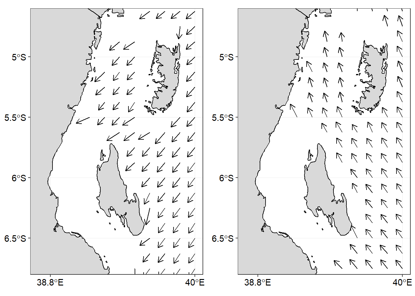
Figure 1: Climatological monthly Wind vector for a) February and b) August
Figure 2 is the animation of the wind vector in the area. We have a glimpse of the pattern of wind in the area throughtout the year. The animation in Figure 2 show a monsoon pattern—the reversing wind direction. It also show clearly when this phonemonon occurs.
wind.vector = ggplot() +
  geom_raster(data = wind.month, aes(x = longitude, y = latitude, fill = velocity))+
  geom_segment(data = wind.month,
               aes(x = longitude, xend = longitude+u/60, y = latitude,
                   yend = latitude+v/60), arrow = arrow(length = unit(0.25, "cm")))+
  geom_sf(data = tz.ke, fill = "grey85", col = 1)+
  coord_sf(xlim = c(38.7, 40), ylim =  c(-6.7, -4.7))+
  scale_fill_gradientn(colours = oce::oceColorsPalette(120), limits = c(0,12),
                       na.value = "white", name = "Speed\n (m/s)")+
  scale_x_continuous(breaks = c(38.8,40))+
  theme_bw()+
  theme(axis.text = element_text(size = 14, colour = 1),
        legend.text = element_text(size = 14, colour = 1),
        legend.title = element_text(size = 14, colour = 1),
        legend.position = c(.12,.17),
        legend.background = element_rect(colour = 1, fill = "white"))+
  labs(x = NULL, y = NULL, title = "Month of : {frame_time}")+
  transition_time(month) +
  ease_aes("linear")

animate(wind.vector)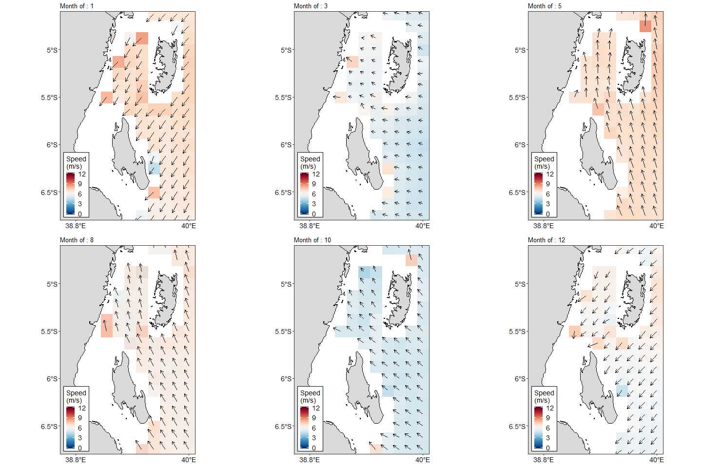
Figure 2: Animated Monthly Climatological Median of Wind vector
Figure 3 show the daily climatological median velocity for 365 days. The static figure 3 can easily animated with just few lines and make an interactive and animated plot as shown in figure 4
## calculate daily climatological median velocity
wind.vel = wind %>% as.tibble() %>%
  mutate(Month = month(date, label = TRUE, abbr = FALSE)) %>%
  group_by(day, Month) %>%
  summarise(velocity = median(velocity, na.rm = TRUE))

## static plog
ggplot(data = wind.vel, aes(x = day, y = velocity, group = Month)) +
  geom_line() +
  geom_point(size = 1.2) +
  coord_cartesian(clip = "off") +
  labs(title = "",
       y = expression(~Wind~speed~(ms^{-1})),
       x = "Number of days in a year")+
  theme_bw()+
  theme(axis.text = element_text(colour = 1, size = 12),
        axis.title = element_text(size = 14, colour = 1),
        panel.grid = element_line(colour = NA))+
  scale_x_continuous(limits = c(0,400),breaks = seq(0,360,30))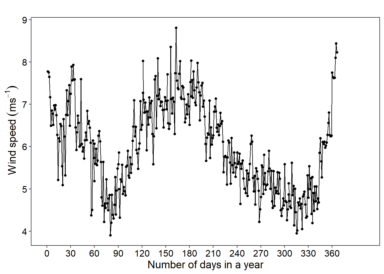
Figure 3: Median Wind speed between 2000 and 2006 around Zanzibar and Pemba Island
climatology = ggplot(data = wind.vel, aes(x = day, y = velocity, group = Month)) +
  geom_line() +
  geom_segment(aes(xend = 364, yend = velocity), linetype = 2, colour = "red")+
  geom_point(size = 2) +
  geom_text(aes(x = 365, label = Month), hjust = 0) +
  coord_cartesian(clip = "off") +
  labs(title = "",
       y = expression(~Wind~speed~(ms^{-1})),
       x = "Number of days in a year")+
  theme_bw()+
  theme(axis.text = element_text(colour = 1, size = 12),
        axis.title = element_text(size = 14, colour = 1),
        panel.grid = element_line(colour = NA))+
  scale_x_continuous(limits = c(0,400),breaks = seq(0,360,30))+
  transition_reveal(Month, day)

animate(climatology)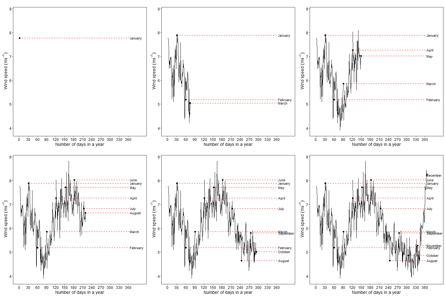
Figure 4: Daily climatological median Wind speed around Zanzibar and Pemba Island
We can combine the inter-annual and intra-annual variability and animate the results as shown in figure 5. The moving points suggest that the wind in the area is very dynamic both within months (intra) and among years (inter)
wind.vel.month = wind %>% as.tibble() %>%
  mutate(Month = month(date, label = TRUE, abbr = TRUE)) %>%
  group_by(day, year, Month) %>%
  summarise(velocity = median(velocity, na.rm = TRUE))


dynamics = ggplot(data = wind.vel.month,
       aes(x = Month, y = velocity, col = Month, size = velocity)) +
  geom_point()+
  guides(fill = FALSE)+
  labs(title = "Year: {closest_state}",
       x = "",  y = expression(~Wind~speed~(ms^{-1})))+
  theme_bw()+
  theme(legend.position = "none", axis.text = element_text(size = 14, colour = 1),
        axis.title = element_text(size = 16, colour = 1),
        plot.title = element_text(size = 14, colour = 1))+
  scale_size(range = c(0.02,2))+
  transition_states(states = year,transition_length = 2, state_length = 5, wrap = TRUE) +
  # ease_aes('quadratic-in-out')+
  enter_fade() +
  exit_shrink() +
  ease_aes('sine-in-out')

animate(dynamics)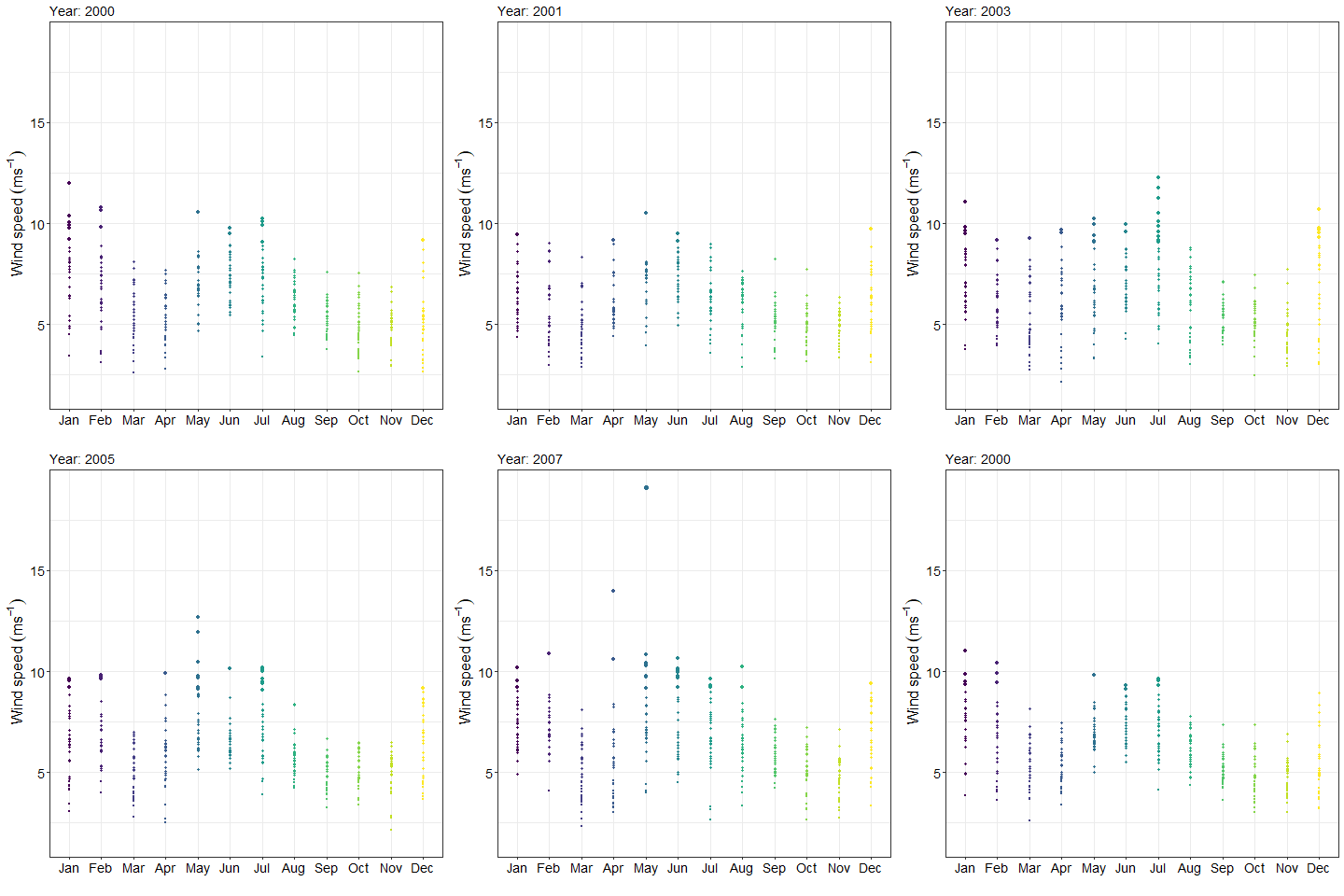
Figure 5: interactive median velocity of wind
Still on vector wind, figure 6 show the mean and standard error of the mean for over a period of nine years.
wind.vel.stats = wind %>% as.tibble() %>%
  mutate(Month = month(date, label = TRUE, abbr = TRUE)) %>%
  group_by(year, Month) %>%
  summarise(mean = mean(velocity, na.rm = TRUE),
            sem = sd(velocity, na.rm = TRUE)/sqrt(length(velocity)))

wind.vel.stats$year = as.factor(wind.vel.stats$year)


mean_error= ggplot(data = wind.vel.stats, aes(x = Month, y = mean, fill = Month)) +
  # geom_col(show.legend = FALSE) +
  labs(y = expression(~Wind~speed~(ms^{-1})),
       x = "Number of days in a year")+
  # geom_point(aes(x = IV, y = DV), data = df, alpha = .25) +
  geom_errorbar(aes(ymin = mean - sem, ymax = mean + sem), width = .2) +
  labs(title = "{closest_state}")+
  theme_bw()+
  theme(legend.position = "none", axis.text = element_text(size = 14, colour = 1),
        axis.title = element_text(size = 16, colour = 1),
        plot.title = element_text(size = 14, colour = 1),
        panel.grid = element_line(colour = NA))+
  transition_states(states = year, transition_length = 2, state_length = 1, wrap = FALSE) +
  # enter_fade() +
  # exit_shrink() +
  ease_aes('sine-in-out')


animate(mean_error)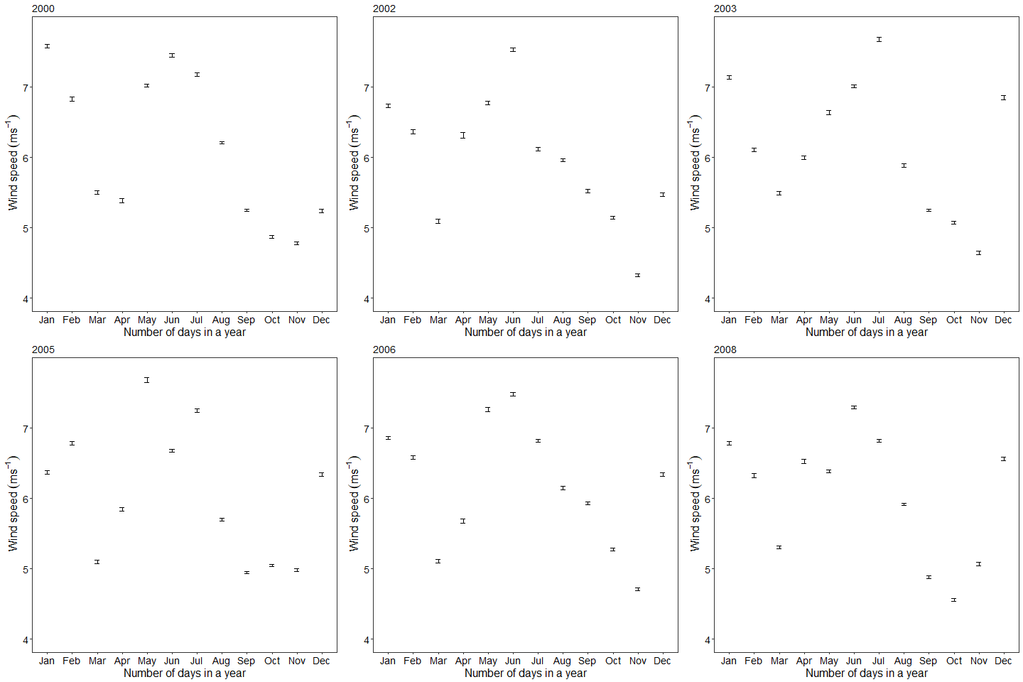
Figure 6: MEan and standard deviation of the mean velocity
Second example: CTD
CTD stands for Conductivity-Temperature-Depth. They contain profiles of several oceanographic variables including temperature, salinity, conductivity, oxygen and fluorescence. I explained how to process CTD files created by Seabird instrument in previous post. I ask you to have a glimpse of the article if you find difficult to follow in this section. Like the wind vector data, CTD data were tranformed into data frame and structured in a format that makes data manipulation, analysis and plotting easy.
## read the files in the directory
files = dir(path = "E:/blogs/masumbuko/content/post/ctd18/", pattern = ".cnv", full.names = TRUE)

ctd = list()

## import the file from cnv to oce object
for (i in 1:length(files)){

  ctd[[i]] = read.ctd(files[i]) %>% ctdTrim(method = "downcast") %>% ctdDecimate(p = 1)

}

## convert oce object to data frame
ctd.tb = NULL

for (j in 1:length(files)){
ctd.df = ctd[[j]]@data %>%
  as.data.frame() %>%
  mutate(lon = ctd[[j]]@metadata$longitude,
         lat = ctd[[j]]@metadata$latitude,
         time = ctd[[j]]@metadata$time,
         station = ctd[[j]]@metadata$station %>% as.factor()) %>%
  # separate(time, c("date", "time"), sep = " ", remove = TRUE) %>%
  select(station, time, lon, lat, pressure, depth, temperature, conductivity,
         salinity, oxygen, fluorescence, turbidity)

ctd.tb = ctd.tb %>% bind_rows(ctd.df)
}
There CTD casts in both Pemba and Zanzibar channel. We first animate the location of the CTD cast as shown in figure 7. The CTD cast were animated based on the surface temperature. We notice that the Pemba channel cast had relatively less warmer water compared to the casts in the Zanzibar channel.
casts = ggplot()+
  geom_point(data = ctd.tb %>% filter(pressure == 5),
             aes(x = lon, y = lat, colour = temperature), size = 4)+
  geom_sf(data = tz.ke, fill = "grey85", col = 1)+
  coord_sf(xlim = c(38.75, 40), ylim = c(-7, -4.8))+
  scale_x_continuous(breaks = c(38.8,39.8))+
  scale_y_continuous(breaks = c(-7, -4.9))+
  theme_bw()+
  theme(axis.title = element_blank(),
        panel.grid = element_line(colour = NA),
        axis.text = element_text(size = 14, colour = 1),
        legend.position = c(.8,.25),
        legend.key.height = unit(1.25, "lines"),
        legend.key.width = unit(.5, "lines"),
        legend.text = element_text(size = 12, colour = 1))+
  scale_color_viridis_c(name = "Temp")+
 transition_states(time, transition_length = 1, state_length = 3, wrap = TRUE ) +
  ease_aes('linear') +
  shadow_mark()

animate(casts)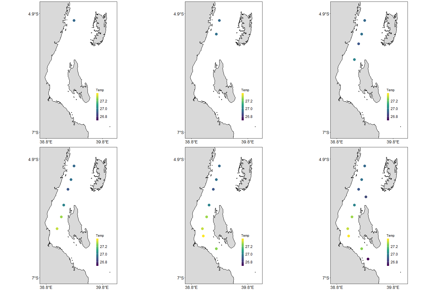
Figure 7: CTD cast locations
You can choose any variable that exist in the CTD and animate its profile to see how they change from the surface to the maximum depth at different ctd cast station. For example, figure 8 show animated salinity profile for each station mapped in figure 7. There is substantial difference of the profile because of the measured at station with different depth.
salinity.anim = ggplot(data = ctd.tb %>% na.omit(),
       aes(x = salinity, y = pressure, size = temperature)) +
  geom_point(show.legend = FALSE) +
  scale_size(range = c(0,1))+
  scale_y_reverse()+
  facet_wrap(~station, scales = "free_y", strip.position = "right")+
  scale_x_continuous(position = "top", breaks = seq(34.8, 35.5, length.out = 6))+
  theme_bw()+
  theme(axis.text = element_text(colour = 1, size = 11))+
  transition_time(depth)+
  ease_aes("sine-in-out")+
  shadow_mark()


animate(salinity.anim)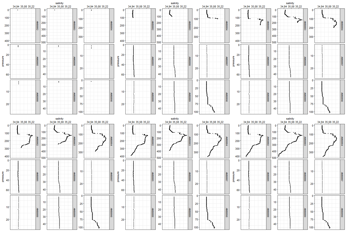
Figure 8: Salinity profile
Sometimes our interest is to show different variables at the same station. We can do that but first our data frame has be converted from wide form to long form. Once that is done, we can select the station of interest and animate its profile variables from the surface to the deepest point as shown in figure 9
ctd.tb.long = ctd.tb %>% select(station, lon, lat, pressure, depth, temperature,salinity, oxygen, fluorescence, turbidity) %>% gather(key = "variable", value = "values", 6:10)


station.anim = ggplot(data = ctd.tb.long%>%filter(station == "AM00882" & variable != "turbidity") %>% na.omit(),
       aes(x = values, y = pressure)) +
  geom_point(show.legend = FALSE) +
  scale_y_reverse()+
  facet_wrap(~variable, scales = "free", strip.position = "top")+
  scale_x_continuous(position = "top")+
  theme_bw()+
  theme(axis.text = element_text(colour = 1, size = 11))+
 transition_time(depth)+
  ease_aes("sine-in-out")+
  shadow_mark()

animate(station.anim)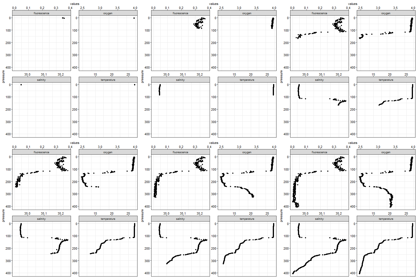
Figure 9: Vertical profile of fluoresnce, oxygen, salinity and temperature at station AM00882
With tidy data, we more flexible, for example I can use the same data to plot oxygen profile of the six station (figure 10)
oxy.animate =  ggplot(data = ctd.tb.long%>%filter(variable == "oxygen") %>% na.omit(),
       aes(x = values, y = pressure)) +
  geom_point(show.legend = FALSE) +
  scale_y_reverse()+
  facet_wrap(~station, scales = "free_y", strip.position = "top")+
  scale_x_continuous(position = "top")+
  theme_bw()+
  theme(axis.text = element_text(colour = 1, size = 11))+
 transition_time(depth)+
  ease_aes("sine-in-out")+
  shadow_mark()

 animate(oxy.animate)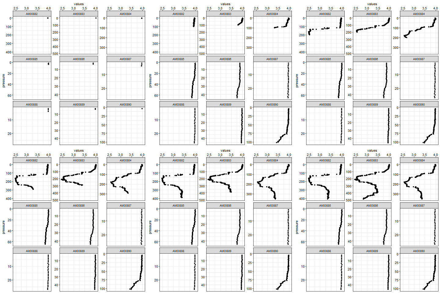
Figure 10: Vertical profile of oxygen at six stations
Third example: Argo floats
gganimate is capable of tracking moving object like Argo floats. Argo floats are like CTD. The data also need to be tranformed to data frame. I have covered the procesin of Argo float data with R in the previous section. Because I wont explain in detail how to process Argo float data in this post, I recommend you glimpse the argo processing if you find difficult to follow along this post. First let us import the file we are going to use in R
# Import the file
argo = read.argo("./Processing/argo_profile/csiro/1901124/1901124_prof.nc")%>%
  handleFlags()
Then transorm the data from oce object to data frame. Note that the process was done with for() loop function as there 217 profiles in this Argo float.
## make a section using the profiles recorded in argo float
argo.section = argo%>%as.section()
## convert argo section to list
argo.list = argo.section[["station"]]

## extract lon from the argo list
longitude = argo.section[["longitude", "byStation"]]

## extract lat from the argo list
latitude = argo.section[["latitude", "byStation"]]

## time can not be extracte the same way lon and lat can. This is because the time is stored in the
time = argo.section[["time", "byStation"]]


## loop through each profile
argo.tb = NULL

for (i in 1:length(argo.list)){

profile = argo.list[[i]]@data%>%
  as.data.frame()%>%
  as.tibble()%>%
  mutate(Date = argo.list[[i]]@metadata$startTime%>%as_datetime(tz = ""),
         Longitude = argo.list[[i]]@metadata$longitude,
         Latitude = argo.list[[i]]@metadata$latitude)%>%
  separate(Date, c("Date", "Time"),sep = " ", remove = TRUE)%>%
  dplyr::select(Scan = scan, Date, Time, Longitude, Latitude,
                Depth = pressure, Temperature = temperature,
                Salinity = salinity)

argo.tb = argo.tb%>%bind_rows(profile)

}
We select the surface value of each profile and compute a wakati variable, just a sequence from 1 to 2017 observations of Argo profile. We map the Argo float track and animate it (Figure 11)
## surface information from Argo float
argo.surface.tb =  argo.tb%>%filter(Scan == 1)%>% mutate(wakati = 1:217)

## map the location
argo.animate = ggplot()+
  geom_sf(data = spData::world, fill = "grey85", col = 1)+
  # geom_path(data = argo.surface.tb,
  #           aes(x = Longitude, y = Latitude), size =.5, col = 2)+
  geom_point(data = argo.surface.tb, aes(x = Longitude, y = Latitude, colour = Temperature))+
  coord_sf(xlim = c(35, 71), ylim = c(-25,0))+
  ggrepel::geom_text_repel(data = argo.surface.tb%>%slice(seq(3,217,25)),
                           aes(x = Longitude, y = Latitude, label = Date))+
  theme_bw()+
  theme(panel.background = element_rect(colour = 1, fill =NA),
        panel.grid = element_line(colour = NA),
        axis.text = element_text(colour = 1, size = 14)) +
  scale_color_gradientn(colours = oce::oceColors9A(120))+
 labs(title = "Tracking of Argo float",
      # subtitle = "Time:{frame_time}",
      x = "", y = "",
      caption = "Data Source: Argo")+
  # transition_reveal(id = 1,along = Date)+
  transition_time(wakati)+
  ease_aes("sine-in-out")+
  shadow_mark()

animate(argo.animate)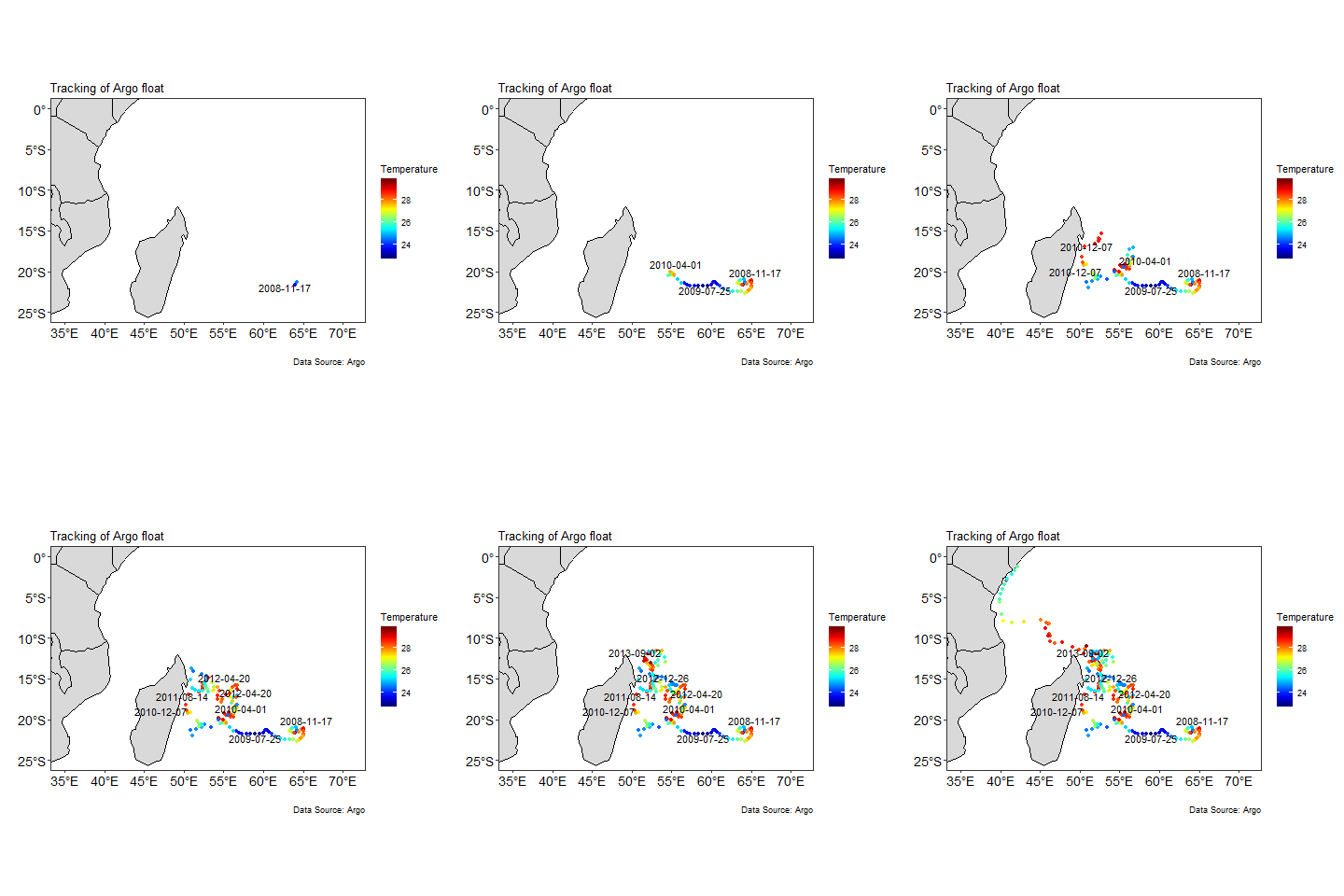
Figure 11: Tracking Argo float cast locations
Bibliography
Pedersen, T. L., & Robinson, D. (2017). Gganimate: A grammar of animated graphics. Retrieved from http://github.com/thomasp85/gganimate
Wickham, H. (2016). Ggplot2: Elegant graphics for data analysis. Springer-Verlag New York. Retrieved from http://ggplot2.org
Wickham, H., & Henry, L. (2018). Tidyr: Easily tidy data with ’spread()’ and ’gather()’ functions. Retrieved from https://CRAN.R-project.org/package=tidyr
Wickham, H., François, R., Henry, L., & Müller, K. (2018). Dplyr: A grammar of data manipulation. Retrieved from https://CRAN.R-project.org/package=dplyr