Introduction
In this post I’am going to illustrate how to model in R. As Wickham & Grolemund1 put it
The prime goal of modeling is to provide simple low-dimension summary of a dataset.
I am not going to bring a novel science in this post but rather to help you learn the most important tools in R2 that will allow you to model your data.
Needed tools
In this routine, we will mainly use modelr3 and tidyverse4 packages. modelr package which wraps around base R’s modelling functions to make them work naturally in a pipe
require(tidyverse)
require(modelr)
require(kableExtra)
require(plotly)
We will use the iris dataset, which comes with R when you install in your machine. You can call the iris dataset with the code in the chunk below. Table 1 summarize the variables contained in the iris dataset, which contain one categorical variables (Species) and four continuos variables—sepal and peltal measurement of length and width.
iris = iris| Species | Length | Width | Length | Width |
|---|---|---|---|---|
| virginica | 5.8 | 2.7 | 5.1 | 1.9 |
| virginica | 6.3 | 2.8 | 5.1 | 1.5 |
| virginica | 6.5 | 3.2 | 5.1 | 2.0 |
| virginica | 6.7 | 3.0 | 5.2 | 2.3 |
| versicolor | 4.9 | 2.4 | 3.3 | 1.0 |
| setosa | 5.0 | 3.5 | 1.6 | 0.6 |
| versicolor | 5.8 | 2.7 | 3.9 | 1.2 |
| setosa | 4.6 | 3.2 | 1.4 | 0.2 |
| virginica | 6.9 | 3.1 | 5.4 | 2.1 |
| setosa | 5.1 | 3.8 | 1.5 | 0.3 |
| 1 Data obtained from Anderson & Edgar (1935). |
Linear regression model
The standard linear model is ubiquitous in statistical training and application, anf for good reason. It is simple to do and easy to understand. Let us explore the iris dataset. Let us first plot the variables to see how they are related. While the association between sepal length and sepal width (Figure 1) does not show clearly the relation, Figure 2 show a clear position relatioship, though is based on species
fig1 = ggplot(data = iris, aes(x = Sepal.Length ,
                        y = Sepal.Width,
                        col = Species))+
  geom_point()+
  cowplot::theme_cowplot()+
  scale_x_continuous(breaks = seq(0,7,1.5))+
  labs(x = "Sepal length (cm)",
       y = "Sepal width (cm)")


  plotly::ggplotly(fig1) #%>%style()%>%layout(legend = list(x = 0.8, y = 0.95))
Figure 1: The association between Sepal length and Sepal width of three species of Iris flower
fig2 = ggplot(data = iris, aes(x = Petal.Length ,
                        y = Petal.Width,
                        col = Species))+
  geom_point(size = 2)+
  cowplot::theme_cowplot()+
  scale_x_continuous(breaks = seq(0,7,1.5))+
  labs(x = "Petal length (cm)",
       y = "Petal width (cm)")


  plotly::ggplotly(fig2) #%>%style()%>%layout(legend = list(x = 0.1, y = 0.95))
Figure 2: The association between Sepal length and Sepal width of three species of Iris flower
Linear model has a general form as in equation (1)
\[ \begin{equation} y = a_1 + a_{2x} + a_{3x}+\cdots + a_n \times x_{n-1} \tag{1} \end{equation} \]
R has tools specifically designed for fitting linear model called lm(). lm()has a special way to specify the model family: formulaas. Formulas look like y~x, which lm() translate to a function in equation (2)
\[ \begin{equation} y = a_1 + a_2 \times X \tag{2} \end{equation} \]
We can use the petal length and petal width variables in the iris data set to fit the model with the base function and look at the output
petal.mod = lm(Petal.Width~Petal.Length, data = iris)
## check coefficients
coef(petal.mod)
## (Intercept) Petal.Length
## -0.3630755 0.4157554Let us look on the summary of the fitted model. Everything is nice and tidy. We have straightforward information, positive effect of Petal length to petal width. The strength of coefficient (adjusted R2) is 0.92, which tell us that the fitte model account for more than 92 percent. We also note that a small p-value (p < 0.05), prove that the strong association between Petal length and Petal width is significant
Call:
lm(formula = Petal.Width ~ Petal.Length, data = iris)

Residuals:
     Min       1Q   Median       3Q      Max
-0.56515 -0.12358 -0.01898  0.13288  0.64272

Coefficients:
              Estimate Std. Error t value Pr(>|t|)
(Intercept)  -0.363076   0.039762  -9.131  4.7e-16 ***
Petal.Length  0.415755   0.009582  43.387  < 2e-16 ***
---
Signif. codes:  0 '***' 0.001 '**' 0.01 '*' 0.05 '.' 0.1 ' ' 1

Residual standard error: 0.2065 on 148 degrees of freedom
Multiple R-squared:  0.9271,    Adjusted R-squared:  0.9266
F-statistic:  1882 on 1 and 148 DF,  p-value: < 2.2e-16
Visualizing the model
For simple model like the petal.mod i created above, you can figure out what pattern the model capture by carefully studying the model family and the coeffients. However, in this post, we focus on understanding a model by lookin at its predictions. This approach has the advantage because every predictive model makes predictions. So we can use the sam set of technique to understand any type of predictive model.
It is also useful to look what the model does not capture—the residuals. The residual are obtained after substracting the predictions from the origin data. Residuals are powerful because they allow us to use models to remove strange patterns so we can study subtler trends that remains.
Predictions
To visualize the predictions from a model, we begin by generating evenly-spaced grid of values that covers the region where our data lies. The easiest way to do that is to use modelr’s package function data_grid(). It’s first argument is a data frame and for each subsequent arguments it finds the unique variable and then generates all combinations
grid = iris %>%
  data_grid(Petal.Length)
Next we add prediction, we will use modelr’s function add_predictions(), which take a data frame and model. Then it adds the predictions from the model to a new column in the data frame.
grid  = grid%>%
  add_predictions(petal.mod)
Next we plot the predictions (Figure 3). You may wonder about all these procedures compared to using geom_abline() function. But the advantage of this approach is that it will work with any model in R, from simple models to complex ones.
fig3 = ggplot(data = iris, aes(x = Petal.Length))+
  geom_point(aes(y = Petal.Width))+
  geom_line(data = grid, aes(y = pred), col = 2, size = 1)+
  cowplot::theme_cowplot()+
  scale_x_continuous(breaks = seq(0,7,1.5))+
  labs(x = "Petal length (cm)",
       y = "Petal width (cm)")

plotly::ggplotly(fig3)
Figure 3: Model fitting
Residuals
The flip-side of predictions are residuals. The predictions tells about the patterns that themodel has captured and the residuals tells about what the model missed out. The residual are just the distance between the observed and predicted values. similar to predictions, we add the residuals to the data with the modelr’s add_residuals() function. Note, however, that we use the original dataset, no a generated grid. this is simply because to compute residual (Figure 2), we need raw y values.
iris = iris%>%
  add_residuals(petal.mod)


iris%>%as.tibble()%>%select(5,1:4,6)%>%sample_n(12)%>%kable("html", digits = 2, align = "c", caption = "The residual values in the dataset", col.names = c("Species", "Length", "Width", "Length", "Width", "Residual"))%>%
  add_header_above(c("","Sepal" = 2, "Petal" = 2, ""))%>%
  add_header_above(c("", "Flower Measurement (cm)" = 4, ""))%>%
column_spec(1:6, width = "8cm", color = "black", bold = FALSE)| Species | Length | Width | Length | Width | Residual |
|---|---|---|---|---|---|
| virginica | 6.5 | 3.0 | 5.8 | 2.2 | 0.15 |
| setosa | 4.8 | 3.4 | 1.9 | 0.2 | -0.23 |
| setosa | 5.4 | 3.9 | 1.7 | 0.4 | 0.06 |
| setosa | 5.0 | 3.4 | 1.5 | 0.2 | -0.06 |
| versicolor | 5.6 | 2.9 | 3.6 | 1.3 | 0.17 |
| versicolor | 5.7 | 2.9 | 4.2 | 1.3 | -0.08 |
| setosa | 5.4 | 3.4 | 1.7 | 0.2 | -0.14 |
| versicolor | 5.6 | 3.0 | 4.1 | 1.3 | -0.04 |
| setosa | 5.5 | 4.2 | 1.4 | 0.2 | -0.02 |
| setosa | 4.9 | 3.1 | 1.5 | 0.2 | -0.06 |
| versicolor | 6.6 | 3.0 | 4.4 | 1.4 | -0.07 |
| setosa | 4.6 | 3.4 | 1.4 | 0.3 | 0.08 |
There are two ways to visualize what residuals tell us about the model. One way si to simply plot a frequency polygon (Figure 4). The frequency polygon help calibrate the quality of teh mdoel—how far away are predictions from observed values. Note that the average of the residual will always be zero.
fig4 = ggplot(data = iris, aes(x = resid))+
  geom_freqpoly(binwidth = 0.5)+
  cowplot::theme_cowplot() +
  labs(x = "Model residuals",y = "Frequencies")

plotly::ggplotly(fig4)
Figure 4: The frequency of residual obtained from model
The other way to look at the residual graphically is by looking plot with the residual (Figure 5). This looks like a random noise, suggesting that the model has done a good job of capturing the pattern. However, we see clusters of residual, contributed by grouping the three species togher, which have different petal width (Figure 2)
ggplot(data = iris)+
  # geom_ref_line(h = 0, colour = 2) +
  geom_point(aes(x = Petal.Length, y = resid))+
  geom_hline(yintercept = 0, linetype = 2)+
  scale_x_continuous(breaks = seq(0,7,1.5))+
  cowplot::theme_cowplot() +
  labs(x = "Petal length (cm)",
       y = "Residuals")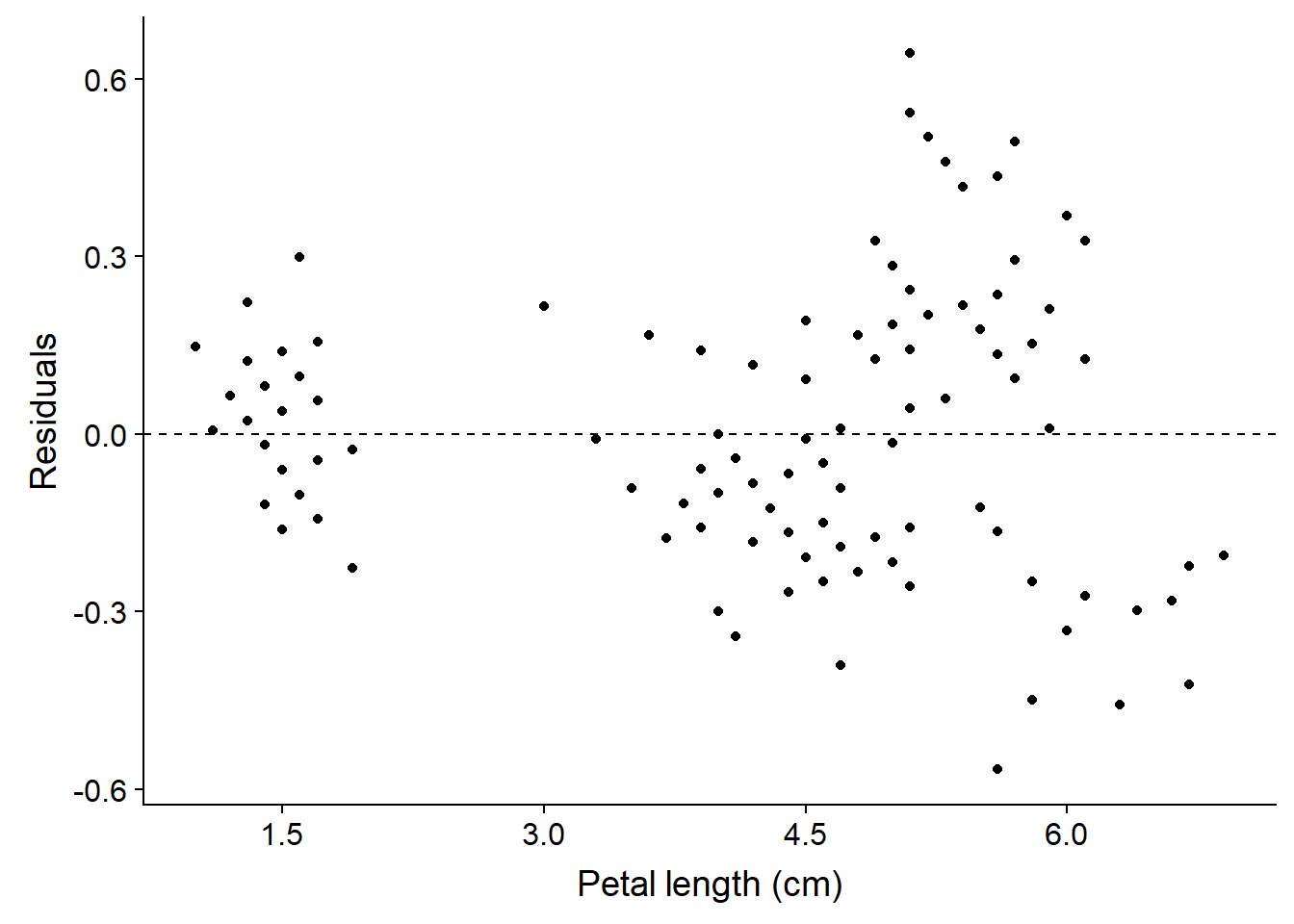
Figure 5: Residuals of the model
Cited Literature
Wickham, H., & Grolemund, G. (2016). R for data science: import, tidy, transform, visualize, and model data. " O’Reilly Media, Inc.“.↩
R Core Team (2018). R: A language and environment for statistical computing. R Foundation for Statistical Computing, Vienna, Austria. URL https://www.R-project.org/.↩
Hadley Wickham (2018). modelr: Modelling Functions that Work with the Pipe. R package version 0.1.2. https://CRAN.R-project.org/package=modelr↩
Hadley Wickham (2017). tidyverse: Easily Install and Load the ‘Tidyverse’. R package version 1.2.1. https://CRAN.R-project.org/package=tidyverse↩