Introduction
Often in environmental studies we are interested in assessing the presence or absence of a long term trend. A widely applied is a parametric test for trend, which involves fitting a linear model that includes some measure of time as one of the predictor variables, and possibly allowing for serially correlated errors in the model. Instead of fitting the data to time series parametric test, Stephen Millard bundles several functions in EnvStats package that are non–parametric and agnostic in dealing with trend (Millard 2013).
These functions include kendallTrendTest()for computing annual trend and kendallSeasonalTrendTest() for computing the seasonal trends. One advantage of these tools is that are non-parametric test—trend test that does not assume normally distributed errors. In this post I will illustrate how to use these tools to assess the annual rate of change in temperature and precipitation for selected stations within the Zambezi river catchment.
Before we proceed, we need to load some packages that we are going to use in this post.
library(EnvStats)
require(tidyverse)
require(magrittr)
Data
We use maximum temperature data collected from ten sites in Zambezi River Basin between 1980 and 2015. The data is already processed and organized in long form to make it easy to manipulate and plotting in R. We can import the dataset using a read_csv function from readr package (Wickham, Hester, and Francois 2017)
data = read_csv("data/TmaxIndexed.csv")data %>%
# sample_n(10) %>%
glimpse()FALSE Rows: 3,253
FALSE Columns: 4
FALSE $ Site <chr> "Mongu", "Mongu", "Mongu", "Mongu", "Mongu", "Mongu", "Mongu"...
FALSE $ Year <dbl> 1986, 1987, 1988, 1989, 1990, 1991, 1992, 1993, 1994, 1995, 1...
FALSE $ Month <chr> "Jan", "Jan", "Jan", "Jan", "Jan", "Jan", "Jan", "Jan", "Jan"...
FALSE $ Tem <dbl> 29.0, 30.6, 29.9, 28.4, 28.6, 28.7, 30.5, 29.1, 28.9, 32.4, 3...We notice that the dataset contains four columns and 3235 observations. The columns include the site, year of and month of observation and temperature value. We notice that months are character, because we need to make a date from year and month, we first create a new column for day and then convert the character months into integer using the case_when function. We then create a date variables from day, mnth and year columns with make_date function from lubridate package (Grolemund and Wickham 2011). Notice that janitor::clean_names() was used to make columns names with lowercase (Firke 2020).
data = data %>%
  janitor::clean_names()%>%
  rename(data = 4) %>%
  mutate(variable = "tmax",
         day = 15,
         months = case_when(month == "Jan"~1, month == "Feb"~2,month == "Mar"~3,month == "Apr"~4,
                            month == "May"~5,month == "Jun"~6,month == "Jul"~7,month == "Aug"~8,
                            month == "Sep"~9,month == "Oct"~10,month == "Nov"~11,month == "Dec"~12),
         date = lubridate::make_date(year = year, month = months, day = day)) %>%
  select(site, date,month, year, variable, data)
Annual Trend
We then need to understand the annual rate of change in temperature (trend) for each site. We can compute for each site manual. However, we can use the for loop to iterate the process for us. Lets us first create the vector file of all the site names that we are going to use as a count of the looping process.
site.names = data %>% distinct(site) %>% pull()I also create a container with a name change.tmax as a list file that will store the resulted data frame of change in temperature. In a nutshell, the loop will first pick temperature data for a particular site data %>% filter(site == site.names[i]) and compute the annual trend of temperature over a period by parsing kendallTrendTest(data ~ year). The result of trend is converted to a tibble with tidy function from broom package (Robinson and Hayes 2020). The tibble file now is in convenient format that tidyverse (Wickham 2017) package like dplyr (Wickham et al. 2018) understand and we can further process the results with mutate function to insert the names and the variables and also select only the variables of interested. We picked four variables that are
- site: name of the station
- variable: the variable of interest, for this case is maximum temperature,
- tau: the rate of change
- slope of the trend
- statistic of the change and,
- p-value: help to draw the the conclusion whether the change is is significant
Then the final output of the computation is stored in container change.tmax[[i]], where the i is represent the site.
change.tmax = list()

for (i in 1:length(site.names)){

change.tmax[[i]] = data %>% filter(site == site.names[i]) %$%
  kendallTrendTest(data ~ year) %>% broom::tidy()%>%
  mutate(site = site.names[i], variable = "tmax") %>%
  select(site, variable, tau = 1, slope = 2, statistic, p_value = 5)

}
As mentioned earlier, the result of rate of change for the ten sites is in tibble, but these tibble files are stored in a list and hence to access them and make a single data frame, we use a function bind_rows from dplyr package. Once the tibble is ready, we create a new column change and convert the p-values into categorical based the magic number 0.05 as cut of points. The tau with corresponding p.values below 0.05 are treated as annual change in temperature is significant and those above 0.05 their annual changes are not significant. We simply create the change using if_else function from dplyr for purpose of distinguish the significant while we plot with color.
annual.change = change.tmax %>%
  bind_rows() %>%
  mutate(change = if_else(p_value < 0.05, true = "Significant", false = "Insignificant"))
Table 1 reveal that a rate of change in temperature (tau) for ten sites in Zambezi River basin vary. With exception to Senang site, which has experience a decreasing trend in temperature, the remaining sites have increased trend in temperature range from 0.005oC/year at Seschek to about 0.031oC/year at Songwe (Table 1). We also notice that Banket and Songwe are the only sites with significant change in temperature (Table 1. The estimated annual trend at Songwe is is 0.031oC/year. The p-value associated with the annual Kendall test for trend is p = 0.0002, which is less than 0.05, indicating the annual increase in temperature of about 0.031oC/year is significant.
annual.change %>%
  select(-variable) %>%
  mutate(across(is.numeric, round, 4)) %>%
  kableExtra::kable(caption = "The annual change in temperature for selected station in the Zambezi River Basin", col.names = c("Sites", "Tau", "Slope", "Statistics", "p-values", "Change")) %>%
  kableExtra::column_spec(column = 2:5, width = "2cm")%>%
  kableExtra::column_spec(column = 6, width = "4cm")  %>%
  kableExtra::kable_styling(font_size = ifelse(knitr:::is_latex_output(), 11, 14),
latex_options = c("hold_position", "repeat_header"))| Sites | Tau | Slope | Statistics | p-values | Change |
|---|---|---|---|---|---|
| Mongu | 0.0573 | 0.0222 | 1.5805 | 0.1140 | Insignificant |
| Kaoma | 0.0270 | 0.0095 | 0.6886 | 0.4911 | Insignificant |
| Kabomp | 0.0099 | 0.0000 | 0.2045 | 0.8380 | Insignificant |
| Senang | -0.0223 | -0.0125 | -0.4412 | 0.6591 | Insignificant |
| Seshek | 0.0057 | 0.0000 | 0.1250 | 0.9005 | Insignificant |
| Harare | 0.0318 | 0.0133 | 0.9022 | 0.3669 | Insignificant |
| Banket | 0.0850 | 0.0375 | 2.4076 | 0.0161 | Significant |
| Chibero | 0.0577 | 0.0250 | 1.6339 | 0.1023 | Insignificant |
| Ruhuhu | 0.0264 | 0.0077 | 0.7864 | 0.4316 | Insignificant |
| Songwe | 0.1273 | 0.0312 | 3.7431 | 0.0002 | Significant |
We can make a plot of annual change (tau) and p-value and color the significance. This help us to visualize and spot easily the magnitude of change. ggplot was used to plot figure 1, which help us identify the rate of change and significance in a more intuitive way.
annual.change %>%
  filter(variable == "tmax") %>%
  ggplot(aes(x = tau, y = p_value, color = change))+
  geom_point(size = 3)+
  geom_vline(xintercept = 0, color = "red", linetype = 2, size = .75)+
  ggrepel::geom_text_repel(aes(label = site), point.padding = .25, segment.colour ="grey70", show.legend = FALSE)+
  ggsci::scale_color_d3(name = "Change")+
  # cowplot::theme_cowplot()+
  # ggpubr::theme_pubr()+
  theme(legend.position = c(.88,.15),
        legend.key = element_blank(),
        legend.background = element_rect(fill = "white", colour = "black"),
        panel.background = element_rect(fill = "white", colour = "black"),
        panel.grid.major = element_line(colour = "grey70", linetype = 3))+
  labs(x = expression(Temperature~change~(degree*C)), y = "p-values")+
  scale_x_continuous(position = "top", breaks = seq(-0.1,0.2,0.025))+
  scale_y_reverse()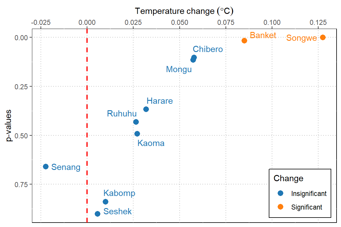
Figure 1: Annual change of temperature
In summary, we have seen how to compute annual trend of temperature. We have also seen how to present the result in both tabular form and plots, in form that is easy for the eye. That’s it for today and next post I will show how to compute seasonal trend using almost similar approach used in this post.
Reference
Firke, Sam. 2020. Janitor: Simple Tools for Examining and Cleaning Dirty Data. https://CRAN.R-project.org/package=janitor.
Grolemund, Garrett, and Hadley Wickham. 2011. “Dates and Times Made Easy with lubridate.” Journal of Statistical Software 40 (3): 1–25. http://www.jstatsoft.org/v40/i03/.
Millard, Steven P. 2013. EnvStats: An R Package for Environmental Statistics. New York: Springer. http://www.springer.com.
Robinson, David, and Alex Hayes. 2020. Broom: Convert Statistical Analysis Objects into Tidy Tibbles. https://CRAN.R-project.org/package=broom.
Wickham, Hadley. 2017. Tidyverse: Easily Install and Load the ’Tidyverse’. https://CRAN.R-project.org/package=tidyverse.
Wickham, Hadley, Romain François, Lionel Henry, and Kirill Müller. 2018. Dplyr: A Grammar of Data Manipulation. https://CRAN.R-project.org/package=dplyr.
Wickham, Hadley, Jim Hester, and Romain Francois. 2017. Readr: Read Rectangular Text Data. https://CRAN.R-project.org/package=readr.