In the previous post, I illustrate how to process ship-based CTD data with oce1 package in R2 enviroment. We saw the power of this package in reading, summarizing and visualizing CTD data. The downside of oce package in my opinion is its strickest nature of relying on R base for data processing and plotting—preventing customization. Therefore, in this post I will illustrate how to tranforming oce dataset format into a tibble—a modern data frame. Once we have CTD measurements, we can use the power of tidyverse3 package to easy tidy4, manipulate5 CTD data and visualize6 the results in a more elegent way.
You need to install several packages (if not yet installed) that I am goint to use in this post.
require(oce)
require(ocedata)
require(sf)
require(leaflet)
require(tidyverse)
Since I need to process all the CTD stations at once, I loop them. Before I loop the files, the path of each file must be determined, which can easily done in R with the dir() function.
### Identify the list in the directory
files = dir(path = "./ctd18/", pattern = ".cnv", full.names = TRUE )
The loop through to read the CTD files from the nine stations. However, before we loop, a container to store the files during the looping process is required. I preallocated the file using the list() and then loop the process with a FOR function
## preallocate the container to store the individual
ctd = list()

### Loop the CNV file and create a list of casted CTD
for (i in 1:length(files)){

ctd[[i]]  = read.ctd(files[i])%>%
  ctdTrim(method = "downcast")%>% # select downcast
  ctdDecimate(p = 1) # align to the same standard pressure
}
Once the list of CTD stations are created, each station can individually separated from a list and transform it from oce format to a tibble. This involves extracting CTD measurement of the first station, then use mutate() from dpyr package to adding station name, date of cast, longitude and latitude of station. I used the pipe operator (%>%) to chain the process.
Table 1 show the the randomly selected cleaned CTD measurements of Station AM00882 casted. For simplist, the data were aligned in the standard pressure interval of 20 meters.
## select variables of interest
ctd.tb = ctd.tb%>%
  select(cruise, station, date, lon,lat,
         pressure, depth, temperature,
         conductivity, salinity, oxygen,
         fluorescence, turbidity = turbidity2)

## summarize the table of station 1
knitr::kable(ctd.tb%>%
               dplyr::slice(seq(1,500,20))%>%
               select(-c(cruise, station, depth, turbidity))%>%
               mutate(date = as.Date(date)),
             digits = 2, caption = "Summary of CTD measurement at station AM00882 spaced at 20 meter interval",
             col.names = c("Date", "Longitude", "Latitude","Pressure", "Temperature",
                           "Conductivity","Salinity", "O2", "Fluorescence"),
align = "c")| Date | Longitude | Latitude | Pressure | Temperature | Conductivity | Salinity | O2 | Fluorescence |
|---|---|---|---|---|---|---|---|---|
| 2018-06-18 | 39.29 | -5.02 | 0 | NA | NA | NA | NA | NA |
| 2018-06-18 | 39.29 | -5.02 | 20 | 26.93 | 5.51 | 34.96 | 3.96 | 0.34 |
| 2018-06-18 | 39.29 | -5.02 | 40 | 26.92 | 5.50 | 34.96 | 3.94 | 0.34 |
| 2018-06-18 | 39.29 | -5.02 | 60 | 26.90 | 5.50 | 34.96 | 3.95 | 0.31 |
| 2018-06-18 | 39.29 | -5.02 | 80 | 26.89 | 5.50 | 34.96 | 3.94 | 0.33 |
| 2018-06-18 | 39.29 | -5.02 | 100 | 26.87 | 5.50 | 34.96 | 3.92 | 0.35 |
| 2018-06-18 | 39.29 | -5.02 | 120 | 23.28 | 5.16 | 35.17 | 3.34 | 0.17 |
| 2018-06-18 | 39.29 | -5.02 | 140 | 18.19 | 4.64 | 35.22 | 2.55 | 0.06 |
| 2018-06-18 | 39.29 | -5.02 | 160 | 17.45 | 4.56 | 35.20 | 2.53 | 0.06 |
| 2018-06-18 | 39.29 | -5.02 | 180 | 16.66 | 4.49 | 35.19 | 2.49 | 0.02 |
| 2018-06-18 | 39.29 | -5.02 | 200 | 16.51 | 4.47 | 35.19 | 2.52 | 0.02 |
| 2018-06-18 | 39.29 | -5.02 | 220 | 15.49 | 4.37 | 35.19 | 2.58 | 0.02 |
| 2018-06-18 | 39.29 | -5.02 | 240 | 14.61 | 4.28 | 35.15 | 2.62 | 0.01 |
| 2018-06-18 | 39.29 | -5.02 | 260 | 12.44 | 4.06 | 35.07 | 3.17 | 0.02 |
| 2018-06-18 | 39.29 | -5.02 | 280 | 12.10 | 4.03 | 35.04 | 3.27 | 0.02 |
| 2018-06-18 | 39.29 | -5.02 | 300 | 12.02 | 4.02 | 35.03 | 3.32 | 0.01 |
| 2018-06-18 | 39.29 | -5.02 | 320 | 11.74 | 3.99 | 35.01 | 3.41 | 0.01 |
| 2018-06-18 | 39.29 | -5.02 | 340 | 11.65 | 3.98 | 35.00 | 3.39 | 0.01 |
| 2018-06-18 | 39.29 | -5.02 | 360 | 11.34 | 3.95 | 34.97 | 3.35 | 0.01 |
| 2018-06-18 | 39.29 | -5.02 | 380 | 11.14 | 3.93 | 34.95 | 3.36 | 0.03 |
| 2018-06-18 | 39.29 | -5.02 | 400 | 10.92 | 3.91 | 34.93 | 3.36 | 0.04 |
I then used ggplot2 package to make standard oceanographic profiles of temperature, salinity and oxygen (Figure 1).
temp = ggplot(data = ctd.tb, aes(x = temperature, y = pressure))+
  geom_path(col = "red")+
  scale_y_reverse()+
  scale_x_continuous(position = "top", breaks = seq(12,30,6))+
  theme_bw()+
  theme(axis.text = element_text(colour = "black", size = 10),
        axis.title = element_text(colour = "black", size = 12),
        panel.grid = element_blank(),
        panel.background = element_rect(colour = "black", fill = NULL))+
    labs(y="Pressure (dbar)",
         x=expression(Temperature~(~degree~C)))

 salinity = ggplot(data = ctd.tb, aes(x = salinity, y = pressure))+
  geom_path(col = "red")+
  scale_y_reverse()+
  scale_x_continuous(position = "top", breaks = seq(34.8,35.4,0.1))+
  theme_bw()+
  theme(axis.text = element_text(colour = "black", size = 10),
        axis.title = element_text(colour = "black", size = 12),
        panel.grid = element_blank(),
        panel.background = element_rect(colour = "black", fill = NULL))+
    labs(y="Pressure (dbar)",
         x= "Salinity")

 oxygen = ggplot(data = ctd.tb, aes(x = oxygen, y = pressure))+
  geom_path(col = "red")+
  scale_y_reverse()+
  scale_x_continuous(position = "top", breaks = seq(2.2,4,.5))+
  theme_bw()+
  theme(axis.text = element_text(colour = "black", size = 10),
        axis.title = element_text(colour = "black", size = 12),
        panel.grid = element_blank(),
        panel.background = element_rect(colour = "black", fill = NULL))+
    labs(y="Pressure (dbar)",
         x=expression(Oxygen~(~mlL^-1)))

 cowplot::plot_grid(temp, salinity, oxygen, nrow = 1)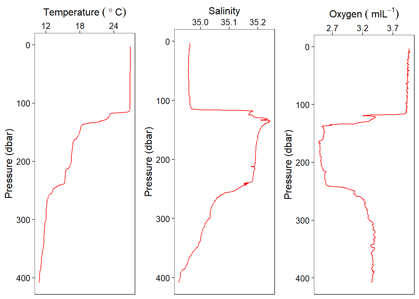
Figure 1: Profile of Temperature, salinity and oxygen collected at Station AM00882
That is for a single station, but hydrographic section requires more than one stations stitched together to render smoothed profiles based on either time, distance, latitude or longitude. Therefore, I am going to loop through to make a tibble of several stations and then plot the hydrogphic section with ggplot2 package. In a nutshell, the process involves three steps. First, create empty container with NULL() function that will store individual tibble generate. Second, a dplyr’s bind_row() function was used to stitch to the bottom each generated file in a sequential order. Third, dplyr’s select() function was used to pick variable of interest and drop the rest. Note that the selection process is done outside the loop boundary, because this is done after the looping process is complete. You can also chain the selection process inside the loop and you will have no problem.
Table 2 show the stations, number of scan, the minimum and maximum depth in each station.
ctd.tb.all.summary = ctd.tb.all%>%
  group_by(station)%>%
  summarise(count = n(),
            min.depth = min(depth, na.rm = TRUE),
            max.depth = max(depth, na.rm = TRUE))

knitr::kable(ctd.tb.all.summary, digits = 2, align = "c",
             col.names = c("Station", "Counts",
                           "Minimum Depth (m)",
                           "Maximum Depth (m)"),
caption = "The summary of the nine stations")| Station | Counts | Minimum Depth (m) | Maximum Depth (m) |
|---|---|---|---|
| AM00882 | 409 | 3.46 | 405.35 |
| AM00883 | 489 | 3.14 | 484.76 |
| AM00884 | 354 | 2.24 | 350.57 |
| AM00885 | 66 | 2.36 | 64.94 |
| AM00886 | 45 | 3.10 | 43.66 |
| AM00887 | 28 | 2.45 | 26.77 |
| AM00888 | 28 | 2.07 | 26.90 |
| AM00889 | 47 | 3.44 | 45.68 |
| AM00890 | 104 | 3.91 | 102.19 |
Using the distinct() function from dplyr package, I was able to identify the unique date and time of CTD cast and the longitude and latitude of each station (Table 3).
ctd.tb.all.info = ctd.tb.all%>%
  distinct(station, lon, lat, date)%>%
  separate(date, c("date", "time"), sep = " ")

knitr::kable(ctd.tb.all.info, digits = 2, align = "c",
             col.names = c("Station", "Date of cast", "Time of cast", "Longitude", "Latitude"),
caption = "The geographical locations, the date and time of casts of the nine stations")| Station | Date of cast | Time of cast | Longitude | Latitude |
|---|---|---|---|---|
| AM00882 | 2018-06-18 | 05:27:07 | 39.29 | -5.02 |
| AM00883 | 2018-06-18 | 13:32:50 | 39.24 | -5.26 |
| AM00884 | 2018-06-18 | 19:22:04 | 39.19 | -5.44 |
| AM00885 | 2018-06-19 | 00:03:26 | 39.11 | -5.71 |
| AM00886 | 2018-06-19 | 05:32:23 | 39.07 | -5.93 |
| AM00887 | 2018-06-19 | 09:54:46 | 38.99 | -6.14 |
| AM00888 | 2018-06-19 | 13:35:21 | 39.01 | -6.26 |
| AM00889 | 2018-06-19 | 18:28:52 | 39.24 | -6.49 |
| AM00890 | 2018-06-19 | 23:17:05 | 39.35 | -6.67 |
Leaflet7 package developed by Cheng and others (2017) was used to create an interactive map using the geographical positions (longitude and latitude) of the CTD casts in coastal water of the Pemba and Zanzibar channel (Figure ??). Because the map is interactive, you can zoom and pan. You can also click on the symbol and a station name will popup.
leaflet(data = ctd.tb.all.info)%>%
  addTiles()%>%
  addMarkers(lng = ~lon, lat = ~lat, popup = ~station)
Figure ?? show the vertical structure of temperature for the nine stations. BUt the the hydrographic section leaves the gap between the stations. This is because the geom_raster() requirest equally spaced interval. To achive this, I used akima package to interpolate temperature based on equal spaced latitude and pressure. The figur ?? show the vertical structure of interpolated temperature from the surface to 40 meter deep of the the nine stations.
ggplot(data = ctd.tb.all%>%na.omit(),
       aes(x = lat, y = pressure))+
  geom_raster(aes(fill = temperature), interpolate = FALSE)+
  scale_y_reverse()+
  scale_fill_gradientn(colours = oceColorsJet(120), name = "Temperature")+
  theme_bw()+
  theme(legend.key.height = unit(3.5, "lines"),
        axis.text = element_text(colour = 1, size = 10),
        axis.title = element_text(colour = 1, size = 12),
        panel.grid = element_blank())+
  labs(x = "Latitude", y = "Pressure (dba)")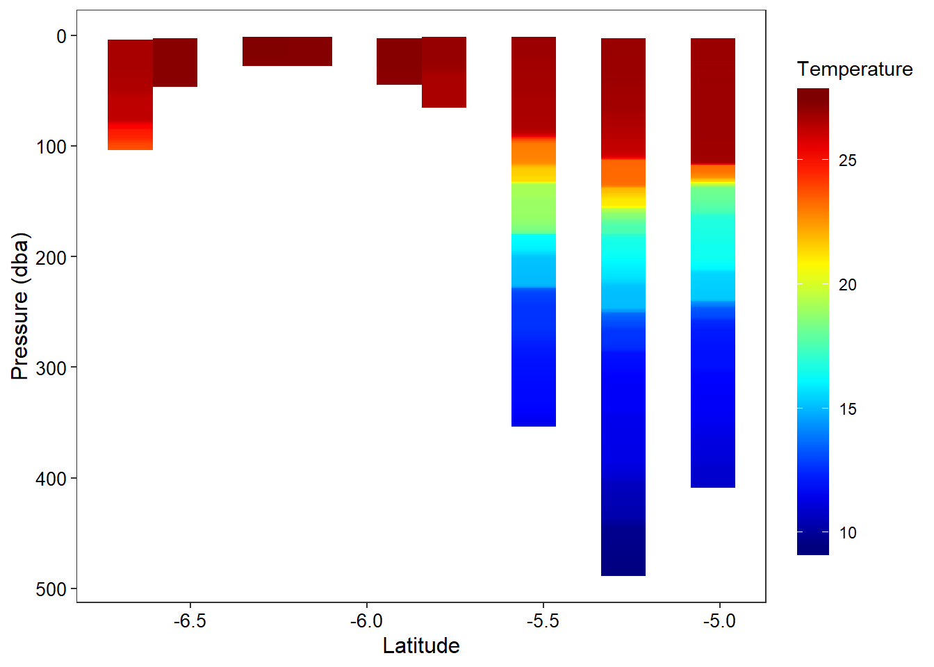
# temp.interp = interpBarnes(x = ctd.tb.all$lat,
#                            y = ctd.tb.all$pressure,
#                            z = ctd.tb.all$temperature)

ctd.tb.all = ctd.tb.all%>%na.omit()

temp.interp = akima::interp(x = ctd.tb.all$lat,
              y = ctd.tb.all$pressure,
              z = ctd.tb.all$temperature,
              duplicate = "mean", nx = 200, ny = 200)

temp.interp = akima::interp2xyz(temp.interp)%>%as.tibble()%>%rename(latitude = x, pressure = y, temperature = z)%>%na.omit()%>%filter(pressure <=40 & pressure > 4)


  ggplot(data = temp.interp, aes(x = latitude, y = pressure))+
    geom_raster(aes(fill = temperature), interpolate = TRUE)+
    geom_contour(aes(z = temperature), col = 1)+
    scale_fill_gradientn(colours = oce.colorsJet(120), name = "Temperature")+
    scale_y_reverse()+
    theme_bw()+
    theme(legend.key.height = unit(3.5, "lines"),
          axis.text = element_text(colour = 1, size = 10),
          axis.title = element_text(colour = 1, size = 12),
          panel.grid = element_blank())+
    labs(x = "Latitude", y = "Pressure (dba)")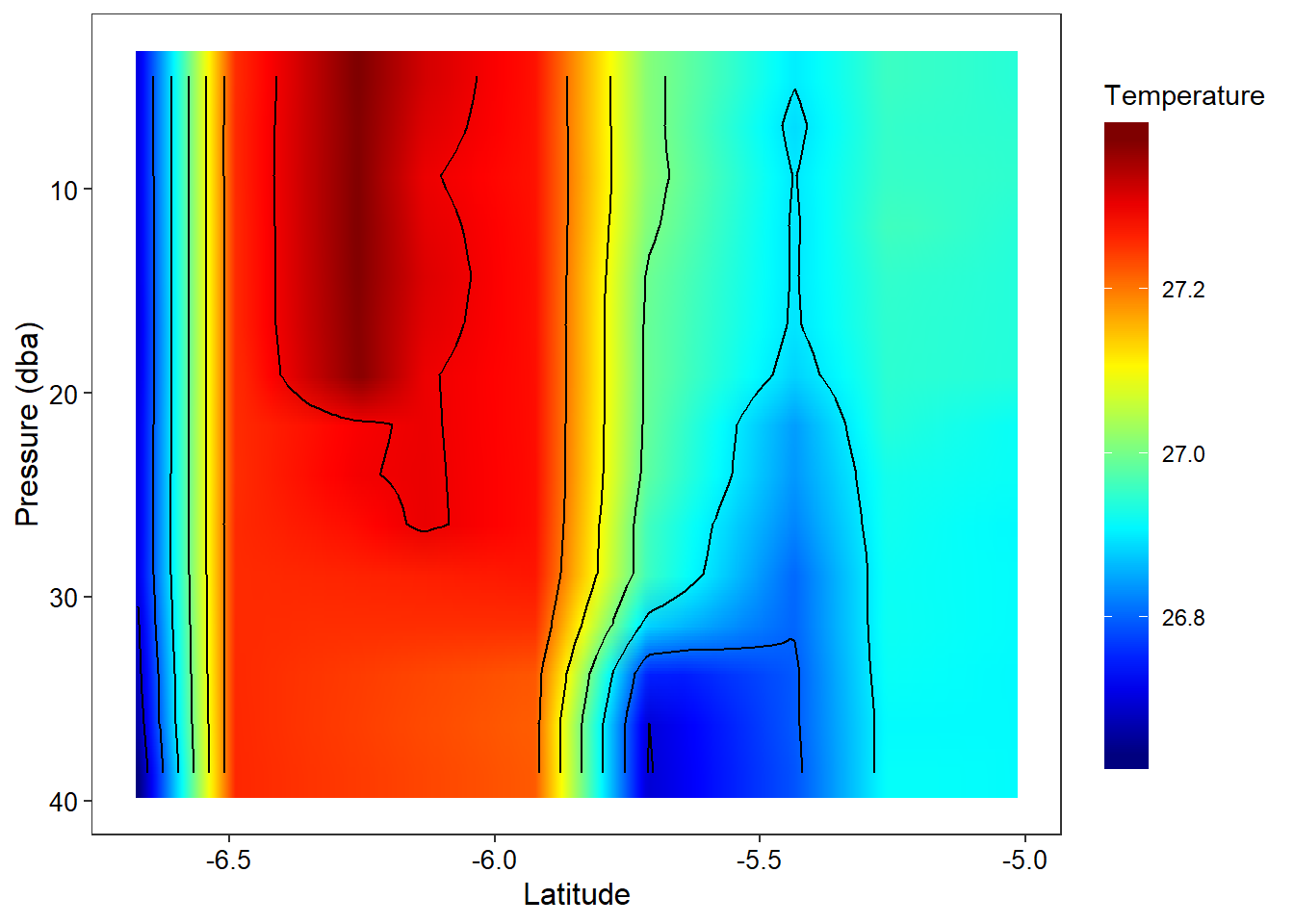
Conclusion
This post illustrate the processing of oceanographic data in R using a combination of packages to achieve a standard plot of temperature profile and section.
Cited Articles
Kelley, D., & Richards, C. (2017). oce: Analysis of Oceanographic Data. R package version 0.9-22.↩
eam, R. C. (2015). R: A language and environment for statistical computing.↩
Wickham, H. (2017). Tidyverse: Easily install and load’tidyverse’packages. R package version, 1(1).↩
Wickham, H. (2016). tidyr: Easily Tidy Data with spread () and gather () Functions. Version 0.6. 0.↩
Wickham, H., Francois, R., Henry, L., & Müller, K. (2015). dplyr: A grammar of data manipulation. R package version 0.4, 3.↩
Wickham, H. (2016). ggplot2: elegant graphics for data analysis. Springer.↩
Cheng, J., Karambelkar, B., Xie, Y., Wickham, H., Russell, K., & Johnson, K. Leaflet: Create Interactive Web Maps with the JavaScript “Leaflet” Library (2017). URL https://CRAN. R-project. org/package= leaflet. R package version, 1(1), 134.↩