If you work with data science, R and Python must be the two programming languages that you use the most. Both R and Python are quite robust languages and either one of them is actually sufficient to carry out the data analysis task. However, instead of considering them as tools that supplement each other, more often you will find people dealing with data claim one language to be better than the other. Truth be told, R and Python are excellent tools in ther own right but are often conceived as rivals. One major reason for such view lies on the experts. Because data analysts have divided the data science field into camps based on the choice of the programming language they are familiar with.
There major two camps—R camp and Python camp—and history is the testimony that camps can not livel in harmony. Members of both camps believe that their choice of language . Honestly, I do not hold to their opinion, but rather wish I have skills for both languages. So, whether you have in R or Python camp, one thing you will notice is that the problem we have in data science is simply that divergence does not lie with the tools but with the people using those tools.
I believe there are few people in the Data Science community who use both R and Pythhon in their analytical workflow. But majority are committed to only one programming language, but wish they had access to some functions from other language. Therefore, there is no reason that hold us to stick using this programming language or the other. Our ultimate goal should be to do better analytics and derive better insights and choice of which programming language to use should not hinder us from reaching our goals.
The questions that always resolute in my mind is whether can we utilize the statistical power of R along with the programming capabilities of Python?. Its undeniable truth that there are definitely some high and low points for both languages and if we can utilize the strength of both, we can end up dong a much better job. Thanks to Kevin Ushey and his collegues (2019) for devloping a reticulate package. reticulate package provides a comprehensive set of tools that allows to work with R and Python in the same environment. The reticulate package provide the following facilities;
- Calling Python from R in a variety of ways including
rmarkdown,sourcing,Python scripts, importing Python modules and using Python interactively within and R session. - Translation between R and Python objects—for example
r_to_pyfunction allows to construct R to Pandas data frame andpy_to_r()function convert python object like data frame, matrix and etc to R - Flexible binding to different versions of Python including virtual environments and conda environment.
Setup Python in Rstudio
To make python work in Rstudio, we must make some setup. The first thing we need to load the reticulate package. Once the reticulate package in the workspace, we use the use_python(PATH) and define the path of Python or Anaconda in your local machine.
Note that setting the Python enviroment and loading the reticulate package is done in the R chunk
require(reticulate)
use_python("c:/Python/Anaconda3/")
Once we have configured the Python environment in R, we must also load some module from R into Rstudio. This will make the functions in these module avaiable for our processing and plotting. We use the convention naming of Python package as seen in the chunk below.
Note that loading Python modules in R session must be done inside the Python chunk. Otherwise you get an error message or a chunk fail to iterate the process
import pandas as pd
import numpy as np
import matplotlib.pyplot as plt
import seaborn as sns
Tibble to Pandas Dataframe
In this section we use function from R to read the dataset from the local machine into R session. The function readxl::read_excel() function is used (Wickham and Bryan 2018). The outocome after reading the file is the tibble format—a modern data frame from the tidyverse ecosystem (Wickham 2017). We first load the tidyverse
require(tidyverse)read the excel file with readxl and manipulate the data with dplyr to the write format
kgr = readxl::read_excel("dege.xlsx")Once the tibble file is in the environment, we need to convert from tibble data frame into pandas dataframe. Make a copy of pandas dataframe from tible with the r. function
note that conversion from tibble to pandas data frame must be done in the Python chunk and not R chunk
kgr_df = kgr %>% mutate(month = lubridate::month(time, abbr = T, label = T))%>% select(sst,chl, month) Then construct pandas data frame from tibble
##
kgrpy = r.kgr_df
We then the power of seaborn package from Python to visualize. For this case, I used the function pairplot—a pairwise plot that show the relationships of variables present in pandas Dataframe. The chunk below was used to plot figure 1
## make a pairplot with seaborn
sns.pairplot(kgrpy, hue="month")
<seaborn.axisgrid.PairGrid object at 0x000000002B94CE48>plt.show()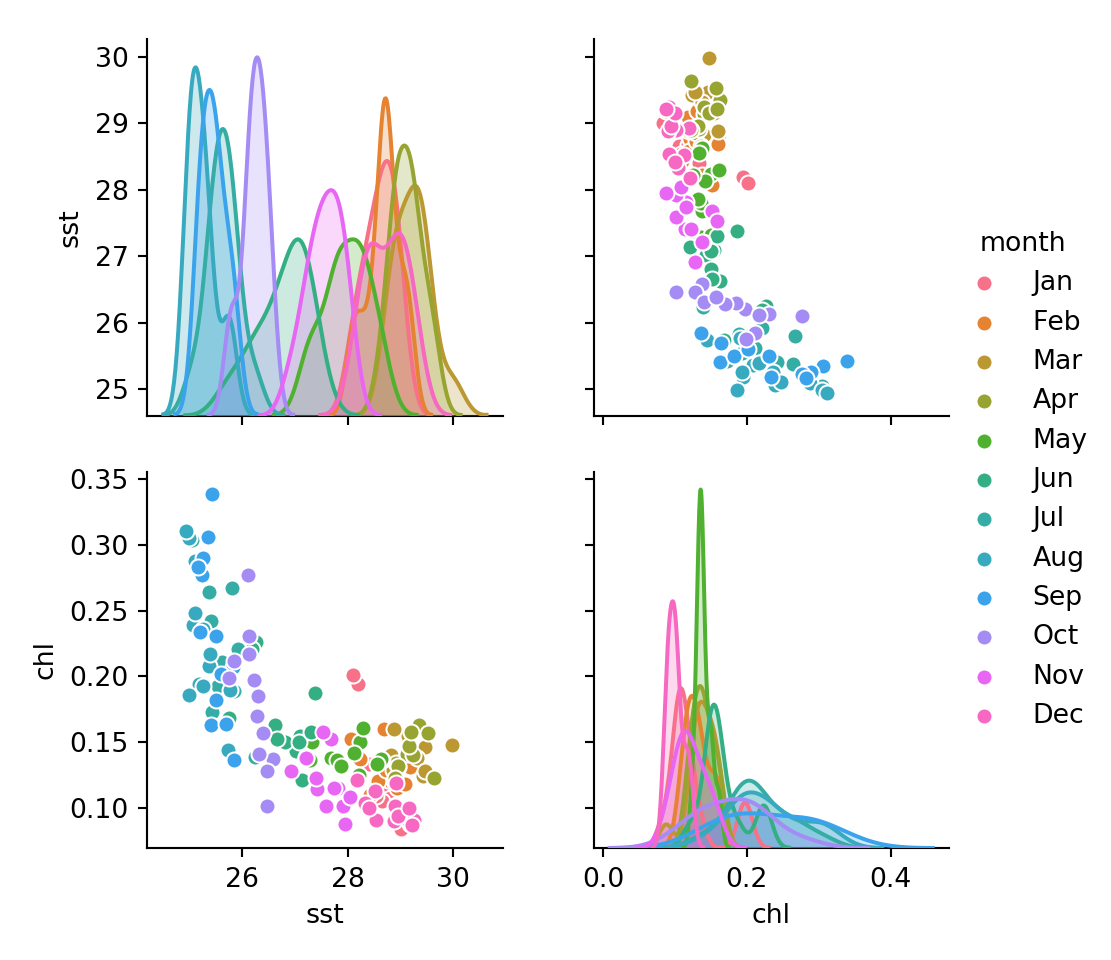
Figure 1: The relationship of variables in the Pandas Dataframe
The chunk below highlight the scatterplot of the relationship between SST and chlorophyll concentration plotted with scatterplot()function from seaborn module and the plot is represented in figure 2
fig = plt.figure()
sns.scatterplot(data=kgrpy, x='chl', y='sst', hue='month')
plt.xlabel("Concentration of Chlorophyll (mg/l)")
plt.ylabel("Sea surface temperature")
plt.gca().legend_.remove()
plt.show()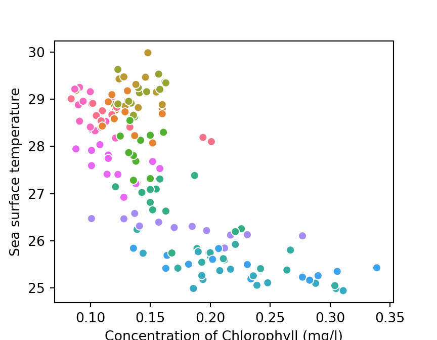
Figure 2: Relationship between SST and Chlorophyll
heatmaps with seaborn module
Heatmaps are three dimensional plots, as previous, we have to import the data into workspace and manipulate it so that months use the label instead of numbers.
kgr = readxl::read_excel("dege.xlsx")kgr_dt_df = kgr %>%
mutate(month = lubridate::month(time, abbr = T, label = T))%>%
select(sst,chl, month, year) Since we have used R chunk, to use seaborn Python module function, we must convert the data first to pandas Dataframe, which then allows us the capability of Python. We use the r. function to convert from tibble to pandas data frame
# Then  construct pandas data frame from tibble
kgr_dt_heatmap = r.kgr_dt_df
Then prepare the file to three dimension that the function sns.heatmap recognize. We arrange in such way that the index which represent Y-column become months, the column which represent the x-axis become year and the values to be filled are chlorophyll. The chunk below hihglights
kgrpy_piv = pd.pivot_table(data=kgr_dt_heatmap, values="chl", index='month', columns='year')Once we have prepared the dataset in the format that heatmap function from seaboarn understand we can plot. Figure 3 was generated using the chunk below;
fig, axes = plt.subplots(nrows=1, ncols=1)
sns.heatmap(data=kgrpy_piv, cmap = "jet", xticklabels=True, yticklabels=True)
# plt.gca().invert_yaxis()
# plt.xlabel([39.4,39.6,39.8,40.0])
plt.show()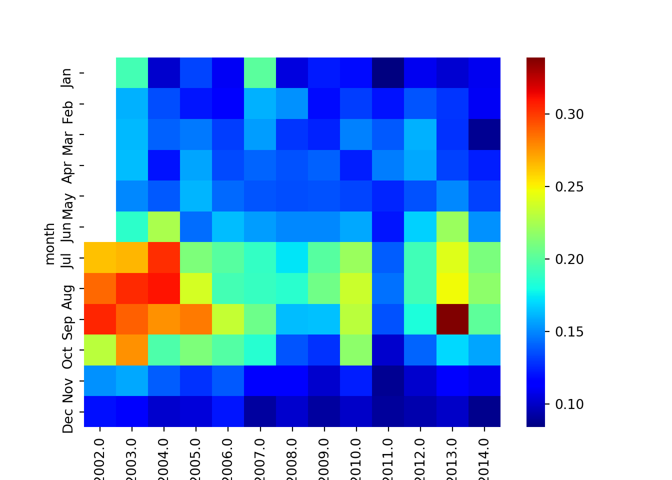
Figure 3: heatmaps showing variation of chlorophyll over years and months
Similarly, the heatmap of sea surface temperature shown in figure 4 was generated using the chunk below;
kgrpy_piv_sst = pd.pivot_table(data=kgr_dt_heatmap, values="sst", index='month', columns='year')
fig, axes = plt.subplots(nrows=1, ncols=1)

sns.heatmap(data=kgrpy_piv_sst, cmap = "jet", xticklabels=True, yticklabels=True)
# plt.gca().invert_yaxis()
# plt.xlabel([39.4,39.6,39.8,40.0])
plt.show()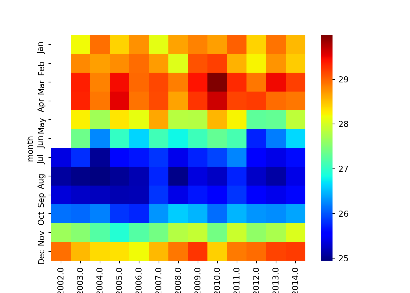
Figure 4: heatmaps showing variation of SST over years and months
Pandas Dataframe to Tibble
In this section we use function from Python to read the dataset from the local machine into R session. The function pd.read_excell() function is used. The outocome after reading the file is the Pandas Dataframe.
kgpy = pd.read_excel("dege.xlsx")Once the Pandas Dataframe file is in the environment, we need to convert it to tibble data dataframe. A py function from reticulate package is used as the chunk below illustrates:
note that conversion from pandas to tibble data frame must be done in the R chunk and not Python chunk
kg_r = py$kgpyWe then use the mutate function from dplyr (Wickham et al. 2018) to create new column called month and then select sst, chl, and month variables.
kg_r = kg_r%>% mutate(month = lubridate::month(time, abbr = T, label = T))%>% select(sst,chl, month) Then, we can visualize the dataset with ggplot package (Wickham 2016). The chunk below was used to generate figure 5
ggplot(data = kg_r, aes(x = chl, y = sst, col = month))+
  geom_point(size = 2)+
  labs(x = expression(Chlorophyll~concentration(mgm^{-3})),
       y = expression(Sea~surface~temperature(degree*C)))+
  theme(legend.key = element_blank())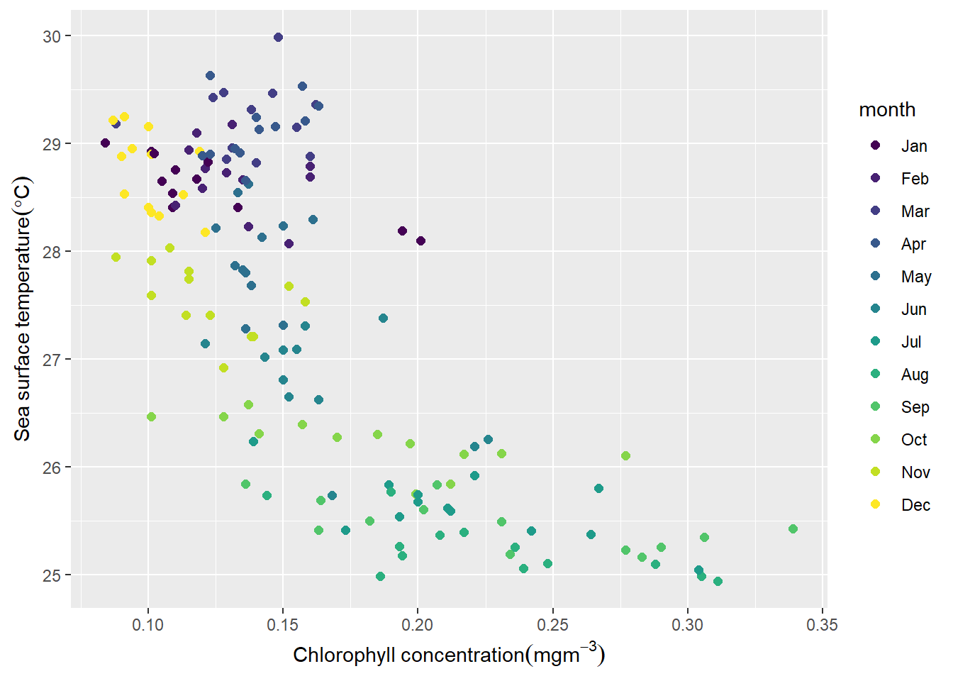
Figure 5: Relationship between chlorophyll concentration and sea surface temperature
References
Ushey, Kevin, JJ Allaire, and Yuan Tang. 2019. Reticulate: Interface to ’Python’. https://CRAN.R-project.org/package=reticulate.
Wickham, Hadley. 2016. Ggplot2: Elegant Graphics for Data Analysis. Springer-Verlag New York. http://ggplot2.org.
———. 2017. Tidyverse: Easily Install and Load the ’Tidyverse’. https://CRAN.R-project.org/package=tidyverse.
Wickham, Hadley, and Jennifer Bryan. 2018. Readxl: Read Excel Files. https://CRAN.R-project.org/package=readxl.
Wickham, Hadley, Romain François, Lionel Henry, and Kirill Müller. 2018. Dplyr: A Grammar of Data Manipulation. https://CRAN.R-project.org/package=dplyr.