Today we will learn about Cartopy, one of the most common packages for making maps within python. Another popular and powerful library is Basemap; however, Basemap is going away and being replaced with Cartopy in the near future, For this reason, investing your time in learning mapping in python with Cartopy module is recommended.
We thank Research in Computing Earth Sciences because most of material in this post are gleaned from their website. I also thank Phil Elson, a developer of Cartopy and created excellent Cartopy Tutorial
Cartopy makes use of the powerful PROJ.4, numpy and shapely libraries and includes a programatic interface built on top of Matplotlib for the creation of publication quality maps. Key features of cartopy are its object oriented projection definitions, and its ability to transform points, lines, vectors, polygons and images between those projections.
Cartopy Projections and other reference systems
In Cartopy, each projection is a class. Most classes of projection can be configured in projection-specific ways, although Cartopy takes an opinionated stance on sensible defaults. Let’s create a Plate Carree projection instance.To do so, we need cartopy’s crs module. This is typically imported as ccrs (Cartopy Coordinate Reference Systems).
Before we import the modules we need for mapping, we first have to initialize the linkage of python in Rstudio using the reticulate package and also set the environment in which the seesion will fetch python functions and package. You must load the reticulate package and set the enviroment while in R chunk;
require(reticulate)## Loading required package: reticulateuse_python("c:/Python/Anaconda3/")We then import some Python’s modules using the import function. Make sure that you insert the Pyhon chunk for you to load these modules
import numpy as np
import pandas as pd
import cartopy.crs as ccrs
import cartopy
import matplotlib.pyplot as plt
We can access the Mollweide projection with the code chunk below;
ccrs.Mollweide()## <cartopy.crs.Mollweide object at 0x0000000028A475E8>Drawing a map
Cartopy optionally depends upon matplotlib, and each projection knows how to create a matplotlib Axes (or AxesSubplot) that can represent itself.
The Axes that the projection creates is a cartopy.mpl.geoaxes.GeoAxes. This Axes subclass overrides some of matplotlib’s existing methods, and adds a number of extremely useful ones for drawing maps.
We’ll go back and look at those methods shortly, but first, let’s actually see the cartopy+matplotlib dance in action:
import matplotlib.pyplot as plt

plt.axes(projection=ccrs.PlateCarree())
plt.show()
That was a little underwhelming, but we can see that the Axes created is indeed one of those GeoAxes[Subplot] instances.
One of the most useful methods that this class adds on top of the standard matplotlib Axes class is the coastlines method. With no arguments, it will add the Natural Earth 1:110,000,000 scale coastline data to the map.
plt.figure()
ax = plt.axes(projection=ccrs.PlateCarree())
ax.coastlines()
plt.show()
We could just as equally created a matplotlib subplot with one of the many approaches that exist. For example, the plt.subplots function could be used:
fig, ax = plt.subplots(subplot_kw={'projection': ccrs.PlateCarree()})
ax.coastlines()
plt.show
## <function make_python_function.<locals>.python_function at 0x0000000026489438>Projection classes have options we can use to customize the map so that Africa is at the center
ax = plt.axes(projection=ccrs.PlateCarree(central_longitude=0))
ax.coastlines()
plt.show()
Useful methods of a GeoAxes
The cartopy.mpl.geoaxes.GeoAxes class adds a number of useful methods. Let’s take a look at:
set_global- zoom the map out as much as possibleset_extent- zoom the map to the given bounding boxgridlines- add a graticule (and optionally labels) to the axescoastlines- add Natural Earth coastlines to the axesstock_img- add a low-resolution Natural Earth background image to the axesimshow- add an image (numpy array) to the axesadd_geometries- add a collection of geometries (Shapely) to the axes
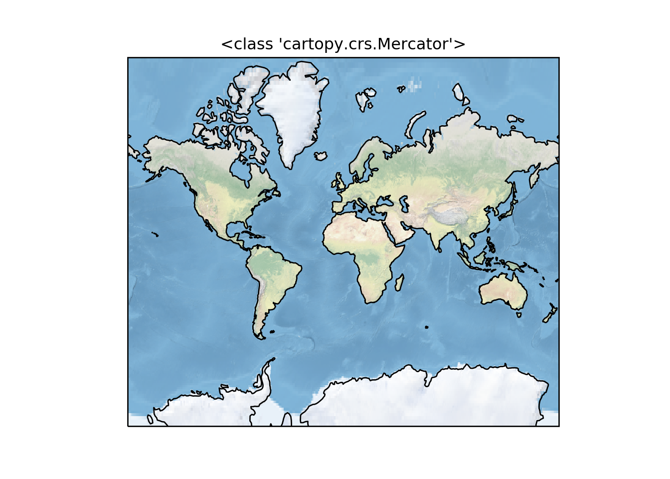
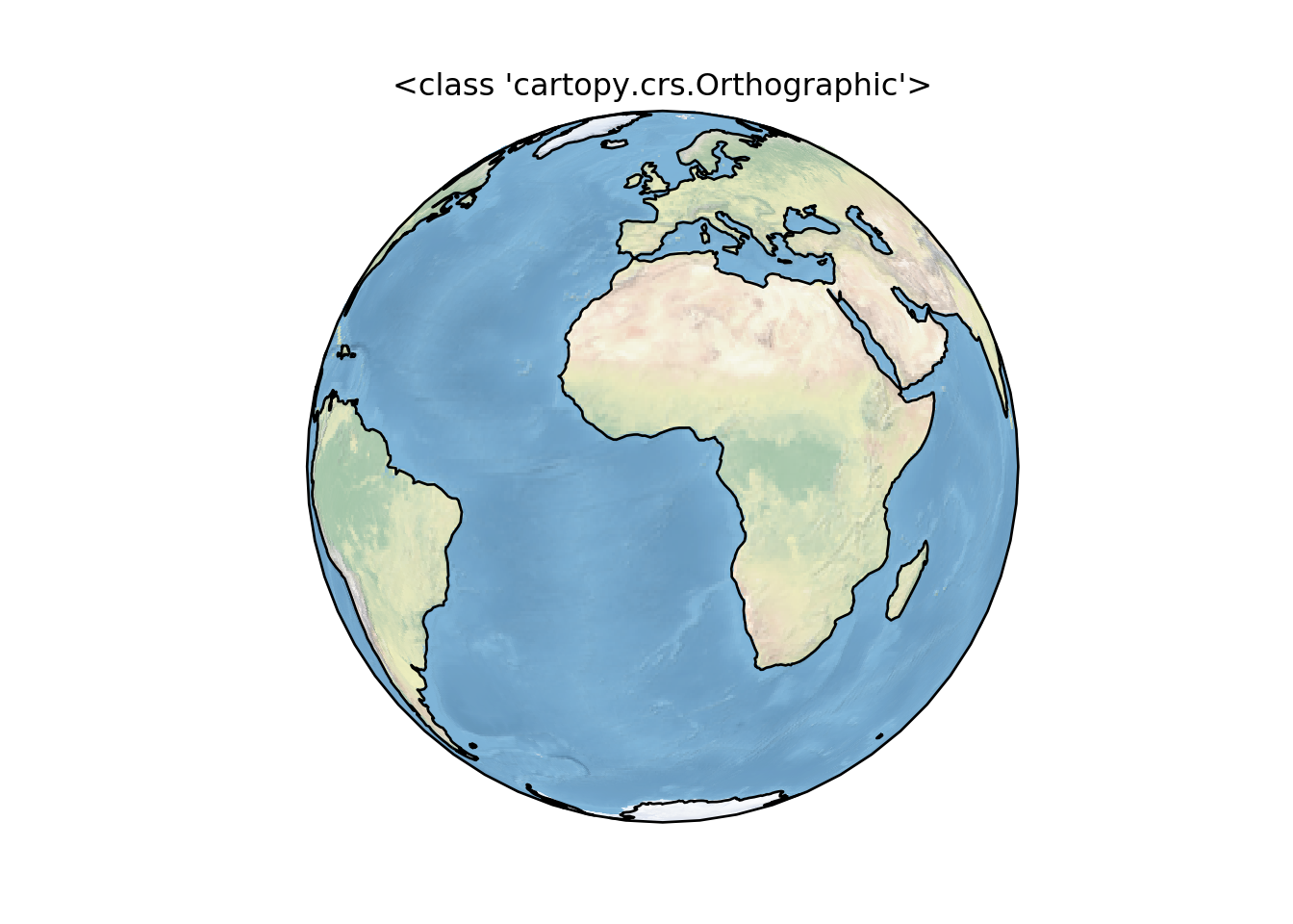
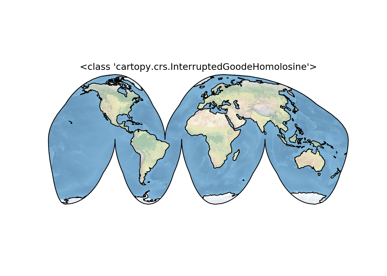
Some More Examples of Different Global Projections
projections = [ccrs.PlateCarree(),
               ccrs.Robinson(),
               ccrs.Mercator(),
               ccrs.Orthographic(),
               ccrs.InterruptedGoodeHomolosine()
              ]


for proj in projections:
    plt.figure()
    ax = plt.axes(projection=proj)
    ax.stock_img()
    ax.coastlines()
    ax.set_title(f'{type(proj)}')
    plt.show()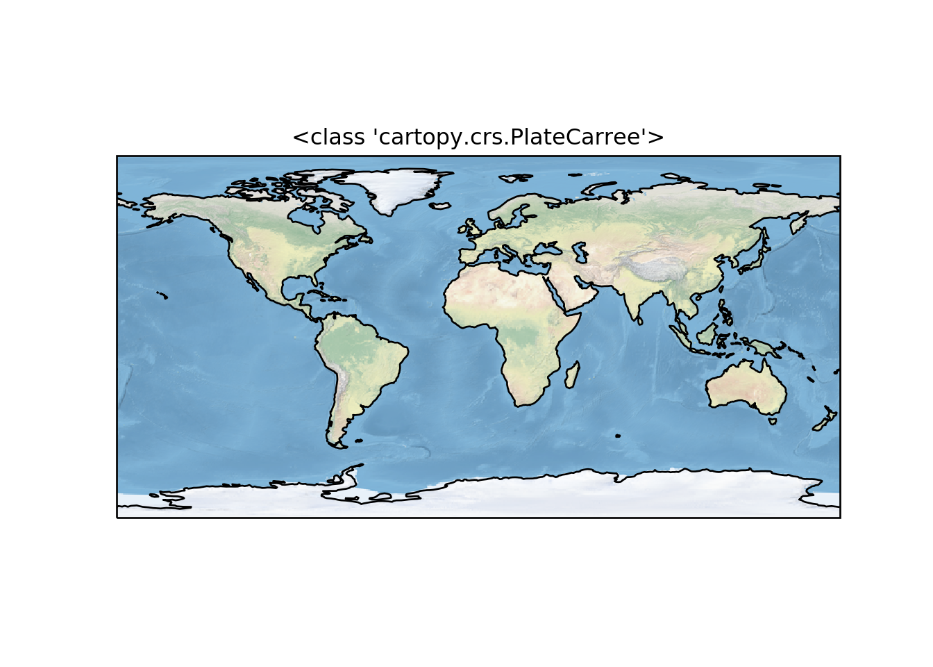

Regional Maps
To create a regional map, we use the set_extent method of GeoAxis to limit the size of the region.
central_lon =43, central_lat = -8.5
extent = [35, 50, -16.5, 0]
ax = plt.axes(projection=ccrs.PlateCarree(central_lon, central_lat))
ax.set_extent(extent)
ax.gridlines()
ax.coastlines(resolution='50m')
plt.show()
Adding Features to the Map
To give our map more styles and details, we add cartopy.feature objects. Many useful features are built in. These “default features” are at coarse (110m) resolution.
cartopy.feature.BORDERSCountry boundariescartopy.feature.COASTLINECoastline, including major islandscartopy.feature.LAKESNatural and artificial lakescartopy.feature.LANDLand polygons, including major islandscartopy.feature.OCEANOcean polygonscartopy.feature.RIVERSSingle-line drainages, including lake centerlinescartopy.feature.STATES(limited to the United States at this scale)
import cartopy.feature as cfeature
import numpy as np

central_lat = 37.5
central_lon = -96
extent = [28, 45, -25, 2]
central_lon = np.mean(extent[:2])
central_lat = np.mean(extent[2:])

plt.figure(figsize=(6, 6))
ax = plt.axes(projection=ccrs.EquidistantConic(central_lon, central_lat))
ax.set_extent(extent)

ax.add_feature(cartopy.feature.OCEAN)
ax.add_feature(cartopy.feature.LAND, edgecolor='black')
ax.add_feature(cartopy.feature.LAKES, edgecolor='black')
ax.add_feature(cartopy.feature.RIVERS)
ax.gridlines()
# ax.gridlines(draw_labels=True, xlocs=[32, 36, 40, 44])
## <cartopy.mpl.gridliner.Gridliner object at 0x000000003791BD88>plt.show()
rivers_50m = cfeature.NaturalEarthFeature('physical', 'rivers_lake_centerlines', '10m')

central_lat = 37.5
central_lon = -96
extent = [28, 45, -25, 2]
central_lon = np.mean(extent[:2])
central_lat = np.mean(extent[2:])

plt.figure(figsize=(6, 6))
ax = plt.axes(projection=ccrs.EquidistantConic(central_lon, central_lat))
ax.set_extent(extent)

ax.add_feature(cartopy.feature.OCEAN)
ax.add_feature(cartopy.feature.LAND, edgecolor='black')
ax.add_feature(cartopy.feature.LAKES, edgecolor='black')
ax.add_feature(rivers_50m, facecolor='None', edgecolor='b')
ax.gridlines()
## <cartopy.mpl.gridliner.Gridliner object at 0x0000000037A3F148>plt.show()
Plotting 2D (Raster) Data
The same principles apply to 2D data. Below we create some example data defined in regular lat / lon coordinates. for this case we will load the global sea surface temperature data. The data is stored as netcdf format and hence we need to load the
import netCDF4 as ncThen we a Dataset function from the netCDF4 module to read the file
sst = nc.Dataset("e:/MatlabWorking/GHRSST/20150101.nc")We need to extract different variables that are stored in the file. But before we extract them, we must look on the internal structure of the file and identify the variables with correct names. We can do that using the nc.variables function
sst.variablesWe noticed that the file is the array of lon. lat, analysed_sst, and time. The time is the single interval. Then, we extract the variables as the chunk below shows;
time = sst.variables['time']
lon = sst.variables['lon']
lat = sst.variables['lat']
data = sst.variables['analysed_sst']
Because the data is in the rectangular grid, we also need to convert the lon and lat to rectangular grid with np.meshgrid(). The purpose of meshgrid is to create a rectangular grid out of an array of x values and an array of y values
lon2d, lat2d = np.meshgrid(lon, lat)Because the temperature was recorded in Kelvin scale, we can simpy convert to degree by simply substracting with 273
datar = data[0,:,:]-273
# datar = np.flipud(datar)
Then we can map the spatial distribution of sea surface temperature around the global as shown in figure 1
plt.figure(figsize=(6,5))
ax = plt.axes(projection=ccrs.PlateCarree())
ax.set_global()
# ax.set_extent([-170,170,-30,30])
ax.coastlines()
ax.contourf(lon2d, lat2d, datar, cmap = "jet")
## <matplotlib.contour.QuadContourSet object at 0x0000000012567588>ax.gridlines(draw_labels=True, xlocs=np.arange(-180,180,30))## <cartopy.mpl.gridliner.Gridliner object at 0x00000000125DDC48>plt.show()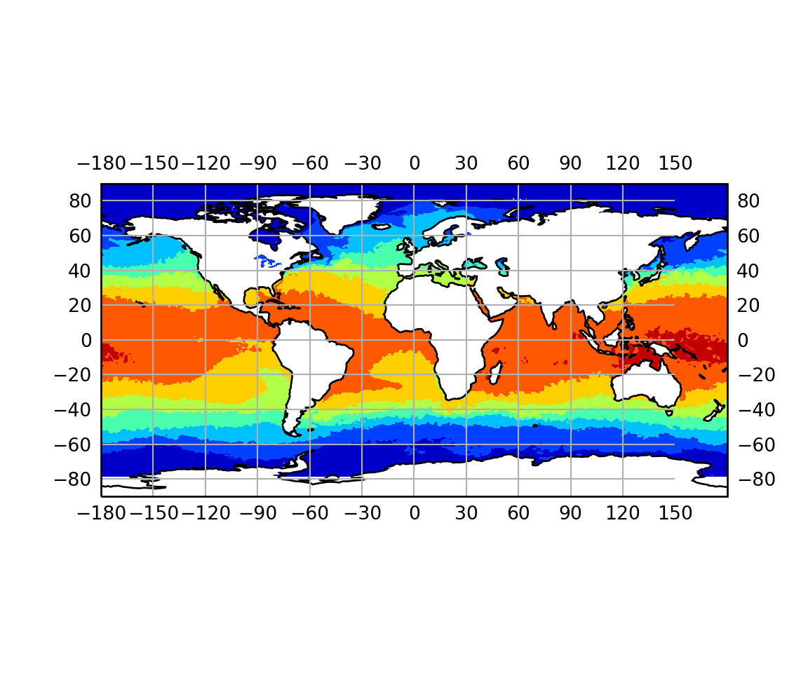
Figure 1: Sea surface temperature
import numpy as np
import matplotlib.pyplot as plt
import cartopy.crs as ccrs
import cartopy.feature as cfeature
from matplotlib.offsetbox import AnchoredText


fig = plt.figure()
# ax = fig.add_subplot(1, 1, 1, projection=ccrs.PlateCarree())
ax = plt.axes(projection=ccrs.PlateCarree())
ax.set_extent([80, 170, -45, 30], crs=ccrs.PlateCarree())

# Put a background image on for nice sea rendering.
ax.stock_img()

# Create a feature for States/Admin 1 regions at 1:50m from Natural Earth
states_provinces = cfeature.NaturalEarthFeature(
    category='cultural',
    name='admin_1_states_provinces_lines',
    scale='50m',
    facecolor='none')

SOURCE = 'Natural Earth'
LICENSE = 'public domain'

ax.add_feature(cfeature.LAND)
ax.add_feature(cfeature.COASTLINE)
ax.add_feature(states_provinces, edgecolor='gray')

# Add a text annotation for the license information to the
# the bottom right corner.
text = AnchoredText(r'$\mathcircled{{c}}$ {}; license: {}'
                    ''.format(SOURCE, LICENSE),
                    loc=4, prop={'size': 12}, frameon=True)
ax.add_artist(text)
plt.show()
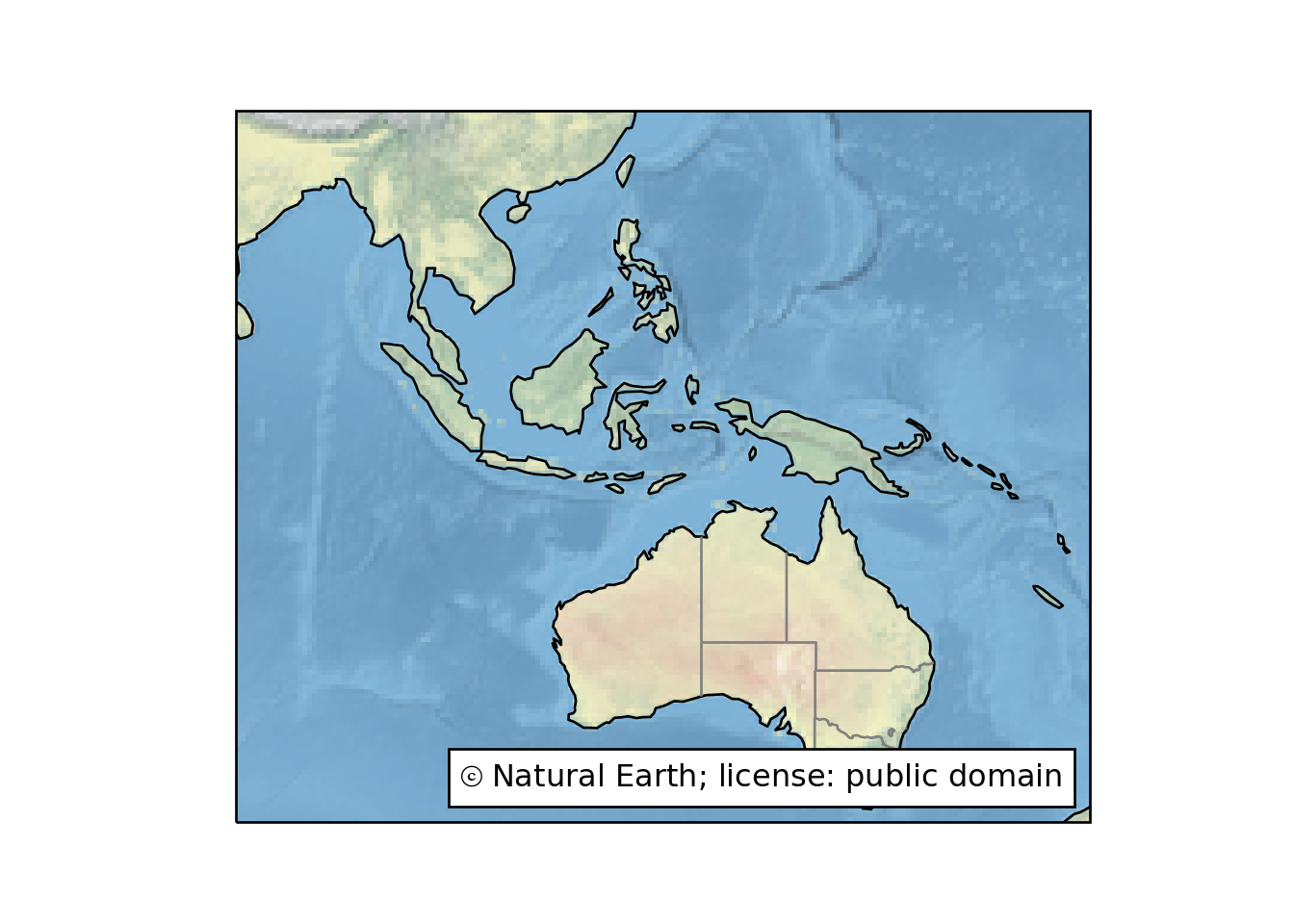
fig = plt.figure()
ax = plt.axes(projection=ccrs.PlateCarree())
ax.set_extent([20, 70, -40, 20], crs=ccrs.PlateCarree())
ax.add_feature(cfeature.LAND, edgecolor='gray')
ax.add_feature(cfeature.BORDERS)
ax.add_feature(cfeature.COASTLINE)
ax.gridlines(xlocs=np.arange(20,70,10), draw_labels=True, crs=ccrs.PlateCarree())
## <cartopy.mpl.gridliner.Gridliner object at 0x0000000037A54748>plt.show()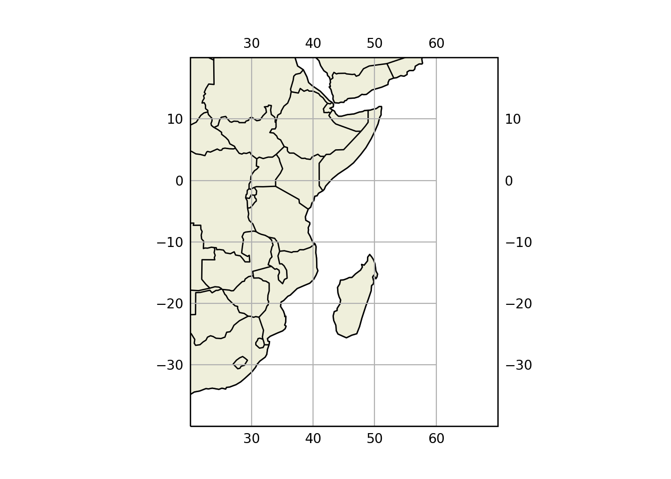
fig = plt.figure()
ax = plt.axes(projection=ccrs.PlateCarree())
ax.set_extent([20, 70, -40, 20], crs=ccrs.PlateCarree())
# Put a background image on for nice sea rendering.
ax.stock_img()
ax.add_feature(cfeature.BORDERS)
ax.add_feature(cfeature.COASTLINE)
ax.gridlines(xlocs=np.arange(20,70,10), draw_labels=True, crs=ccrs.PlateCarree())
## <cartopy.mpl.gridliner.Gridliner object at 0x000000003815EC08>plt.show()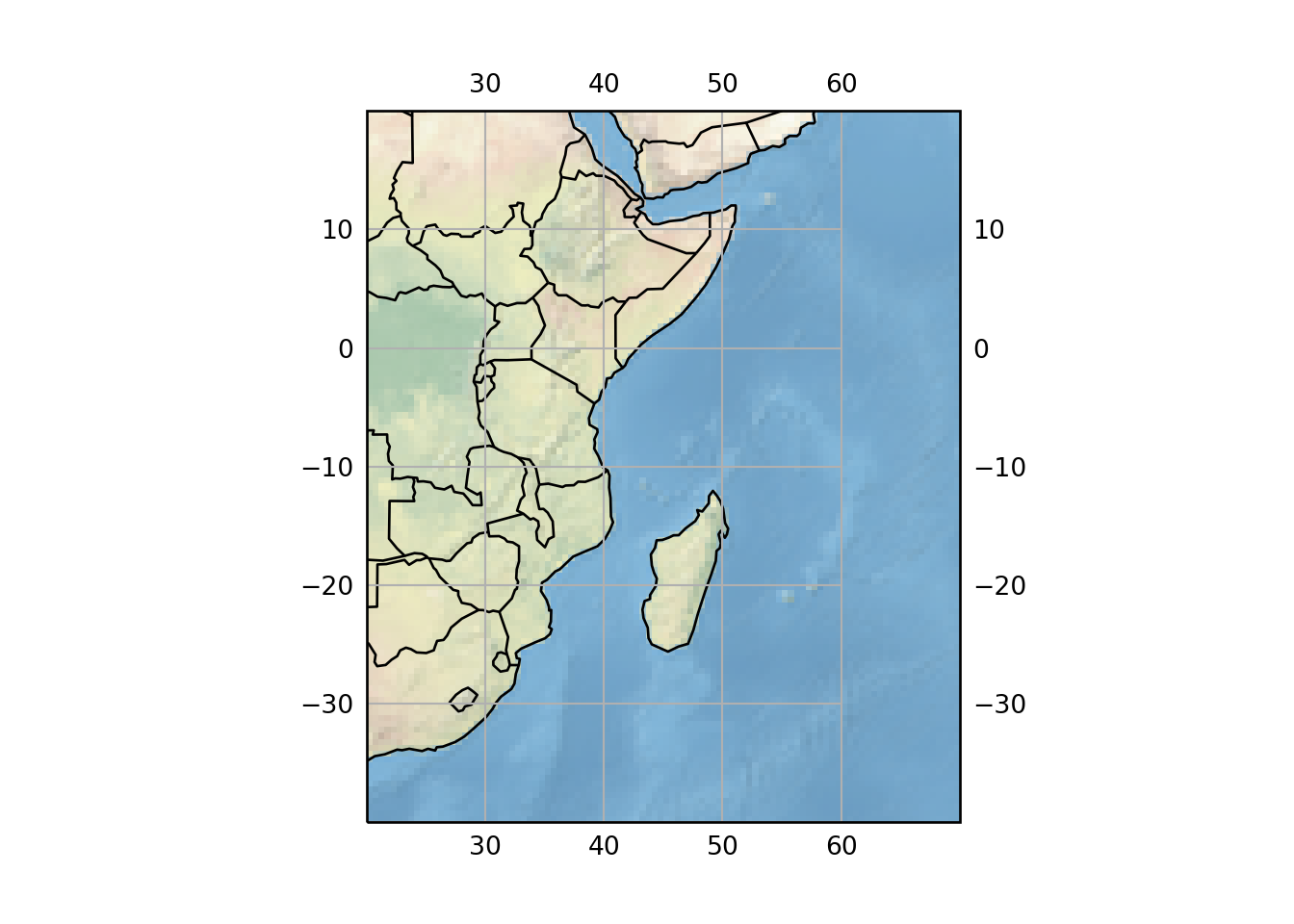
fig = plt.figure()
ax = fig.add_subplot(1, 1, 1, projection=ccrs.PlateCarree())
ax.set_extent([-20, 60, -40, 45], crs=ccrs.PlateCarree())
ax.stock_img()
ax.add_feature(cfeature.LAND)
ax.add_feature(cfeature.OCEAN)
ax.add_feature(cfeature.COASTLINE)
ax.add_feature(cfeature.BORDERS, linestyle='dotted')
ax.add_feature(cfeature.LAKES, alpha=0.5)
ax.add_feature(cfeature.RIVERS)
plt.show()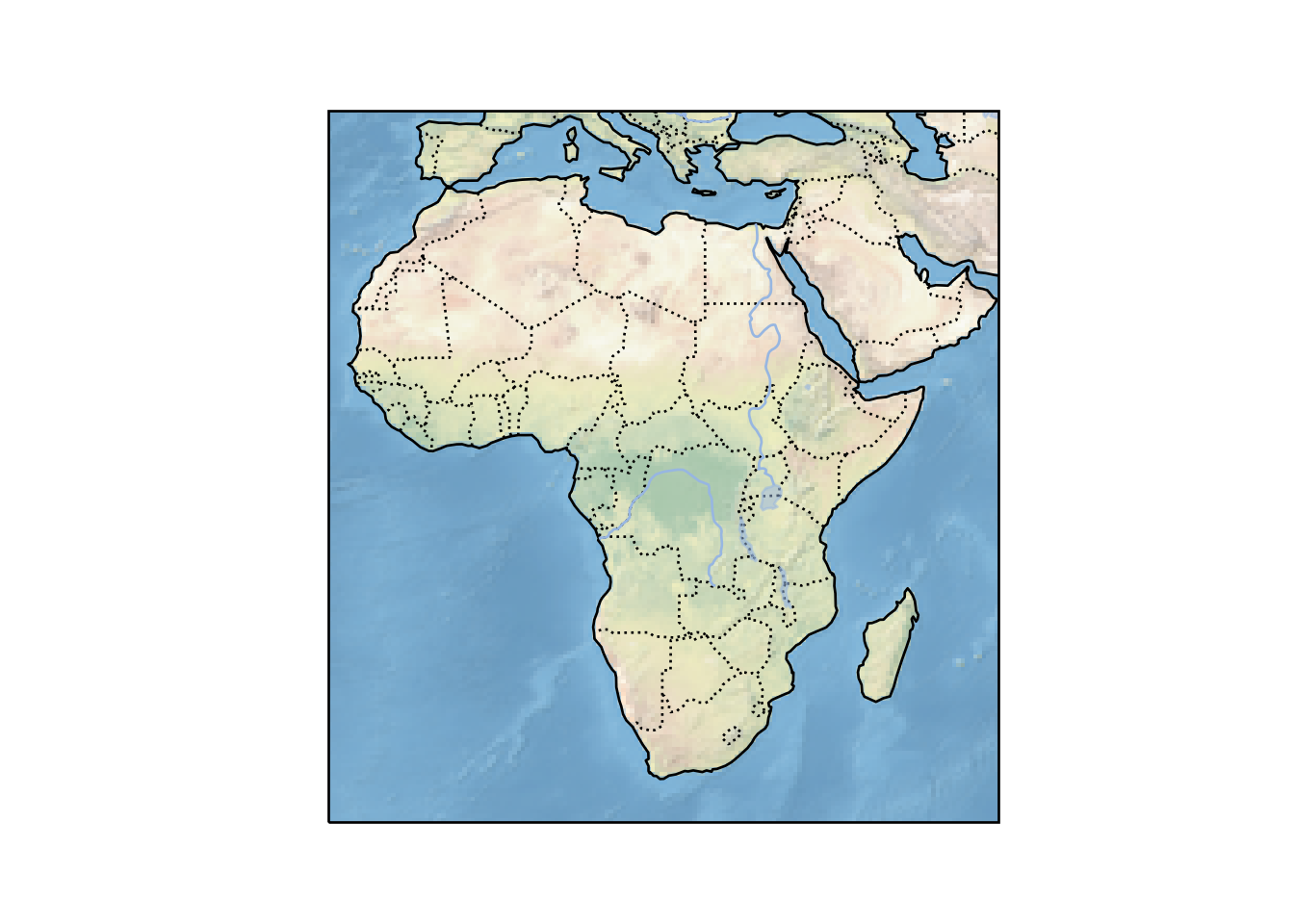
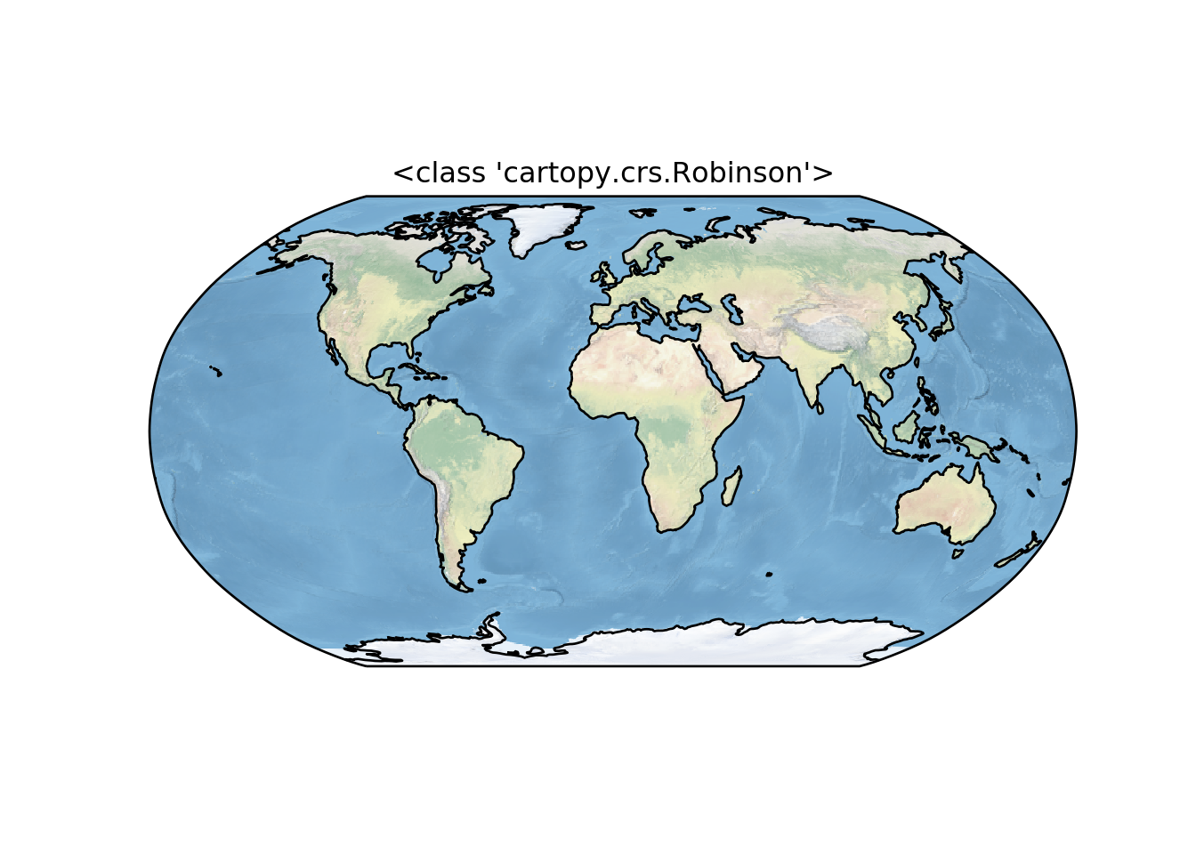
Global Map
An example of a simple map that compares Geodetic and Plate Carree lines between two locations.
fig = plt.figure(figsize=(8, 4))
ax = fig.add_subplot(1, 1, 1, projection=ccrs.Robinson(central_longitude=0))
ax.set_global()
ax.stock_img()
ax.coastlines()
ax.gridlines()
# ax.plot(-0.08, 51.53, 'o', transform=ccrs.PlateCarree())
# ax.plot([-0.08, 132], [51.53, 43.17], transform=ccrs.PlateCarree())
# ax.plot([-0.08, 132], [51.53, 43.17], transform=ccrs.Geodetic())
## <cartopy.mpl.gridliner.Gridliner object at 0x000000003BD9A748>plt.show()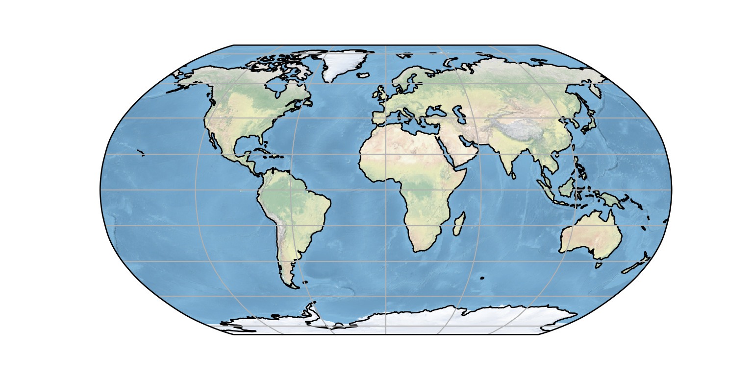
Filled contours
We use the gridded sea surface temperature and because I want to see the pacific and Indian ocean, I used the Mollweide projection and center the longitude to 130.
## read the netcdf file with Dataset function from netCDF4 module
sst = nc.Dataset("e:/MatlabWorking/GHRSST/20050101.nc")
## sst.variables
## extract individual varibales in the nc file
time = sst.variables['time'][:]
lon = sst.variables['lon'][:]
lat = sst.variables['lat'][:]
sst = sst.variables['analysed_sst']
## extract an array of the first day and convert temperature from Kelvin to Degree Celsius
sstr = sst[0,:,:]-273

## create a rectangular of the long and lat
lon2d, lat2d = np.meshgrid(lon, lat)


plt.figure(figsize=(8,4))
ax = plt.axes(projection=ccrs.Mollweide(central_longitude=160),)
ax.set_global()
# ax.set_extent([-170,170,-30,30])
ax.coastlines()
ax.contourf(lon2d, lat2d, datar, transform=ccrs.PlateCarree(), cmap='nipy_spectral')
# ax.gridlines(draw_labels=True, xlocs=np.arange(-180,180,30))# unsupported with Mollweide
## <matplotlib.contour.QuadContourSet object at 0x000000003BDEB308>plt.show()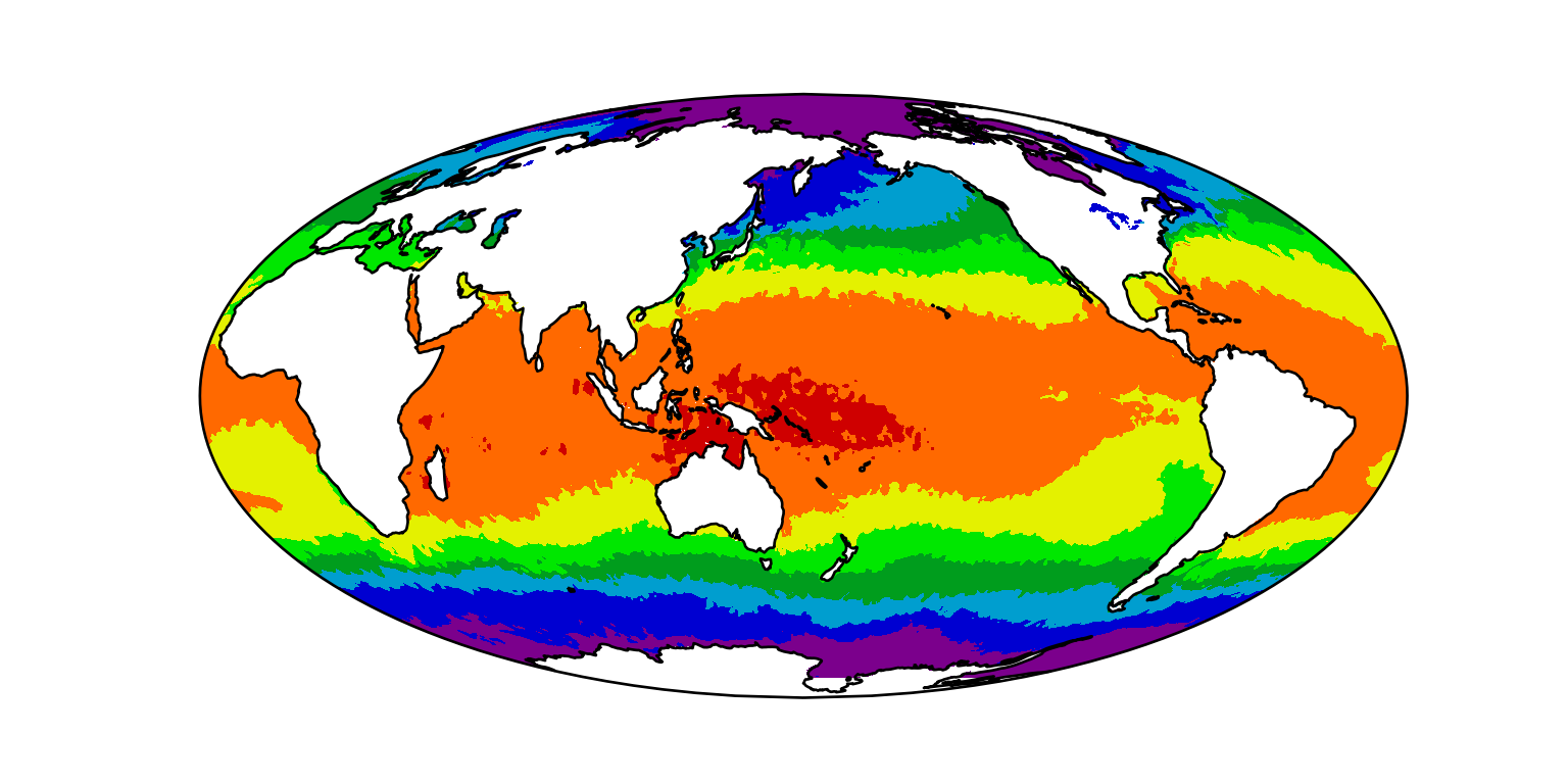
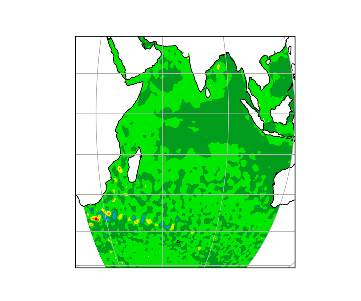
We can also read and map the mean sea level anomaly as the chunk below illustrate
## read mean sea level anomaly data
msla = nc.Dataset("e:/MatlabWorking/Altimetry/msla_h/indian_ocean-twosat-msla-h_010193_311295.nc")
## msla.variables
time = msla.variables['time'][:]
lon = msla.variables['lon'][:]
lat = msla.variables['lat'][:]
sla = msla.variables['sla']
sla30 = sla[30,:,:]

lon2d, lat2d = np.meshgrid(lon, lat)

plt.figure(figsize=(6,5))
ax = plt.axes(projection=ccrs.Mollweide(central_longitude=60))
# ax.set_global()
ax.set_extent([20,120,-50,20])
ax.coastlines()
# ax.add_feature(cfeature.BORDERS, linestyle = "dotted") # uncomment to plot country boundaries
ax.contourf(lon2d, lat2d, sla30, transform=ccrs.PlateCarree(), cmap='nipy_spectral')
## <matplotlib.contour.QuadContourSet object at 0x0000000037A6D548>ax.gridlines(draw_labels=False, xlocs=np.arange(-180,180,30))## <cartopy.mpl.gridliner.Gridliner object at 0x00000000349F7908>plt.show()