Kernel density estimation is a popular tool for visualizing the distribution of data. In this post, we are going to look on how to create smoothed map of random points. We will use a shapefile dataset that contains potential fishing zones derived from sea surface temperature recorded between January and June 2020 in Pemba channel. You can simply download the file from this link.
Once you have downloaded the file, unzip and browse in the uncompressed file you find the shapefile pfz.shp (together with it’s corresponding .DBF. .PRJ and .SHX files). Set the folder containing these files as your R working directory.You will need to load three packages shown in the chunk below to accomplish this exercise. If these packages are not installed in your machine, you can install them with install.packages().
require(sf)
require(btb)
require(tidyverse)
Once we have uncompressed the file, we can use st_read() function to read the file (Pebesma 2018).
fronts.polygons = st_read("pfz/pfz.shp", quiet = TRUE)

fronts.polygons
A glimpse of a dataset tell us that this dataset is a simple feature with 7693 polygon features (Wickham and Henry 2018). These features are projected in Universal Transverse Mercator Zone 37 South (Pebesma 2018). The dataset has date which tell us the data of the fronts. The source variable is of no meaning and we can skip for now.
Since the polygon are in UTM, we can compute the area of each polygon with st_area() function (Pebesma 2018). We compute areas in square kilometer and filter out the area of the Exclusive Economic Zone from the dataset (Firke 2020; Wickham et al. 2018).
fronts.polygons.area = fronts.polygons %>%
  mutate(area_km2 = as.numeric(st_area(geometry)/1000000),
         month = lubridate::month(date, label = TRUE))%>% filter(area_km2 < 200000)
We then converting the polygon into point by using the st_cast() function
fronts.points.wgs = fronts.polygons.area %>%
   # st_crop(xmin = 38, ymin = -6, xmax = 40, ymax = -4)%>%
  # st_transform(4326)  %>%
  st_cast("POINT") %>%
   mutate(month = lubridate::month(date, label = TRUE))
Kernel Smoothin of PFZ
The kernelSmoothing() function allows to square and smooth geolocated data points (Santos et al. 2020). It calculates a classical kernel smoothing (conservative) or a geographically weighted median. There are four major call modes of the function. The first call mode is kernelSmoothing(obs, epsg, cellsize, bandwith) for a classical kernel smoothing and automatic grid. The second call mode is kernelSmoothing(obs, epsg, cellsize, bandwith, quantiles) for a geographically weighted median and automatic grid. The third call mode is kernelSmoothing(obs, epsg, cellsize, bandwith, centroids) for a classical kernel smoothing and user grid. The fourth call mode is kernelSmoothing(obs, epsg, cellsize, bandwith, quantiles, centroids) for a geographically weighted median and user grid.
For this post, we will focus on the first call that only square and smooth geolocated potential fishing zones and compute the total number that fall in each grid. Before we compute we need first to convert the points from the simple feature to tibble that contains eastings (x), northings (y) to allow the kernelSmoothing() function to work. Unfortunate, the function throw an error when only two variables are provided, hence I had to compute the area to make a third column, though not usef in the analysis.
fronts.points.tb = fronts.points.wgs %>%
  st_coordinates() %>%
  as_tibble() %>%
  rename(x = X, y = Y) %>%
  mutate(area = fronts.points.wgs$area_km2)
Once the file is created, we can smooth into grid with the kernelSmoothing by passing the four arguments, a sEPSG is projection code and for our case the code for the area is 32737. The second argument is iCellSize which define the length and width of the grid, for this case I chose 10000 (~10km). A iCellSize value must be in the same unit as the northings and eastings. for our case is in meters.
A third argument in the function i a iBandwidth, which is the radius of the Kernel Density. This bandwidth acts as a smoothing parameter, controlling the balance between bias and variance. A large bandwidth leads to a very smooth (i.e. high-bias) density distribution. A small bandwidth leads to an unsmooth (i.e. high-variance) density distribution. The unit of measurement is free. It must be the same as the unit of iCellSize variable. The last argument is a vQuantiles, which compute values that relate to the rank order of values in that distribution. This will calculate the third variable in our dataset(area) into the 10,50 and 90th quantile. As mentioned earlier, it is not useful for area, but is useful is other variables are of interest.
The output of the kernelSmoothing is a simple feature in UTM coordinates, hence we need to convert to Geographical Coordinate System using st_transform function. The EPSG code for WGS84 is 4326, which is parsed in the argument.
fronts.smoothed = fronts.points.tb %>%
  kernelSmoothing(sEPSG = "32737",
                  iCellSize = 10000L,
                  iBandwidth = 20000L,
                  vQuantiles = c(0.1, 0.5, 0.9)) %>%
  st_transform(4326) %>%
  st_as_sf()
Visualizing
TWe can then plot the spatial distribution of smoothed potential fishing zones using ggplot2. Figure 1 that show variation of PFZ in the Pemba channel was generated using the code below;
fronts.smoothed %>%
  st_crop(xmin = 38, ymin = -6.5, xmax = 41, ymax = -3) %>%
  ggplot() +
  geom_sf(aes(fill = nbObs), col = NA)+
  geom_sf(data = tz.ke, fill = "grey80") +
  coord_sf(xlim = c(38.6, 39.8), ylim = c(-6,-4.6))+
  # scale_fill_gradientn(colours = mycolor, breaks = seq(0,110,10), name = "Number\nof PFZs",
  #                      guide = guide_colorbar(reverse = TRUE, nbin = 11, raster = FALSE,barheight = unit(6,"cm")))+
  scale_fill_viridis_c() +
  metR::scale_x_longitude(ticks = 0.4)+
  metR::scale_y_latitude(breaks = seq(-5.8,-4.8, length.out = 4) %>% round(1))+
  theme_bw() +
  theme(legend.position = c(0.13,.45),
        axis.text = element_text(size = 11, colour = "black"),
        legend.background = element_rect(fill = "grey83")) +
  ggspatial::annotation_north_arrow(location = "tl", width = unit(.75, "cm"), height = unit(.75, "cm"))+
  ggspatial::annotation_scale(location = "bl", text_cex = .9)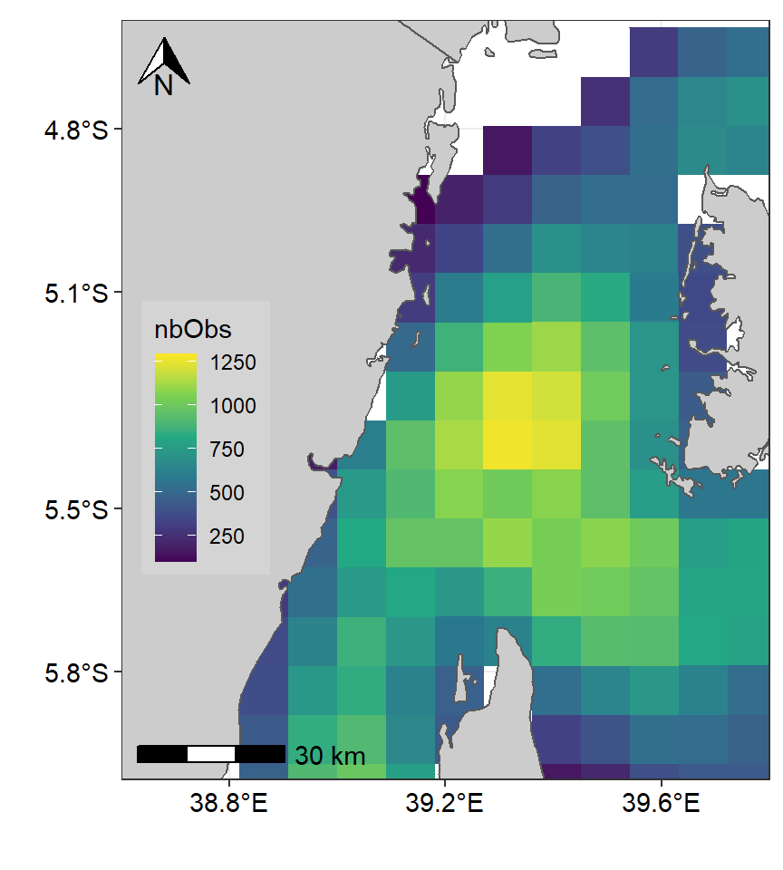
Figure 1: Spatial Distribution of Potential fishing zones in the Pemba channel. Color codes using Viridis pallete
Though figure 1 clearly indicate that the areas with high and low density of fishing zones, but the color code might hide some crues. To enhance this, after several trial, I came up with my color code below that was used to plot figure 2).
mycolor = c("#7f007f", "#0000ff",  "#007fff", "#00ffff", "#00bf00", "#7fdf00",
            "#ffff00", "#ff7f00", "#ff3f00", "#ff0000", "#bf0000")
ke.pfz = fronts.smoothed %>%
st_crop(xmin = 38, ymin = -6.5, xmax = 41, ymax = -3) %>%
ggplot() +
geom_sf(aes(fill = nbObs), col = NA)+
geom_sf(data = tz.ke, fill = "grey80") +
coord_sf(xlim = c(38.6, 39.8), ylim = c(-6,-4.6))+
scale_fill_gradientn(colours = mycolor, breaks = seq(100,1400,120), name = "Number\nof PFZs",
guide = guide_colorbar(reverse = TRUE, nbin = 11, raster = FALSE,barheight = unit(6,"cm")))+
metR::scale_x_longitude(ticks = 0.4)+
metR::scale_y_latitude(breaks = seq(-5.8,-4.8, length.out = 4) %>% round(1))+
theme_bw() +
theme(legend.position = c(0.13,.45),
axis.text = element_text(size = 11, colour = "black"),
legend.background = element_rect(fill = "grey83"),
plot.caption = ggtext::element_markdown()) +
ggspatial::annotation_north_arrow(location = "tl", width = unit(.75, "cm"), height = unit(.75, "cm"))+
ggspatial::annotation_scale(location = "bl", text_cex = .9)+
labs(caption = "<span style = 'font-size:8pt;color:#888888'> Data Source: Tanzania Fisheries Research Insitute <br> Moderate Resolution Imaging Spectroradiometer, <br> Plymouth Marine Laboratory </span>")
ke.pfz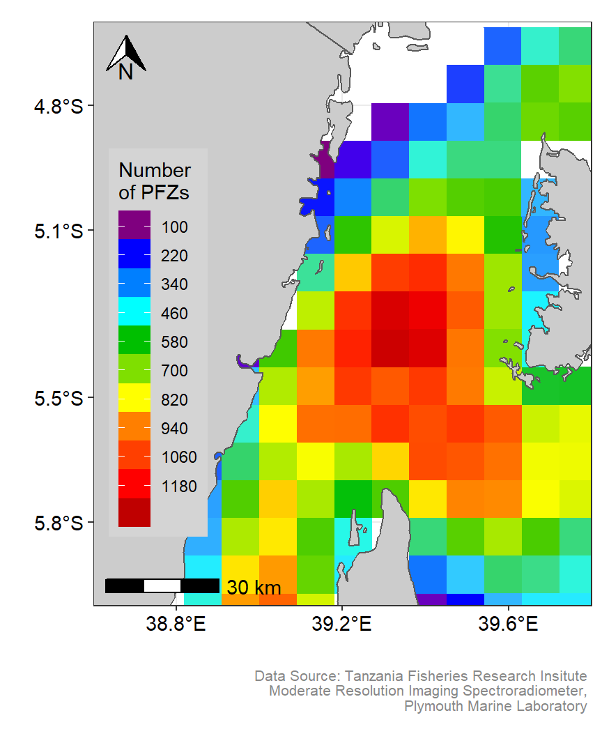
Figure 2: Spatial Distribution of Potential fishing zones in the Pemba channel. Customized color codes
Smoothing density
Sometimes you might want a smoothed grid or filled contour rather than the polygons presented in figure 2. To address that some people would interpolate to impute the value into grids. Another approach is to rasterize the feature—converting simple feature into gridded raster. I prefer the second approach to make smoothing of potential fishing zones in the Pemba Channel. To reduce computation load, I first reduce the feature to fall on the area of interest by cropping using st_crop.
fronts.pemba = fronts.smoothed %>%
  st_crop(xmin = 38, ymin = -7, xmax = 41, ymax = -3.5) %>%
  select(nbObs)
Once the feature in the area of interest are obtained, I can convert them from simple feature to raster using st_rasterize function from stars package (???). To make the high resolution raster, I parsed nx = 30 and ny = 30 to define the number of grids in the area.
## convert sf into stars object
fronts.pemba.raster = fronts.pemba %>%
  stars::st_rasterize(nx = 30, ny = 30)

# fronts.pemba.raster %>% plot()
The raster generated is cube object, therefore, to make it accessible to other package, I need to convert it to data frame. This was done using as_tbl_cube function from cubelyr package (???), which allows to extract the longitude and latitude as vector object and a third variable observation in matrix form.
## convert to data table with cubelyr
fronts.pemba.tb = fronts.pemba.raster %>% cubelyr::as.tbl_cube()

## oobtain individual compponent
lon = fronts.pemba.tb$dims$x
lat = fronts.pemba.tb$dims$y
obs = fronts.pemba.tb$mets

class(lon); class(lat); class(obs)
Then from the combinatin of lat, lon, and obs, I can create a data frame using expand.grid function. Once the data frame is created, the variables names were changed to meaningful names;
fronts.pemba = expand.grid(lon,lat) %>%
  bind_cols(expand.grid(obs))  %>%
  rename(lon = 1, lat = 2)

fronts.pemba %>% glimpse()
Once we have prepared our dataset, we can take the power of ggplot2 (Wickham 2016) and its extensions ggspatial (Dunnington 2020), and metR (Campitelli 2019) to make visual appealing maps. Figure 3 show density variation of Potential fishing zones in the Pemba channel. This plot was generated using geom_contour_fill function from metR package (Campitelli 2019). Similarly, figure 4 show the density of potential fishing zones in the Pemba channel presented as filled contour. This plot used default geom_filled_contour function that comes with ggplot2 (Wickham 2016).
met.pfz = ggplot() +
  # geom_contour_filled(data = fronts.pemba, aes(x = lon, y = lat, z = nbObs), bins = 12)+
  metR::geom_contour_fill(data = fronts.pemba, aes(x = lon, y = lat, z = nbObs), bins = 120, na.fill = TRUE)+
  geom_sf(data = tz.ke, fill = "grey80") +
  coord_sf(xlim = c(38.6, 39.8), ylim = c(-6,-4.7))+
  scale_fill_gradientn(colours = mycolor, breaks = seq(100,1400,120), name = "Number\nof PFZs",
                       guide = guide_colorbar(reverse = TRUE, nbin = 11, raster = TRUE, barheight = unit(6,"cm")))+
  metR::scale_x_longitude(ticks = 0.4)+
  metR::scale_y_latitude(breaks = seq(-5.8,-4.8, length.out = 4) %>% round(1))+
  theme_bw() +
  theme(legend.position = c(0.13,.45),
        axis.text = element_text(size = 11, colour = "black"),
        legend.background = element_rect(fill = "grey83"),
        plot.caption = ggtext::element_markdown()) +
  ggspatial::annotation_north_arrow(location = "tl", width = unit(.75, "cm"), height = unit(.75, "cm"))+
  ggspatial::annotation_scale(location = "bl", text_cex = .9)+
  labs(caption = "<span style = 'font-size:8pt;color:#888888'> Data Source: Tanzania Fisheries Research Insitute <br> Moderate Resolution Imaging Spectroradiometer, <br> Plymouth Marine Laboratory </span>")

met.pfz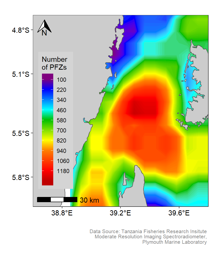
Figure 3: Smoothed spatial Distribution of Potential fishing zones in the Pemba channel. Customized color codes
mycolor2 = c("#040ED8", "#4196FF", "#86D9FF", "#9CEEFF", "#AFF5FF", "#CEFFFF",
             "#FFFE47", "#FFEB00", "#FF9000", "#FF4800", "#FF0000", "#9E0000")

gg.pfz = ggplot() +
  geom_contour_filled(data = fronts.pemba, aes(x = lon, y = lat, z = nbObs), bins = 12)+
  # metR::geom_contour_fill(data = fronts.pemba, aes(x = lon, y = lat, z = nbObs), bins = 120, na.fill = TRUE)+
  geom_sf(data = tz.ke, fill = "grey80") +
  coord_sf(xlim = c(38.6, 39.8), ylim = c(-6,-4.7))+
  # scale_fill_gradientn(colours = mycolor2, breaks = seq(100,1400,120), name = "Number\nof PFZs",
  #                      guide = guide_colorbar(reverse = TRUE, nbin = 11, raster = TRUE, barheight = unit(6,"cm")))+
  scale_fill_manual(name = "Number", values = mycolor2, label = seq(110,1400,110),
                    guide = guide_legend(keywidth = unit(4,"mm"), keyheight = unit(5,"mm"), reverse = FALSE))+
  metR::scale_x_longitude(ticks = 0.4)+
  metR::scale_y_latitude(breaks = seq(-5.8,-4.8, length.out = 4) %>% round(1))+
  theme_bw() +
  theme(legend.position = c(0.13,.45),
        axis.text = element_text(size = 11, colour = "black"),
        legend.background = element_rect(fill = "grey83"),
        plot.caption = ggtext::element_markdown()) +
  ggspatial::annotation_north_arrow(location = "tl", width = unit(.75, "cm"), height = unit(.75, "cm"))+
  ggspatial::annotation_scale(location = "bl", text_cex = .9)+
  labs(caption = "<span style = 'font-size:8pt;color:#888888'> Data Source: Tanzania Fisheries Research Insitute <br> Moderate Resolution Imaging Spectroradiometer, <br> Plymouth Marine Laboratory </span>")

gg.pfz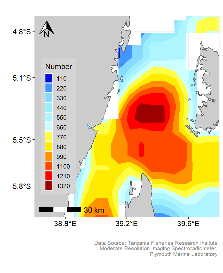
Figure 4: Smoothed contour spatial Distribution of Potential fishing zones in the Pemba channel. Customized color codes
To help a visual check appealing, I have combined the three maps in one plot shown in figure 5. You can raise your eye to pick of the three maps which is subtle in revealing the spatial distribution of PFZ in Pemba channel. Check on both color codes and the style used to represent these feature on space. The three maps were aligned using patchwork package (Pedersen 2020).
require(patchwork)

ke.pfz + met.pfz + gg.pfz![Spatial maps of PFZ genated using density polygons [left panel], smoothed raster using metr [middle panel] and filled contour [right panel]](/post/2020-07-06-kernel-smoothin-of-spatial-data_files/figure-html/fig5-1.png)
Figure 5: Spatial maps of PFZ genated using density polygons [left panel], smoothed raster using metr [middle panel] and filled contour [right panel]
Cited
Campitelli, Elio. 2019. MetR: Tools for Easier Analysis of Meteorological Fields. https://CRAN.R-project.org/package=metR.
Dunnington, Dewey. 2020. Ggspatial: Spatial Data Framework for Ggplot2. https://CRAN.R-project.org/package=ggspatial.
Firke, Sam. 2020. Janitor: Simple Tools for Examining and Cleaning Dirty Data. https://CRAN.R-project.org/package=janitor.
Pebesma, Edzer. 2018. Sf: Simple Features for R. https://CRAN.R-project.org/package=sf.
Pedersen, Thomas Lin. 2020. Patchwork: The Composer of Plots. https://CRAN.R-project.org/package=patchwork.
Santos, Arlindo Dos, Francois Semecurbe, Auriane Renaud, Cynthia Faivre, Thierry Cornely, Farida Marouchi, and Farida Marouchi. 2020. Btb: Beyond the Border - Kernel Density Estimation for Urban Geography. https://CRAN.R-project.org/package=btb.
Wickham, Hadley. 2016. Ggplot2: Elegant Graphics for Data Analysis. Springer-Verlag New York. http://ggplot2.org.
Wickham, Hadley, Romain François, Lionel Henry, and Kirill Müller. 2018. Dplyr: A Grammar of Data Manipulation. https://CRAN.R-project.org/package=dplyr.
Wickham, Hadley, and Lionel Henry. 2018. Tidyr: Easily Tidy Data with ’Spread()’ and ’Gather()’ Functions. https://CRAN.R-project.org/package=tidyr.