Principal Component Analysis (PCA)
Principal Component Analysis (PCA) is widely used to explore data. This technique allows you visualize and understand how variables in the dataset varies. Therefore, PCA is particularly helpful where the dataset contain many variables.This is a method of unsupervised learning that allows you to better understand the variability in the data set and how different variables are related.
The Components in PCA are the underlying structure in the data. They indicates the directions where there is the most variance, the directions where the data is most spread out. This means that PCA helps us to find the straight line that best spreads the data out when it is projected along it. This is the first principal component, the straight line that shows the most substantial variance in the data.
PCA is a type of linear transformation on a given data set that has values for a certain number of variables (coordinates) for a certain amount of spaces. This linear transformation fits this dataset to a new coordinate system in such a way that the most significant variance is found on the first coordinate, and each subsequent coordinate is orthogonal to the last and has a lesser variance. In this way, you transform a set of x correlated variables over y samples to a set of p uncorrelated principal components over the same samples. We need to load some packages in R session that we are going to use in this post. I prefer loading the packages in my session using the require() function, but you can load using library() function.
require(tidyverse)
require(kableExtra)
require(factoextra)
require(ggbiplot)
Exploring the data
Before we dive in to the analysis, we want to explore our data set and become familiar with it. We use a simple and easy to understand dataset. This dataset consists of data on 120 observations sampled in Pemba and Zanzibar channel during the wet and dry season. Table 1 shows the sampled ten observations of the the dataset. There nine variables, two are factor (channel and season variables) and the other seven are numerical variables.
set.seed(1254)

data %>%
  mutate_if(is.numeric, round, digits = 3) %>%
  sample_n(10)%>%
  kableExtra::kable(format = "html", caption = "A sample of dataset", align = "c") %>%
  kableExtra::add_header_above(c("", "", "Numerical Variables" = 7)) %>%
  kableExtra::column_spec(column = 1:2, width = "2cm", background = "lightblue") %>%
kableExtra::column_spec(3:9, width = "2cm", background = "pink")| channel | season | sst | pH | salinity | do | chl | po4 | nitrate |
|---|---|---|---|---|---|---|---|---|
| Pemba | Dry | 28.2 | 8.04 | 35.0 | 5.86 | 0.001 | 0.836 | 0.462 |
| Zanzibar | Wet | 28.0 | 8.09 | 35.0 | 6.01 | 0.531 | 0.420 | 0.501 |
| Pemba | Wet | 27.6 | 7.98 | 34.0 | 6.98 | 0.921 | 0.166 | 0.574 |
| Zanzibar | Wet | 27.8 | 8.10 | 35.0 | 6.26 | 0.199 | 0.443 | 0.391 |
| Pemba | Dry | 28.6 | 7.94 | 34.8 | 5.20 | 0.001 | 0.767 | 0.511 |
| Zanzibar | Wet | 28.0 | 8.04 | 34.0 | 6.26 | 1.126 | 0.397 | 0.623 |
| Pemba | Dry | 28.5 | 8.04 | 34.0 | 6.20 | 0.001 | 0.767 | 0.694 |
| Pemba | Dry | 28.0 | 8.03 | 35.0 | 5.30 | 0.001 | 0.698 | 0.464 |
| Zanzibar | Wet | 28.0 | 8.05 | 34.8 | 6.00 | 0.026 | 0.065 | 0.550 |
| Pemba | Wet | 28.9 | 8.06 | 34.5 | 5.34 | 0.062 | 0.305 | 0.317 |
Figure 1 is a pairplot that compare each pair of variables as scatterplots in the lower diagonal, densities on the diagonal and correlations written in the upper diagonal. I picked spearman rank correlation to evaluate the correlation of environmental variables to chlorophyll concentration at dry and wet season. We notice that physical and chemical variables influence chlorophyll-a either positive or negative at different seasons.
require(GGally)

data %>%
  GGally::ggscatmat(columns = 3:9 ,color = "season", corMethod = "spearman") +
  ggsci::scale_color_jco()+
  ggpubr::theme_pubclean()+
  theme(strip.background = element_rect(fill = "grey90"),
        axis.text = element_text(size = 8),
        legend.position = "right",
        legend.key = element_blank())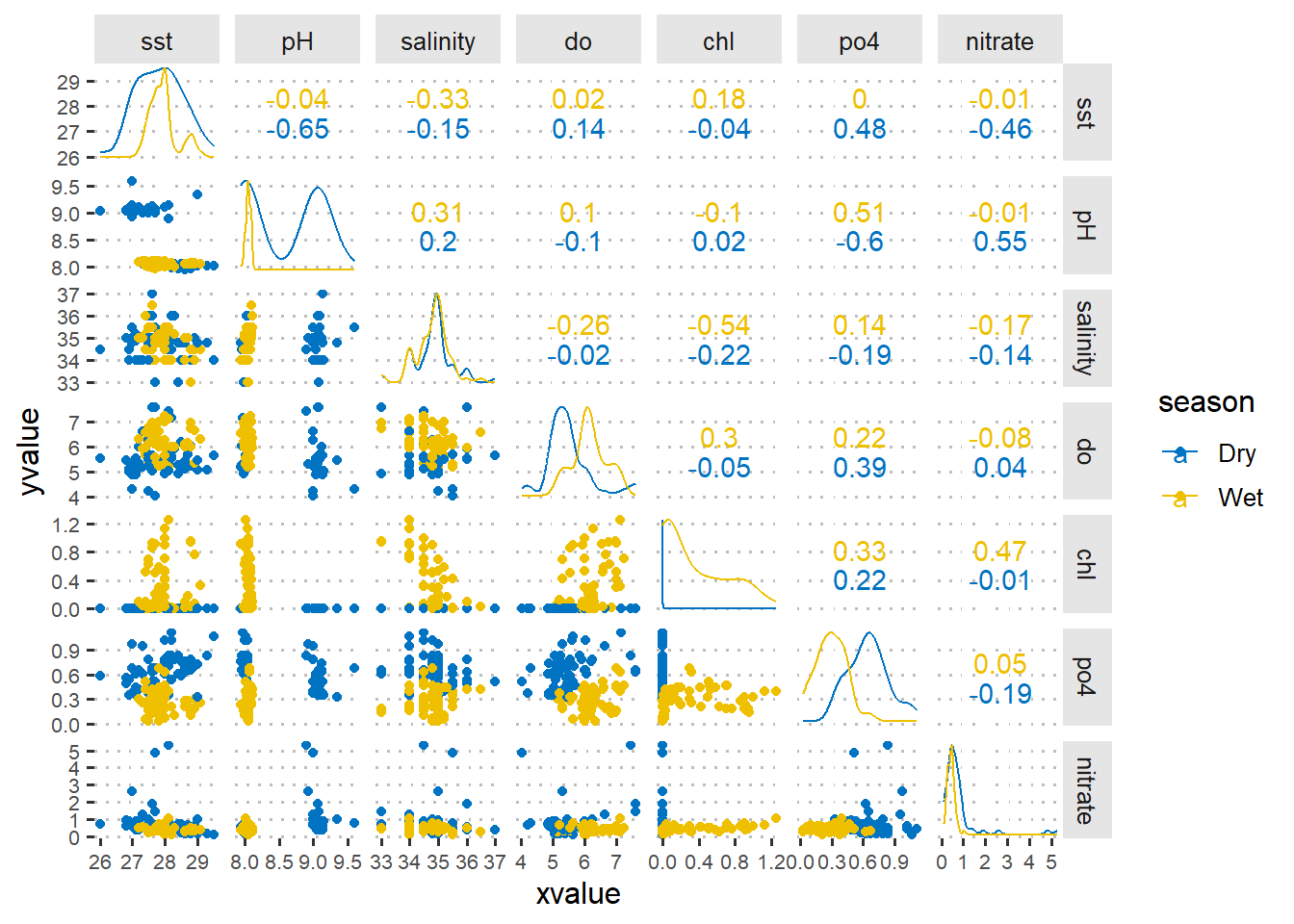
Figure 1: A pairplot showing the asoociation of numerical values sampled in dry and wet seeasons
Compute the Principal Components
PCA prefer numerical data, therefore, we need to trim off the dataset channel and season variables, because they are categorical variables. Once we have removed the categorical variables, we also need to filter variables for a particular season. I will start with the dry season. We use the filter function from dpyr (Wickham et al. 2018) package to drop all observation collected during the rain season.
## Dry season
dry.season = data %>%
  filter(season == "Dry")
Our dataset is reduced to seven numerical variables and 60 observation collected during the dry season in Pemba and Zanzibar channel. To compute PCA, we simply parse the arguments data = dry.season and scale = TRUE in prcomp() function, which performs a principal components analysis and assign the output as dry.pca.
## PCA computation
dry.pca = dry.season %>%
  select(3:9) %>%
  prcomp(scale. = TRUE, center = TRUE)
Then We can summarize our PCA object with summary().
dry.pca %>%
  summary()
Importance of components:
PC1 PC2 PC3 PC4 PC5 PC6 PC7
Standard deviation 1.5046 1.3373 0.9955 0.8483 0.7964 0.63574 0.4459
Proportion of Variance 0.3234 0.2555 0.1416 0.1028 0.0906 0.05774 0.0284
Cumulative Proportion 0.3234 0.5789 0.7205 0.8233 0.9139 0.97160 1.0000We get seven principal components, called PC1-9. Each of these explains a percentage of the total variation in the dataset. That is to say: PC1 explains 32% of the total variance, which means that nearly one-thirds of the information in the dataset can be encapsulated by just that one Principal Component. PC2 explains 25% of the variance. So, by knowing the position of a sample in relation to just PC1 and PC2, you can get a very accurate view on where it stands in relation to other samples, as just PC1 and PC2 can explain 57% of the variance.
Plotting PCA
Kassambara and Mundt (2020) developed a factoextra package that provide tools to extract and visualize the output of exploratory multivariate data analyses, including PCA (R Core Team 2018). However, in this post will make a biplot using a ggbiplot package (Vu 2011). A biplot allows to visualize how the samples relate to one another in PCA (which samples are similar and which are different) and simultaneously reveal how each variable contributes to each principal component.
A ggbiplot package is easy to use and offers a user-friendly and pretty function to plot biplots (Vu 2011). If biplot package is yet in your machine, you can simply install it from github as the code below shows;
devtools::install_github("vqv/ggbiplot")Figure 2 is a biplot generated using ggbiplot function in the code below. The axes are seen as arrows originating from the center point. Here, you we that the variables \(PO_4^{-}\), \(O_2\), \(Chl-a\), and \(NO_3^{-}\) a all contribute to PC1, with higher values in those variables moving the samples to the right on this plot. This lets you see how the data points relate to the axes, but it’s not very informative without knowing which point corresponds to which sample season.
dry.pca %>%
  ggbiplot::ggbiplot()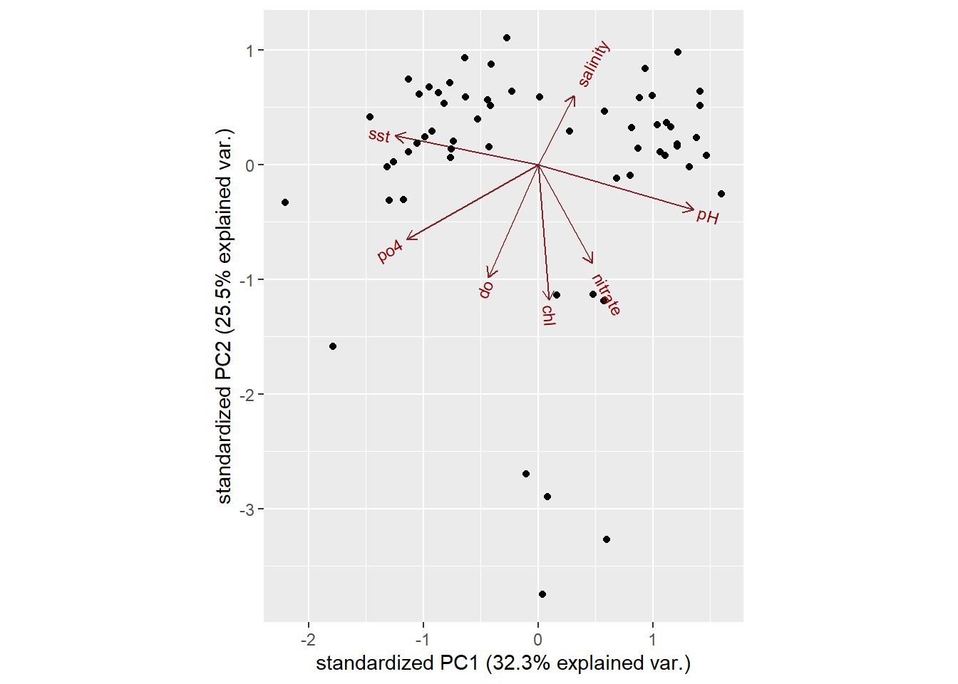
Figure 2: A regular biplot
Since we know the channel the data were collected, we can put the points into Pemba and Zanzibar channels. We can further customize the biplot by parsing argument ellipse = TRUE, which will draw an ellipse around each group. The code below generates figure 3
dry.pca %>%
  ggbiplot::ggbiplot(
    scale = 1,
    groups = dry.season$channel,
    ellipse = T)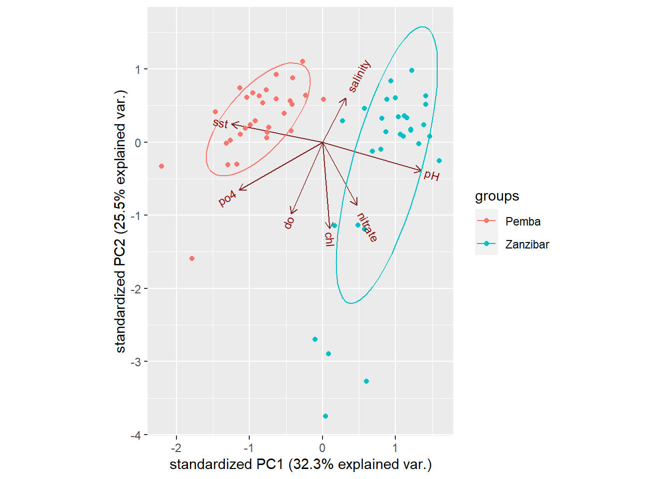
Figure 3: Customized biplot
A customized figure 3 reveal a distinct of data for the two channel. By looking on PC, we find that the points and ellipse to the left is purely Pemba channel whereas to the right is Zanzibar channel. Looking at the axes, we also notice that the data at Pemba channel are characterized by low values of sst, phosphate and dissolved oxygen for PC1 and high values of SST PC2. The Zanzibar channel on contrary is characterized with positive values of pH, nitrate and chl for PC1. Salinity and chl are somehow in the middle.
Of course, we have many principal components available, each of which map differently to the original variables. We can ask ggbiplot to plot these other components, by parsing the choices argument. Figure 4 was generated using PC5 and PC6:
dry.pca %>%
  ggbiplot::ggbiplot(
    scale = 1,
    groups = dry.season$channel,
    choices=c(5,6),
    ellipse = T)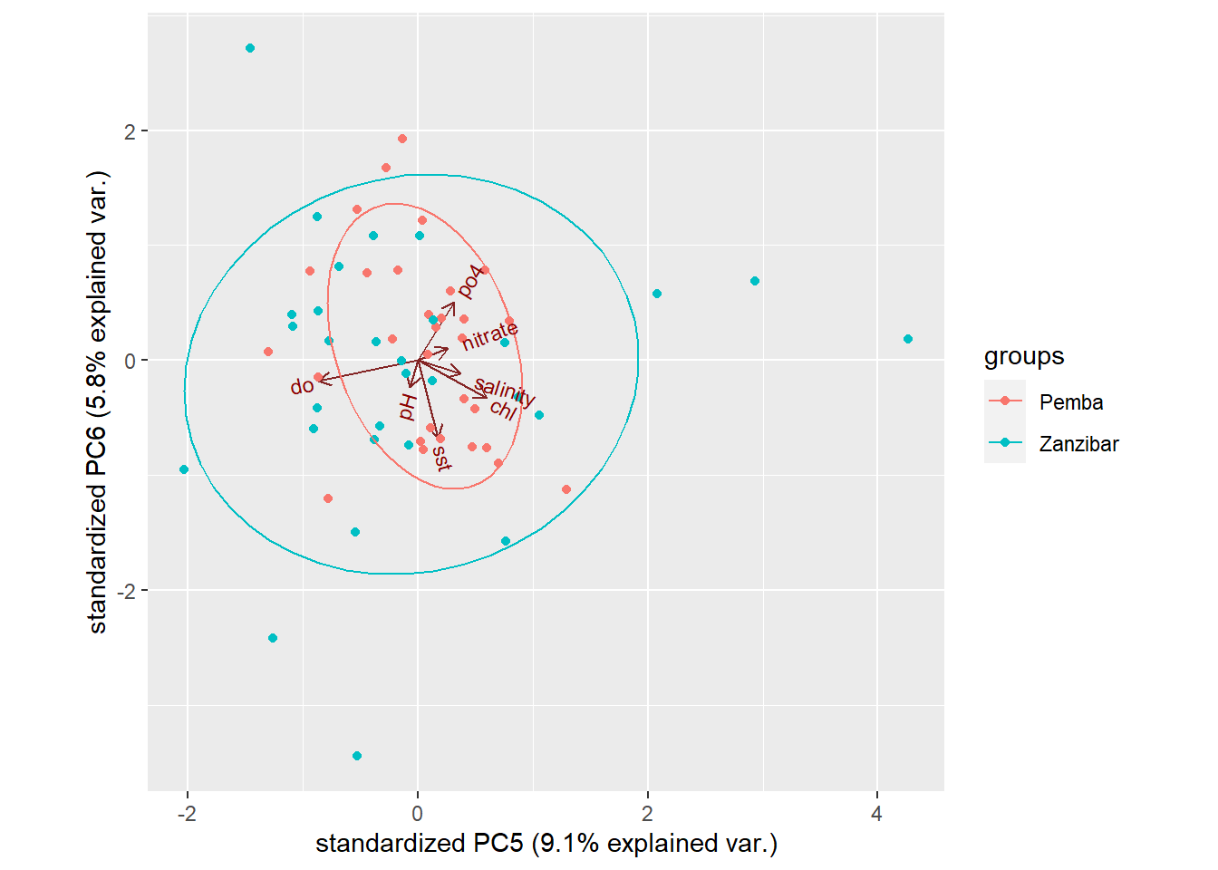
Figure 4: Customized biplot
We don’t see much in figure 4 because PC5 and PC6 explain very small percentages of the total variation, so it would be surprising if we found that they were very informative and separated the groups or revealed apparent patterns.
Customize ggbiplot
As ggbiplot is based on the ggplot function, you can use the same set of graphical parameters to alter our biplots as you would for any ggplot. For instance, figure 5 we simply added the reference line with geom_vline and geom_hline(). We also changed from the default totheme_pubclean() from ggpubr (Kassambara 2020) and strip off the legend title and position legend to the top of the plot with theme().
dry.pca %>%
  ggbiplot::ggbiplot( scale = 1,
    groups = dry.season$channel,
    ellipse = T) +
  geom_vline(xintercept = 0, linetype = 3)+
  geom_hline(yintercept = 0, linetype = 3)+
  ggpubr::theme_pubclean() +
  theme(legend.position = "top", legend.title = element_blank(), legend.key = element_blank())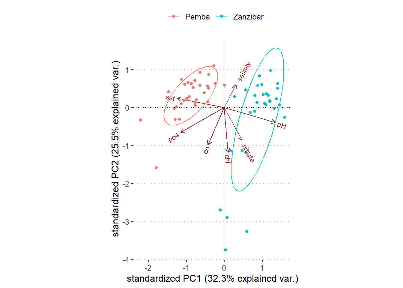
Figure 5: Customized biplot
Refeences
Kassambara, Alboukadel. 2020. Ggpubr: ’Ggplot2’ Based Publication Ready Plots. https://CRAN.R-project.org/package=ggpubr.
Kassambara, Alboukadel, and Fabian Mundt. 2020. Factoextra: Extract and Visualize the Results of Multivariate Data Analyses. https://CRAN.R-project.org/package=factoextra.
R Core Team. 2018. R: A Language and Environment for Statistical Computing. Vienna, Austria: R Foundation for Statistical Computing. https://www.R-project.org/.
Vu, Vincent Q. 2011. Ggbiplot: A Ggplot2 Based Biplot. http://github.com/vqv/ggbiplot.
Wickham, Hadley, Romain François, Lionel Henry, and Kirill Müller. 2018. Dplyr: A Grammar of Data Manipulation. https://CRAN.R-project.org/package=dplyr.