Heatmaps are powerful data visualization tools broadly widely used with meteorologic and oceanographic data. Heatmaps are excellent at tracking signals that move, like ocean current. These diagrams can be used for many more types of atmospheric features. The concept is to represent a matrix of values as colors where usually is organized by a gradient. This post explains how to create a heatmap of ocean current in R using the geom_tile(), geom_contour_filled from ggplot2 (Wickham 2016) and geom_contour_fill from metR package (Campitelli 2019). We will also see how to customize the plot color with scale_fill_gradientn() and scale_fill_manual() functions within the ggplot2 package.
Let’s start by loading the package into the session. I load a tidyverse package, which bundles different packages for data import, manipulate, visualize and share. We load the package using a require() function (R Core Team 2018). For color palette, I also load the wesanderson package (Ram and Wickham 2018). I will use both the generic and customized palette for heatmaps plots I will generate in this post.
.
require(wesanderson)
require(tidyverse)
Let’s first extract the names of all the palette with wes_palettes
pa = wes_palettes %>%
  names()

pa
[1] "BottleRocket1" "BottleRocket2" "Rushmore1" "Rushmore"
[5] "Royal1" "Royal2" "Zissou1" "Darjeeling1"
[9] "Darjeeling2" "Chevalier1" "FantasticFox1" "Moonrise1"
[13] "Moonrise2" "Moonrise3" "Cavalcanti1" "GrandBudapest1"
[17] "GrandBudapest2" "IsleofDogs1" "IsleofDogs2" My interest is to use the Zissou1 palette, which is indexed at location 7. I generate two more colour palettes from Zissou1 using wes_palette function. One for continuous plot and the other for discrete one.
pal = wes_palette(name = pa[7], n = 10, type = "continuous")
pal2 = wes_palette(name = pa[7], n = 5, type = "discrete")
Once i have created my palette, I can now load the dataset. In this post I use the ocean current data collected close to Jambe Island, in Tanga region coastal waters. The data was collected using the SonTek M9 adp instrument, which measure and records profile of current. I load the data using the read_csv function from readr (Wickham, Hester, and Francois 2017).
shallow.tb = read_csv("jambe_adp_m9.csv")Tiled
There are different functions to create a heatmap in ggplot2 and one of them is the geom_tile. The good news of using ggplot2 function is simply that it works with data frame that are tidied in `xyz format. Our dataset is in that format and hence we can go straight to make a heatmap. Figure 1 is a heatmap showing the how speed of current varies both with depth and longitude.
transect.tile = shallow.tb %>%
  ggplot() +
  geom_tile(aes(x = lon, y = depth, fill = speed)) +
  coord_cartesian(expand = FALSE) +
  labs(x = NULL, y = "Water Depth [m]")+
  theme_bw() %+%
  theme(panel.background = element_rect(fill = "grey90"),
        panel.grid.major = element_line(linetype = 3, colour = "grey60"),
        axis.text = element_text(colour = 1, size = 10),
        axis.title = element_text(colour = 1, size = 12),
        legend.background = element_blank(),
        legend.key = element_blank(),
       legend.position = "right")+
  scale_y_reverse()+
  metR::scale_x_longitude(ticks = 0.005,position = "bottom")

transect.tile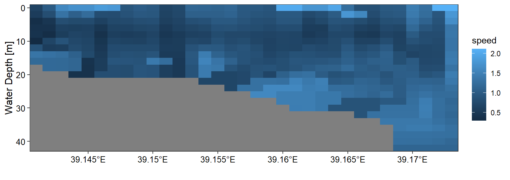
Figure 1: Cross section of ocean Current velocity in shallow water along Jambe Island, in Tanga region. The grey color represent the bottom depth
The generic color gradient in figure 1 may not show clearly the feature difference, hence I used the color palette i created to customize figure 2. You will notice that now figure 2 is clearly and easy to notice where the change of ocean current speed.
transect.tile +
  scale_fill_gradientn(colours = pal, breaks = seq(0.34,2.1, length.out = 8),
                       labels = seq(0.34,2.1, length.out = 8) %>% round(2), na.value = NA)+
  guides(fill = guide_legend(title.position = "right",direction = "vertical",
                               title.theme = element_text(angle = 90, size = 12, colour = "black"),
                               barheight = .5, barwidth = .95,
                               title.hjust = 0.5, raster = FALSE,
                               title = expression(Current~velocity~(ms^{-1}))))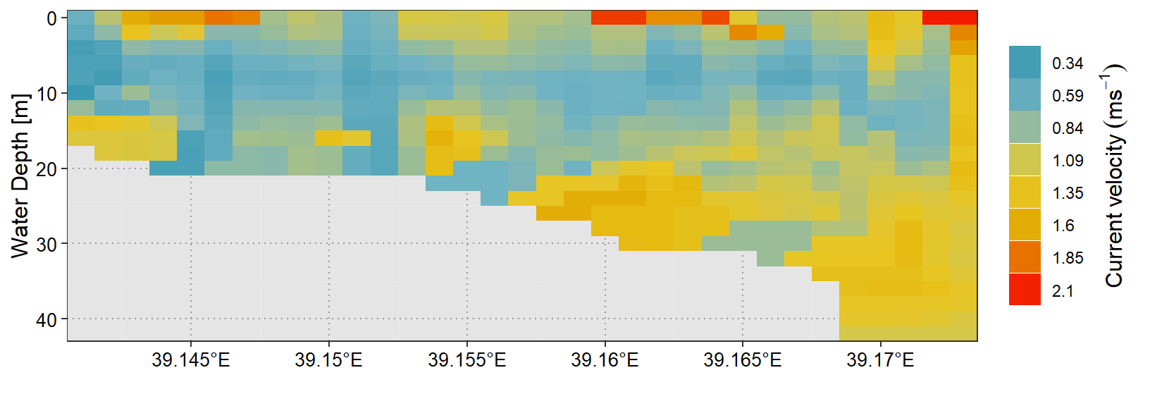
Figure 2: Color coded cross section of ocean Current velocity in shallow water along Jambe Island, Tanga. The grey color represent the bottom depth
Each individual column in figure 2 is speed of ocean current from the surface to the bottom, averaged by longitude. The horizontal axis shows the longitude, and the vertical axis shows the speed of current from the surface to the maximum depth.
filled contour
Campitelli (2019) developed a metR package that has several plotting functions. One of these function is the geom_filled_contour, which plot xyz into filled contour with equal interval. However, the drawback of this function is its tendency of imputing missing values. For instance the bottom depth that the geom_tile separated with the current velocity in figure 2 is filled with interpolated value in figure 3 and 4
transect.metr = shallow.tb %>%
  ggplot() +
  metR::geom_contour_fill(aes(x = lon, y = depth, z = speed),
                          na.fill = TRUE, bins = 10) +
  coord_cartesian(expand = FALSE) +
  labs(x = NULL, y = "Water Depth [m]")+
  theme_bw() %+%
  theme(panel.background = element_rect(fill = "grey90"),
        panel.grid.major = element_line(linetype = 3, colour = "grey60"),
        axis.text = element_text(colour = 1, size = 10),
        axis.title = element_text(colour = 1, size = 12),
        legend.background = element_blank(),
        legend.key = element_blank(),
       legend.position = "right")+
  scale_y_reverse()+
  metR::scale_x_longitude(ticks = 0.005,position = "bottom")

transect.metr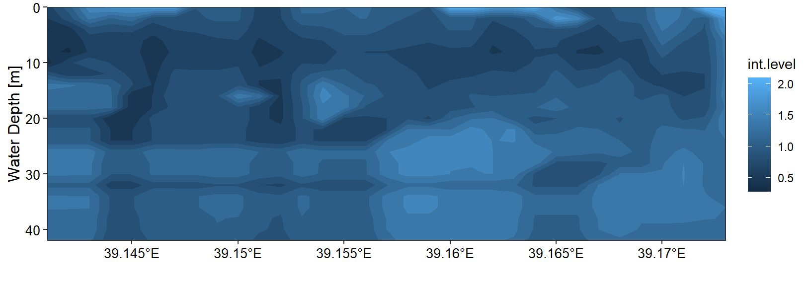
Figure 3: Cross section of ocean Current velocity in shallow water along Jambe Island, in Tanga region. The grey color which represent the bottom depth has disappeared
transect.metr +
  scale_fill_gradientn(colours = pal, breaks = seq(0.34,2.1, length.out = 8),
                       labels = seq(0.34,2.1, length.out = 8) %>% round(2))+
  guides(fill = guide_legend(title.position = "right",direction = "vertical",
                               title.theme = element_text(angle = 90, size = 12, colour = "black"),
                               barheight = .5, barwidth = .95,
                               title.hjust = 0.5, raster = FALSE,
                               title = expression(Current~velocity~(ms^{-1}))))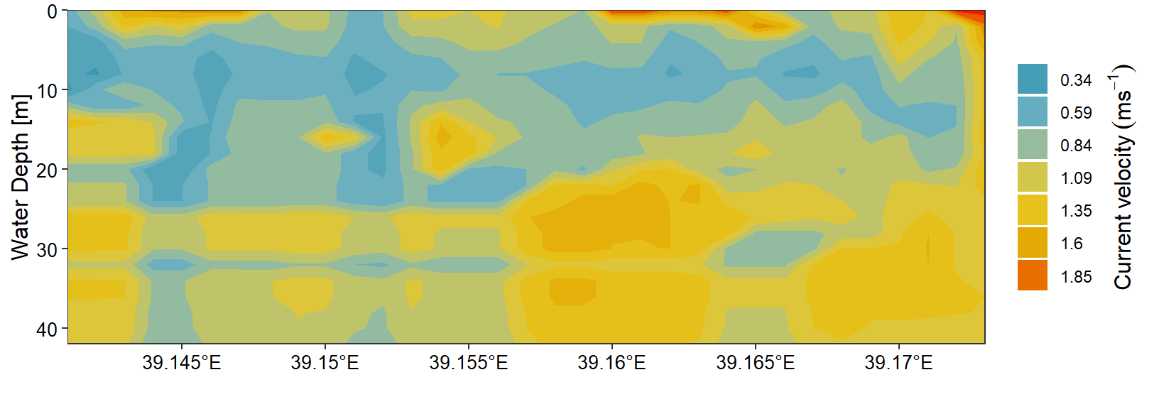
Figure 4: Cross section of ocean Current velocity in shallow water along Jambe Island, in Tanga region. . The grey color which represent the bottom depth has disappeared
Since version 3.3.0, ggplot2 added a geom_contour_filled function that works similar to geom_contour_fill of metR package. It plot filled contour of gridded data without interpolating the missing values. The chunk below generates figure 5.
transect.gg = shallow.tb %>%
   # filter(depth < 6) %>%
   ggplot(aes(x = lon, y = depth)) +
  # metR::geom_contour_fill(aes(z = speed), na.fill = TRUE, bins = 20) +
  geom_contour_filled(aes(z = speed), bins = 10)+
  scale_y_reverse() +
  coord_cartesian(expand = FALSE) +
  labs(x = NULL, y = "Water Depth [m]")+
  theme_bw() %+%
  theme(panel.background = element_rect(fill = "grey90"),
        panel.grid.major = element_line(linetype = 3, colour = "grey60"),
        axis.text = element_text(colour = 1, size = 10),
        axis.title = element_text(colour = 1, size = 12),
        legend.background = element_blank(),
        legend.key = element_blank(),
       legend.position = "right")+
  metR::scale_x_longitude(ticks = 0.005,position = "bottom")

transect.gg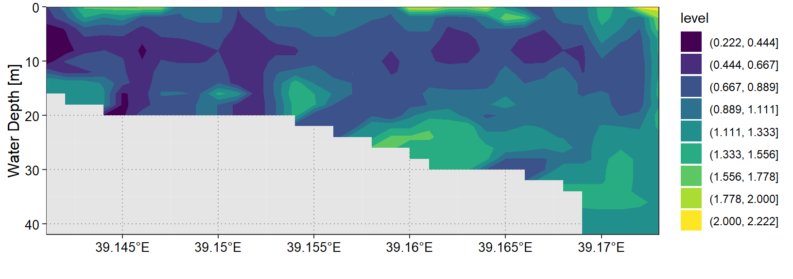
Figure 5: heatmap with default viridis color
You may might not be interested with default viridis color that from geom_contour_filled function (figure 5). The customized figure 6 was generate used the chunk below.
transect.gg  +
  scale_fill_manual(values = pal,  labels = seq(0.304,2.129, length.out = 10) %>% round(2))+
  guides(fill = guide_legend(title.position = "right",direction = "vertical",
                               title.theme = element_text(angle = 90, size = 12, colour = "black"),
                               barheight = .5, barwidth = .95,
                               title.hjust = 0.5, raster = FALSE,
                               title = expression(Current~velocity~(ms^{-1}))))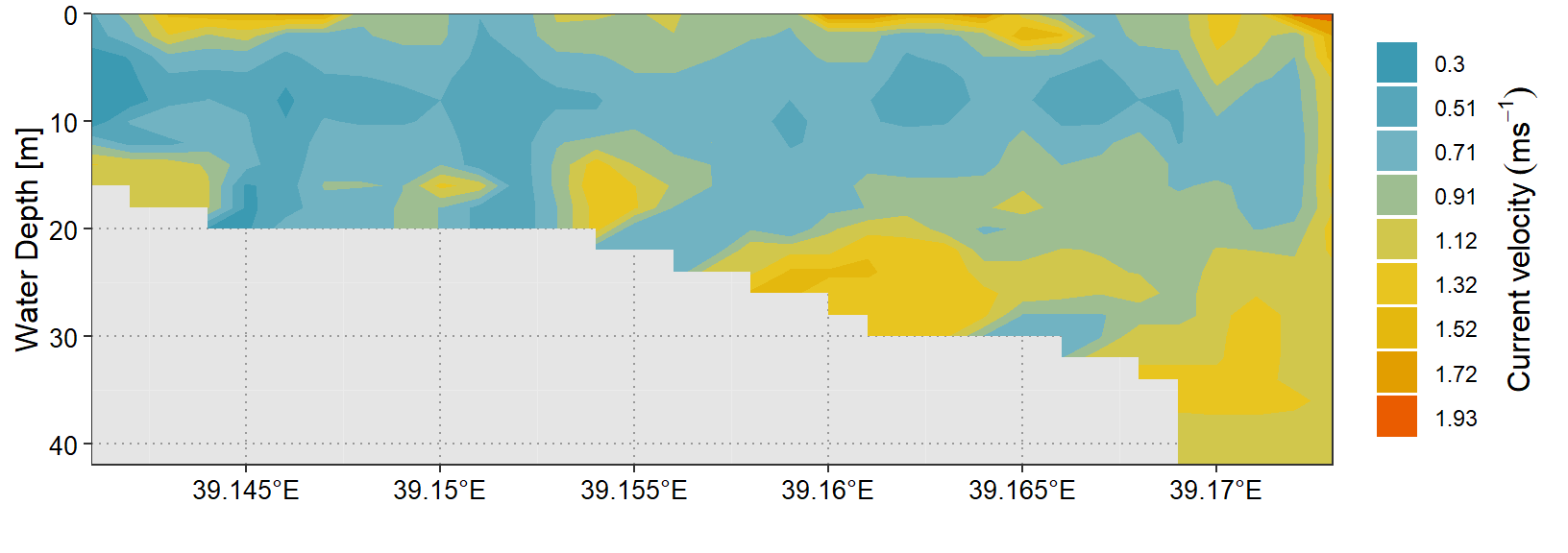
Figure 6: Heatmap with manual filled color
mycolor = c("#7f007f", "#0000ff",  "#007fff", "#00ffff", "#00bf00", "#7fdf00",
            "#ffff00", "#ff7f00", "#ff3f00", "#ff0000", "#bf0000")
References
Campitelli, Elio. 2019. MetR: Tools for Easier Analysis of Meteorological Fields. https://CRAN.R-project.org/package=metR.
Ram, Karthik, and Hadley Wickham. 2018. Wesanderson: A Wes Anderson Palette Generator. https://CRAN.R-project.org/package=wesanderson.
R Core Team. 2018. R: A Language and Environment for Statistical Computing. Vienna, Austria: R Foundation for Statistical Computing. https://www.R-project.org/.
Wickham, Hadley. 2016. Ggplot2: Elegant Graphics for Data Analysis. Springer-Verlag New York. http://ggplot2.org.
Wickham, Hadley, Jim Hester, and Romain Francois. 2017. Readr: Read Rectangular Text Data. https://CRAN.R-project.org/package=readr.