Introduction
I recently came across a map showing the climatological annual distribution of rainfall shown in figure 1. I was fascinated with the visual appeal of this map. The map clearly convey the message with clarity, simplicity and visual appeal, which spark my thinking and paused for a moment to figure out how could I make a similar plot like figure 1, which was made in MATLAB in R?.
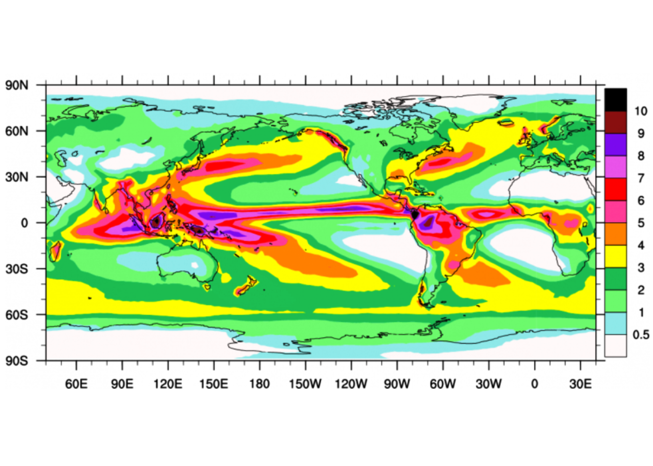
Figure 1: Climatological annual mean precipitation (mm/day) for 1979-2010
For those who are unfamiliar with R or who have a broad experience of working with MATLAB, R has two major paradigms for producing plots. The first is the base graphics system—the sequence of functions bundled with R that are part of the graphics package, which is core and install automatically when you install the software. The second paradigm is the ggplot2 package, written and maintained by (2016), which use the the grammar of graphics approach to make maps and plots. The ggplot2 is specifically designed to work with data stored in tabular format like the data frame or tibble.
One thing that I always like the ggplot2 package approach is that the plots are made by adding layer on top of the previous layer. Therefore, this post is not focusing on anything oceanographic, but on a little trick on making a map that get the message across with the clarity, simplicity and visual appeal. We intend to use R to make map similar to figure 1, which was made in MATLAB.
Handling data
Before you start working on the visual part of any visualization, you acctully need data. The data is what makes a visualization interesting. For this post we use the Global Precipitation Climatology Project (GPCP) Monthly Analysis Product, which was accessed from this link. Further information about the dataset can obtained from NOAA website through this link. In addition to precipitation dataset, we need the shapefile data that show the continents of the global.
Required packages
Obviously, we need to load the tidyverse (Wickham 2017) together with the metR (Campitelli 2019), sf (Pebesma 2018) and lubridate (Grolemund and Wickham 2011) package. note that I’m using the latest version of these package.
require(metR)
require(tidyverse)
require(sf)
require(lubridate)
require(ncdf4)
If you are new to netCDF files, they can be a little overwhelming. We can use the ncdump::NetCDF() function to obtain information about the NetCDF file in a convinient form. From table 1, we notice that the precipitation dataset has four variables time, lat, lon, and precip. The length of each of these variables are presented in table 2.
meta = ncdump::NetCDF("./precip.mon.mean.nc")

meta$variable %>% select(name, units, longname) %>% knitr::kable(caption = "Variables present in the precipitation dataset")| Variable | Units | Long name |
|---|---|---|
| time_bnds | days since 1800-01-01 00:00:00 0:00 | time_bnds |
| lat_bnds | degrees_north | lat_bnds |
| lon_bnds | degrees_east | lon_bnds |
| precip | mm/day | Average Monthly Rate of Precipitation |
meta$dimension %>% select(name, len,) %>% slice(1:3) %>%
  kableExtra::kable(format = "html",caption = "Dimensions of the variable in the precipitation dataset ",
                    col.names = c("Variable name", "length")) %>%
kableExtra::column_spec(column = 1:2, width = "5cm")| Variable name | length |
|---|---|
| lat | 72 |
| lon | 144 |
| time | 483 |
Once we have the information about the file, We can then use the nc_open() function from ncdf4 package (Pierce 2017) to read netCDF file.
trmm = nc_open("e:/Data Manipulation/trmm_precipitation/precip.mon.mean.nc")Then call ncvar_get to read the data from a variable in the file. The time is in julian format and since we know the begin time, we can convert the the original time to julian and the add it to the julian day. Once we have the time in the right format, we convert them into gregorian calendar. The insol package (Corripio 2014) provide the functions for date conversion from julian to gregorian.
lon= ncdf4::ncvar_get(trmm, "lon")
data = ncdf4::ncvar_get(trmm, "precip")
lat= ncdf4::ncvar_get(trmm, "lat")
t= ncdf4::ncvar_get(trmm, "time")

## convert the original date to julian and add the julian day
time = insol::JD(lubridate::ymd("18000101", tz = ""))+t

## convert julian to gregorian date
date = insol::JD(time, inverse = TRUE) %>% as.Date()
We can check the length and dimension of the variables using the length() and dim() functions. We notice that there 144 spacing of longitude and 72 spacing of latitude for over 483 months between 1978-12-31 an 2019-02-28
length(lon); length(lat);length(date);dim(data)[1] 144[1] 72[1] 483[1] 144 72 483Formatting data
Different visualization tools use different data formats, and the structure you use varies by the story you want to tell. Most people are used to working with data in Excel and ggplot2 capitalize on this idea of working with data structured in tabular format like Excell. unfortunate, the precipitation dataset downloaded as netcdf format. That means to make use of this dataset, we ought to convert the data from the original format to ggplot2–readable. R has bunch of tools to assist with that. However, I created several function to smooth to process that extends the data manipulation in R. The file contains three main functions that we will use. These include
matrix_tb: convert matrix into data frameFirstCap: Capitalize the first letter of the word. This is an extension of thetoupper()andtolower()gridding_semba: used to interpolate irregular points into equal spaced regular grids. The extended functions in R can be load with thesource()function.
source("./semba_functions.R")We then convert the matrix in array representing precipitation for each month into a data frame and store them in the list file.
trmm.tb = list()

for (n in seq_along(date)){
trmm.tb[[n]] = matrix_tb(lon, lat, data[,,n])%>%
  mutate(date = date[n]) %>%
  select(date, lon = x, lat = y, rain = value)

}
Then we unlist the data frame and arrange them in rows and convert the longitude format from 0–360 to -180 to 180 degrees as shown in table 3.
trmm.tb = trmm.tb %>%
  bind_rows() %>%
mutate(lon = lon)| Date | Longitude | Latitude | Rainfall |
|---|---|---|---|
| 1991-03-31 | 28.75 | 8.75 | 2.2924082 |
| 1994-11-30 | 91.25 | -63.75 | 1.4881935 |
| 1996-10-31 | 158.75 | -66.25 | 0.7802227 |
| 1997-11-30 | 236.25 | 88.75 | 0.3195865 |
| 2003-10-31 | 3.75 | -36.25 | 1.6928258 |
| 2008-11-30 | 223.75 | -21.25 | 3.0226760 |
| 2010-06-30 | 358.75 | 36.25 | 0.0739706 |
| 2018-01-31 | 11.25 | 76.25 | 4.0491910 |
To obtain the global climatological annual precipitation value, we used group_by() and summarise() functions from dplyr (Wickham et al. 2018) package as highlighted in the chunk block below
trmm.tb.climatology = trmm.tb %>%
  group_by(lon,lat) %>%
  summarise(rain.mean = mean(rain, na.rm = TRUE)) %>%
  ungroup()
Once we have the precipiation data set computed and arranged in the data frame, we import the shapefile of the continent boundary with st_read() function from sf package
world = st_read("./afcntry.shp")Plotting with ggplot2
Once we have the rain data in data frame, we can use the ggplot2 and metR functions to map the distribution of rain over the global as figure 1. First we plot the precipitation as filled contour with metR::geom_contour_fill() and add the continent shapefile with the geom_sf() function. Then, add other layers to make the map visually appealing. The chunk below highlight the code that was used to make figure 2
ggplot()+
  geom_contour_fill(data = trmm.tb.climatology %>% filter(lat > -62 & lat < 62),
                    aes(x = lon, y = lat, z = rain.mean), bins = 12)+
  scale_fill_gradientn(colors = oce::oceColorsVorticity(120), limits = c(0.5,10), breaks =seq(0,11,1.5))+
  geom_sf(data = spData::world, fill = NA, col = NA)+
  coord_sf(expand = FALSE, xlim = c(10,358), ylim = c(-61,61))+
  # scale_x_continuous(breaks = seq(-150,150,50))+
  scale_y_continuous(breaks = seq(-60,60,30))+
  guides(fill = guide_legend(title = "mean rainfall (mm/day)",
                             keyheight = 1.55,
                             title.position = "right",
                             title.theme = element_text(angle = 90, size = 12)))+
  theme_bw()+
  theme(axis.text = element_text(size = 11, colour = 1))+
  labs(x = NULL, y = NULL)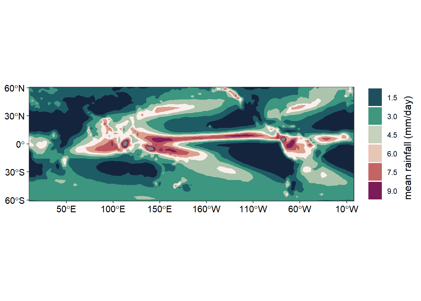
Figure 2: Climatological annual mean precipitation (mm/day) for 1979-2010
Conclusion
We have seen that combining the function from metR package with gfunctions from gplot2 package, we are able to make maps that show the distribution of precipitation around the global. From figure 2, we notice that the regions that receive high rainfall are those close to the equator.
References
Campitelli, Elio. 2019. MetR: Tools for Easier Analysis of Meteorological Fields. https://CRAN.R-project.org/package=metR.
Corripio, Javier G. 2014. Insol: Solar Radiation. https://CRAN.R-project.org/package=insol.
Grolemund, Garrett, and Hadley Wickham. 2011. “Dates and Times Made Easy with lubridate.” Journal of Statistical Software 40 (3): 1–25. http://www.jstatsoft.org/v40/i03/.
Pebesma, Edzer. 2018. Sf: Simple Features for R. https://CRAN.R-project.org/package=sf.
Pierce, David. 2017. Ncdf4: Interface to Unidata netCDF (Version 4 or Earlier) Format Data Files. https://CRAN.R-project.org/package=ncdf4.
Wickham, Hadley. 2016. Ggplot2: Elegant Graphics for Data Analysis. Springer-Verlag New York. http://ggplot2.org.
———. 2017. Tidyverse: Easily Install and Load the ’Tidyverse’. https://CRAN.R-project.org/package=tidyverse.
Wickham, Hadley, Romain François, Lionel Henry, and Kirill Müller. 2018. Dplyr: A Grammar of Data Manipulation. https://CRAN.R-project.org/package=dplyr.