Introduction
Bar plots with error bars are very frequently used plots in sciences to represent the variation in a continuous variable within one or more categorical variables. Error bars give a general idea of how precise a measurement is, or conversely, how far from the reported value the true (error free) value might be. If the value displayed on your barplot is the result of an aggregation (like the mean value of several data points), you may want to display error bars. These are not always straightforward to make with the base functions in R. In this post I illustrate plotting bar and point with error bars with the ggplot2 package (Wickham 2016).
There essential three values—standard deviation, Standard error or confidence Interval that are widely used to represent the variation of the values from the mean. Sometimes scientist never mention which one is used. It is important to understand them and how they are calculated, since they give very different results. For the purpose of time, I will only focus on the standard deviation to illustrate the point in this post. We first need to load the tidyverse package that house several package for import, manipulate and visualize the data. We simply load the functions of the package using the require function.
require(tidyverse)Dataset
In this post, I use the dataset from colleague that represent the concentration of ammonia \(NH_4-N\) collected from Pemba, Zanzibar and Mafia Channel along the coastal waters of Tanzania. The data is stored in Excel spreadsheet. Let’s first import the dataset from the local directory of my machine into R session. This is done using the read_excel function from the readxl package (Wickham and Bryan 2018)
nutrients = readxl::read_excel("/data_rearranged_semba.xlsx", sheet = 3)To contrast a variable across site and sampling time, we first need to summaries the data to obtain means and a measure of variation of ammonia for each of the three sites during the sampling period in the data set. There are several ways to do this in R, but we like the summarise and group_by functions in the dplyr(Wickham et al. 2018) . The code in the chunk below summarize the data set presented in table below
nutrients = nutrients %>%
  group_by(month, site) %>%
  summarise(value = mean(ammonia),
            error = sd(ammonia)) %>%
  ungroup()
We can now make a bar plot of means of ammonia concentration during the sampled period with standard deviations as the error bar and color them with channel. The following code uses the standard deviations. The code in the chunk below was used to make figure 1. In a nutshell, the bar was created with the geom_col function. The function geom_col uses the value of the y variable (mean_PL) as the height of the bars.
Then, add an extra layer using the geom_errorbar function, which takes at least 3 arguments in its aesthetics—ymin and ymax, which define the position of the bottom and the top of the error bar respectively. Note that within the geom_errorbar function, ymin and ymax are the top and bottom of the error bars (defined here as mean \(\pm\) sd), and width defines how wide the error bars are.
nutrients %>%
  ggplot(aes(fill= site, y = value, x = as.factor(month)))+
  geom_col(position = "dodge")+
  geom_errorbar(aes(ymin = value-error, ymax = value+error),
                position = position_dodge(0.9), width = .3)+
  scale_x_discrete(name = "", label = c("Apr 2012", "Sep 2012" ,"Jan 2013" ,
                             "Apr 2013", "Sep 2013", "Jan 2014"))+
  ggsci::scale_fill_jco(name = "Site")+
  ggpubr::theme_pubclean()+
  theme(axis.title.x = element_blank(), legend.position = "right")+
  coord_cartesian(expand = FALSE)+
  scale_y_continuous(breaks = seq(20,110,20), name = expression(NH[4]-N))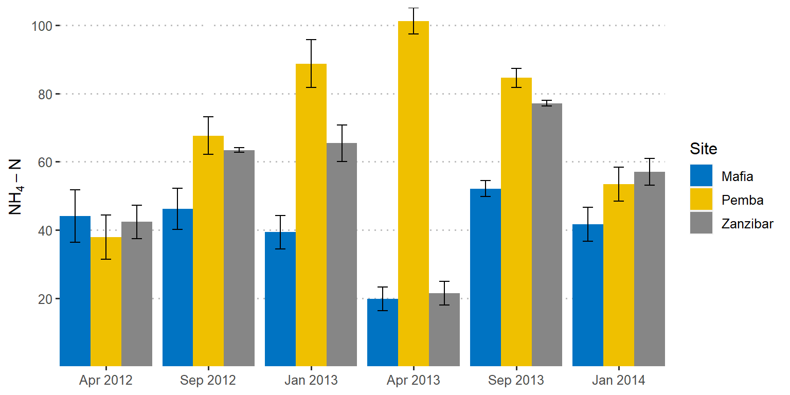
Figure 1: Barplot showing the mean values with standard deviation as error. Error bars in both sides
Sometimes you may wish to only show the position of the top of the error bar and hide the bottom error as seen in figure 2. That is easily done by supplying only the mean value in the ymin argument when add an extra layer using the geom_errorbar as the chunk below illustrates;
nutrients %>%
  ggplot(aes(fill= site, y = value, x = as.factor(month)))+
  geom_col(position = "dodge")+
  geom_errorbar(aes(ymin = value, ymax = value+error, col= site),
                position = position_dodge(0.9), width = .3)+
  scale_x_discrete(name = "", label = c("Apr 2012", "Sep 2012" ,"Jan 2013" ,
                             "Apr 2013", "Sep 2013", "Jan 2014"))+
  ggsci::scale_fill_jco(name = "Site")+
  ggsci::scale_color_jco(name = "Site")+
  ggpubr::theme_pubclean()+
  theme(axis.title.x = element_blank(), legend.position = "right")+
  coord_cartesian(expand = FALSE)+
  scale_y_continuous(breaks = seq(20,110,20), name = expression(NH[4]-N))
Figure 2: Barplot showing the mean values with standard deviation as error. Errors in top side
You can also use geom_point instead of geom_bar if you want the error bars to plot on points as in figure 3 generated using the lines of code in the chunk below;
nutrients %>%
  ggplot(aes(col= site, y = value, x = as.factor(month)))+
  geom_point(position = position_dodge(0.4), size = 4)+
  geom_errorbar(aes(ymin = value-error, ymax = value+error),
                position = position_dodge(0.4), width = .3)+
  scale_x_discrete(name = "", label = c("Apr 2012", "Sep 2012" ,"Jan 2013" ,
                             "Apr 2013", "Sep 2013", "Jan 2014"))+
  ggsci::scale_color_jco(name = "Site")+
  ggpubr::theme_pubclean()+
  theme(axis.title.x = element_blank(), legend.position = "right",
        legend.key = element_blank())+
  scale_y_continuous(breaks = seq(20,110,20), name = expression(NH[4]-N))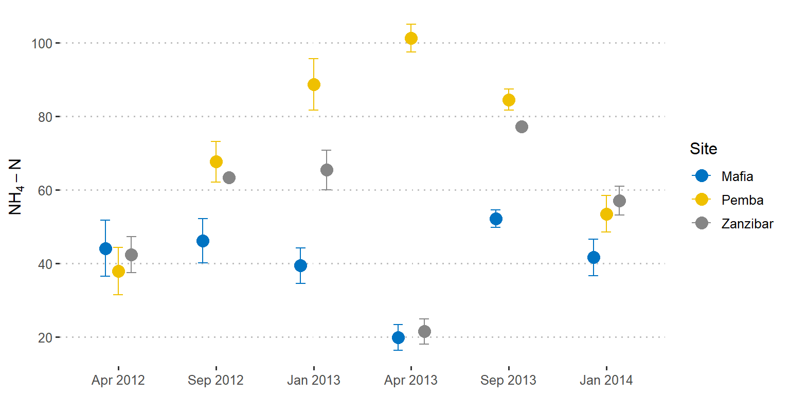
Figure 3: Point plots showing the mean values with standard deviation as error
References
Wickham, Hadley. 2016. Ggplot2: Elegant Graphics for Data Analysis. Springer-Verlag New York. http://ggplot2.org.
Wickham, Hadley, and Jennifer Bryan. 2018. Readxl: Read Excel Files. https://CRAN.R-project.org/package=readxl.
Wickham, Hadley, Romain François, Lionel Henry, and Kirill Müller. 2018. Dplyr: A Grammar of Data Manipulation. https://CRAN.R-project.org/package=dplyr.