One major task for scientists in their daily routine is to prepare graphics for technical document, reports or manuscripts for publication. Graphics in form of figures carry the weight of the arguments. They need to be clear, attractive and convincing. according to [@], the difference between good and bad figures always lead into the difference between a highly influential or an obscure paper; a grant/contract won or lost; and a job interview gone well or poorly.
For the last ten years I have squeezed myself into preparing figures for scientific publications and have made throusands of figures. Honestly to say that over this period I have switched from one software to the other in figure preparation pipeline. I made figures using Microsoft Excel, OriginPro, SPSS, Matlab, SigmaPlot, matplotlib in python, base R, ggplot2 in R and many others. However, my current preferred tool for making graphics is the ggplot2 package in R. However, looking on the spectrum over the last ten years and the constant switch from one software/tools to the other, I dont expect that I will continue using ggplot2 for the next ten years.
One thing I have learned over the years is that automation should be the main skills for scientists. Because automation serve time for prepare and analyse data. It also remove the barrier of repeative production of figures and statistical results. In this post I will show you how to visualize vector field of ocean surface current using the ggplot2 package (Wickham 2016). I will further highlight the drawbacks of the default geom of ggplot2 and why sometimes ggplot2 functions fail to produce elegant oceanographic plots. Last I will illustrate the use of alternative geoms from metR package (Campitelli 2019) to overcome the challenges inherited in ggplot2 package.
require(metR)
require(tidyverse)
require(lubridate)
require(oce)
require(ocedata)
require(sf)
Dataset
The drifter dataset contain surface current information linked to locations in the physical world. This spatial information help us to understand where the high speed current versus low speed current are found in the ocean. It is helpful to visualize this kind of data in the proper geospatial context i.e to show the data on a realistic map. I have filtered the data to cover the western part of the tropical indian ocean. I prepared and arrange drifter information in data frame—a rectangular collection of variables (columns) and observations (rows). The dataset contains observation of surface current world wide collected by the Global Drifter Program on all major oceans. Among the variables in the dataset are shown in table 1 include:
- id: a unique number of drifter
- lon: longitude information
- lat: latitude information
- year, month, day, hour of the drifter records
- u: the zonal component of surface current
- v: the meridional component of the surface current
| id | lon | lat | year | month | day | hour | u | v |
|---|---|---|---|---|---|---|---|---|
| 114807 | 51.19 | -16.58 | 2013 | 6 | 7 | 0 | 0.23 | 0.19 |
| 63945810 | 50.99 | -4.53 | 2017 | 12 | 30 | 18 | 0.53 | 0.52 |
| 64726990 | 40.03 | -6.82 | 2017 | 7 | 1 | 18 | -0.64 | 1.40 |
| 109535 | 47.32 | -5.43 | 2014 | 11 | 20 | 18 | -0.13 | -0.26 |
| 9727912 | 42.50 | -9.83 | 1998 | 10 | 3 | 6 | -0.08 | 0.16 |
| 25006 | 52.43 | -11.27 | 2001 | 8 | 5 | 12 | -0.27 | 0.11 |
| 63356010 | 45.10 | -6.74 | 2017 | 4 | 16 | 18 | 0.64 | 0.16 |
| 63816 | 51.43 | -4.45 | 2009 | 10 | 23 | 12 | 0.17 | 0.31 |
| 45979 | 44.52 | -12.50 | 2005 | 5 | 14 | 0 | -0.37 | -0.19 |
| 52953 | 47.45 | -11.91 | 2005 | 1 | 16 | 12 | -0.09 | -0.11 |
| 63071 | 50.12 | -4.17 | 2008 | 1 | 10 | 18 | 0.15 | -0.13 |
| 61478290 | 53.84 | -12.38 | 2016 | 1 | 4 | 18 | -0.32 | -0.03 |
The drifter observations were randomly distributed within the area as shown in figure 1 and requires binning—a process of making equal size grid in the area.
## convert drifter observation into simple features
drifter.split.sf = drifter.split %>%
  st_as_sf(coords = c("lon", "lat")) %>%
  st_set_crs(4326)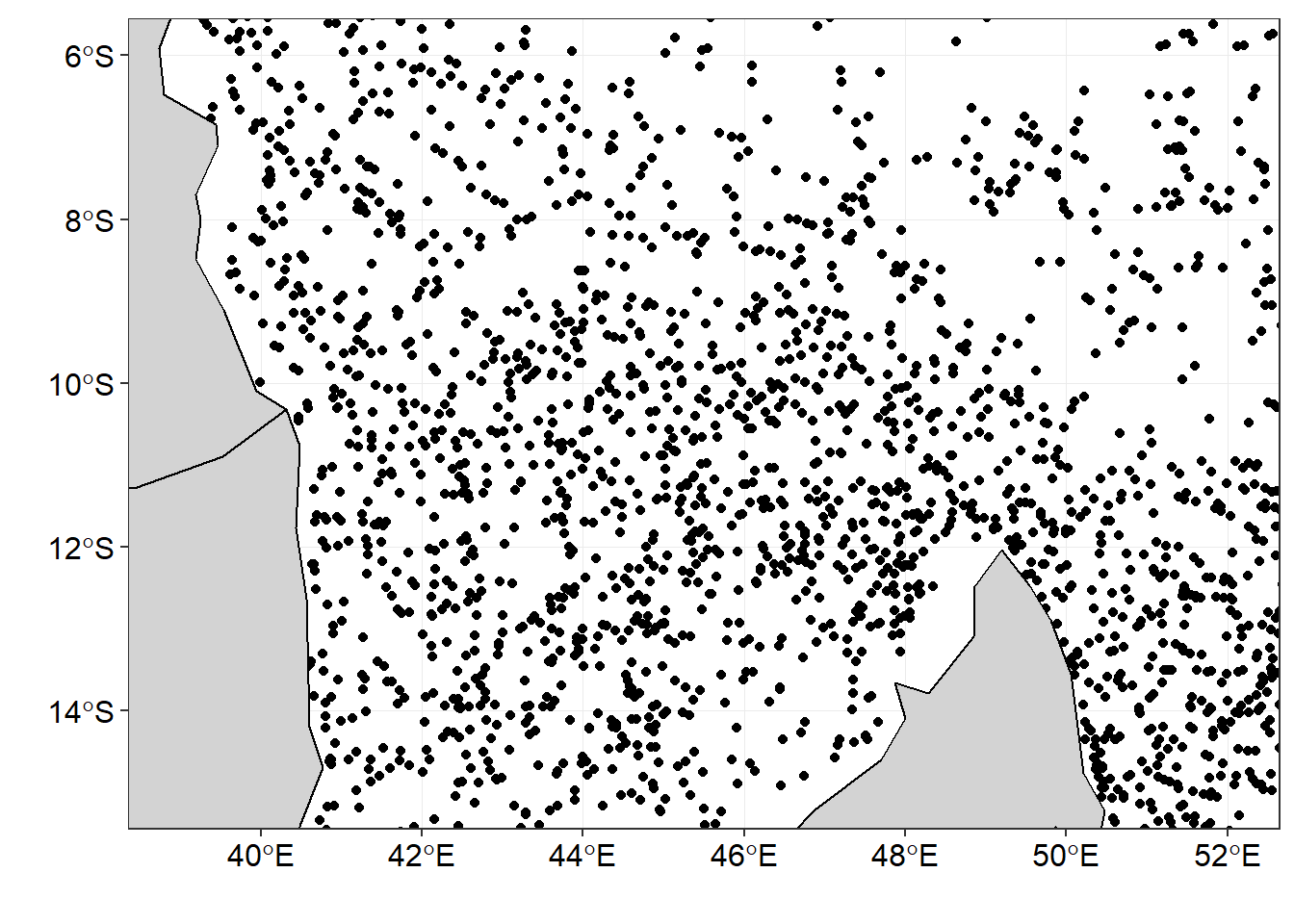
Figure 1: The distribution of drifter observation within the area
To minimize biasness of sampling, the area was divided into equal size grids show in in figure 2.
## divide the tropical indian ocean region into grids
drifter.grid = drifter.split.sf %>%
  st_make_grid(n = c(70,60))%>%
  st_sf()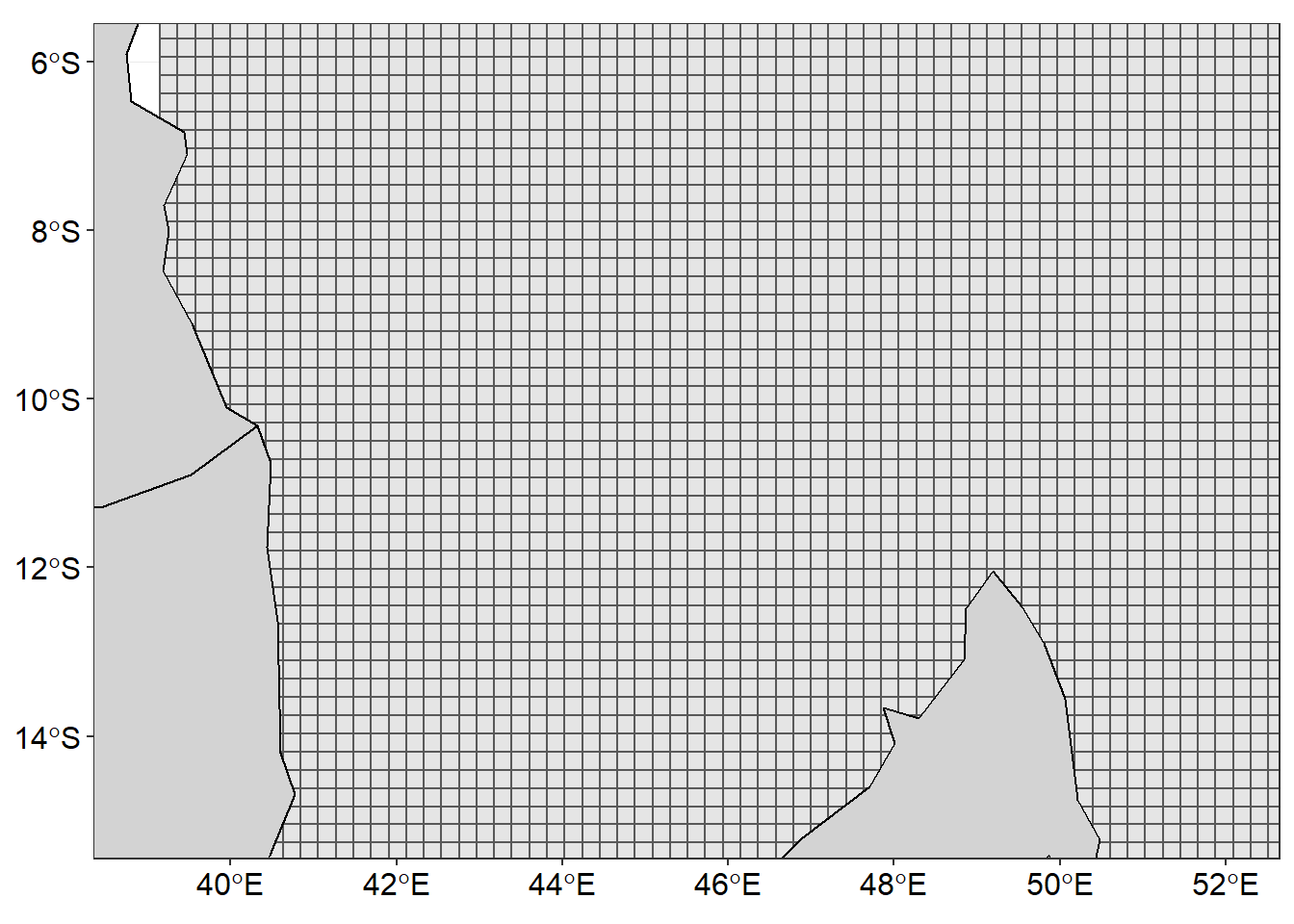
Figure 2: Gridded area to fill drifter observations
Once the area was gridded, then the the mean value of U and V component and the number of observation were calculated in each grid cell.
drifter.split.sf.se = drifter.split.sf%>% filter(season=="SE")

drifter.gridded = drifter.grid %>%
  mutate(id = 1:n(), contained = lapply(st_contains(st_sf(geometry),drifter.split.sf.se),identity),
         obs = sapply(contained, length),
         u = sapply(contained, function(x) {median(drifter.split.sf.se[x,]$u, na.rm = TRUE)}),
         v = sapply(contained, function(x) {median(drifter.split.sf.se[x,]$v, na.rm = TRUE)}))
Then convert the gridded drifter information into data frame
drifter.gridded = drifter.gridded %>% select(obs, u, v) %>% na.omit()

## obtain the centroid coordinates from the grid as table
coordinates = drifter.gridded %>%
  st_centroid() %>%
  st_coordinates() %>%
  as_tibble() %>%
  rename(x = X, y = Y)

## remove the geometry from the simple feature of gridded drifter dataset
st_geometry(drifter.gridded) = NULL

## stitch together the extracted coordinates and drifter information int a single table for SE monsoon season
current.gridded.se = coordinates %>%
  bind_cols(drifter.gridded) %>%
  mutate(season = "SE")

## bind the gridded table for SE and NE
## Note that similar NE follow similar procedure, hence not shown in the post
drifter.current.gridded = current.gridded.ne %>%
  bind_rows(current.gridded.se)
After binning, we found that some grids lack the drifter information, therefore, these grids were filled with the U, V values using the Interpolation technique. The chunk below highlight the code for the process
## select grids for SE season only
drf.se = drifter.current.gridded %>%
  filter(season == "SE")

## interpolate the U component
u.se = interpBarnes(x = drf.se$x, y = drf.se$y, z = drf.se$u)

## obtain dimension that determine the width (ncol) and length (nrow) for tranforming wide into long format table
dimension = data.frame(lon = u.se$xg, u.se$zg) %>% dim()

## make a U component data table from interpolated matrix
u.tb = data.frame(lon = u.se$xg,
                  u.se$zg) %>%
  gather(key = "lata", value = "u", 2:dimension[2]) %>%
  mutate(lat = rep(u.se$yg, each = dimension[1])) %>%
  select(lon,lat, u) %>% as.tibble()

## interpolate the V component
v.se = interpBarnes(x = drf.se$x,
                    y = drf.se$y,
                    z = drf.se$v)

## make the V component data table from interpolated matrix
v.tb = data.frame(lon = v.se$xg, v.se$zg) %>%
  gather(key = "lata", value = "v", 2:dimension[2]) %>%
  mutate(lat = rep(v.se$yg, each = dimension[1])) %>%
  select(lon,lat, v) %>%
  as.tibble()

## stitch now the V component intot the U data table and compute the velocity
uv.se = u.tb %>%
  bind_cols(v.tb %>% select(v)) %>%
  mutate(vel = sqrt(u^2+v^2))
Visualising Vector field
Figure 3 was made with ggplot2 package. The smoothed velocity grid was created with the geom_raster() function and the vector field showing the direction and speed superimposed on the current velocity was done with the segment() function. You notice that these geoms did a wonderful job and the figure is surface current speed and direction are clearly distinguished with the arrow and the length of the arrow. The code used to create figure 3 are shown in the chunk below.
ggplot() +
  geom_raster(data = uv.se, aes(x = lon, y = lat, fill = vel), interpolate = TRUE)+
  geom_segment(data = uv.se, aes(x = lon, xend = lon + u/1.2, y = lat, yend = lat+v/1.2),
               arrow = arrow(angle = 20, length = unit(.2, "cm"), type = "open"))+
  geom_sf(data = wio,fill = "lightgrey", col = "black")+
  coord_sf(ylim = c(-15,-6), xlim = c(39, 52))+
  scale_fill_gradientn(name = "Speed\n(m/s)",colours = oceColorsVelocity(120),
                       limits = c(0,1.6), breaks =seq(0.1,1.6,.3))+
  theme_bw()+
  theme(legend.position = "right",
        legend.key.height = unit(1.4, "cm"),
        legend.background = element_blank(),
        axis.text = element_text(size = 12, colour = 1))+
  labs(x = "", y = "")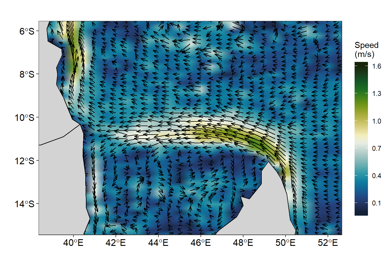
Figure 3: Vector field showing speed and direction of surface current created with ggplot2 package
Figure 4 is similar to Figure 3 but created with different geoms. Unlike Figure 3 that was created with the geom_raster() and geom_segment() functions, Figure 4 was made using the geom_contour_fill() function for smoothed contour of current velocity and the vector field was made with geom_vector() function. You can see a very clear difference between Figure 3 and Figure 4. In figure 3 only the current speed is (length) of the arrow differs but the head arrow remain the same for all the segments. But in figure 4, the speed and direction are distinguished by the both the arrow and the head of the segment.
ggplot() +
  metR::geom_contour_fill(data = uv.se, aes(x = lon, y = lat, z = vel), na.fill = TRUE, bins = 70) +
  metR::geom_vector(data = uv.se, aes(x = lon, y = lat, dx = u, dy = v),
                    arrow.angle = 30, arrow.type = "open", arrow.length = .5,
                    pivot = 0,preserve.dir = TRUE, direction = "ccw")+
   geom_sf(data = wio,fill = "lightgrey", col = "black")+
  coord_sf(ylim = c(-15,-6), xlim = c(39, 52))+
  scale_fill_gradientn(name = "Speed\n(m/s)",colours = oceColorsVelocity(120),
                       limits = c(0,1.6), breaks =seq(0.1,1.6,.3))+
  theme_bw()+
  theme(legend.position = "right",
        legend.key.height = unit(1.2, "cm"),
        legend.background = element_blank(),
        axis.text = element_text(size = 12, colour = 1))+
  scale_mag(max = 1.5, name = "Speed", max_size = 0.7)+
  labs(x = "", y = "")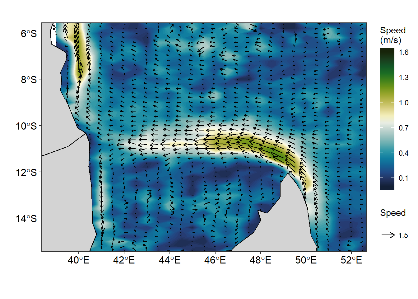
Figure 4: Vector field showing speed and direction made with metR package
The artifacts of geom_raster() function when the argument interpolate = TRUE is applied is very visible (Figure 5a). This artifact is easily handled with the function geom_contour_fill() from metR package, which produce a smoothed surface velocity (figure 5b).
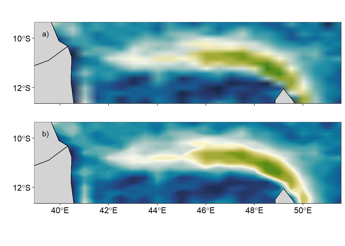
Figure 5: Smoothed velocity using a) geom_raster() and b) geom_contour_fill() functions
The geom_segment() and geom_contour_fill() function both produce an elegant vector field that represent the speed and direction of surface current. However, when you wish to produce streamlines of surface current speed and direction, the two geoms are unable to derive that product. Thanks to Campitelli (2019) for developing a powerful geom_streamline() function that handle that issue. The figure 6 was created with geom_streamline() function to make path that are tangential to a vector field. The streamlines of surface current in figure 6 are similar to massless that moves with the flow.
ggplot() +
  metR::geom_contour_fill(data = uv.se, aes(x = lon, y = lat, z = vel),
                          na.fill = TRUE, bins = 70) +
  metR::geom_streamline(data = uv.se,
                        aes(x = lon, y = lat, dx = u, dy = v),
                        L = 1.75, res = .9, n = 40, jitter = 4)+
  geom_sf(data = wio,fill = "lightgrey", col = "black")+
  coord_sf(ylim = c(-15,-6), xlim = c(39, 52))+
  scale_fill_gradientn(name = "Current",colours = oceColorsVelocity(120),
                       limits = c(0,1.6), breaks = seq(0.1,1.6,.3))+
  theme_bw()+
  theme(legend.position = "right",
        legend.key.height = unit(1.4, "cm"),
        legend.background = element_blank(),
        axis.text = element_text(size = 12, colour = 1))+
  labs(x = "", y = "")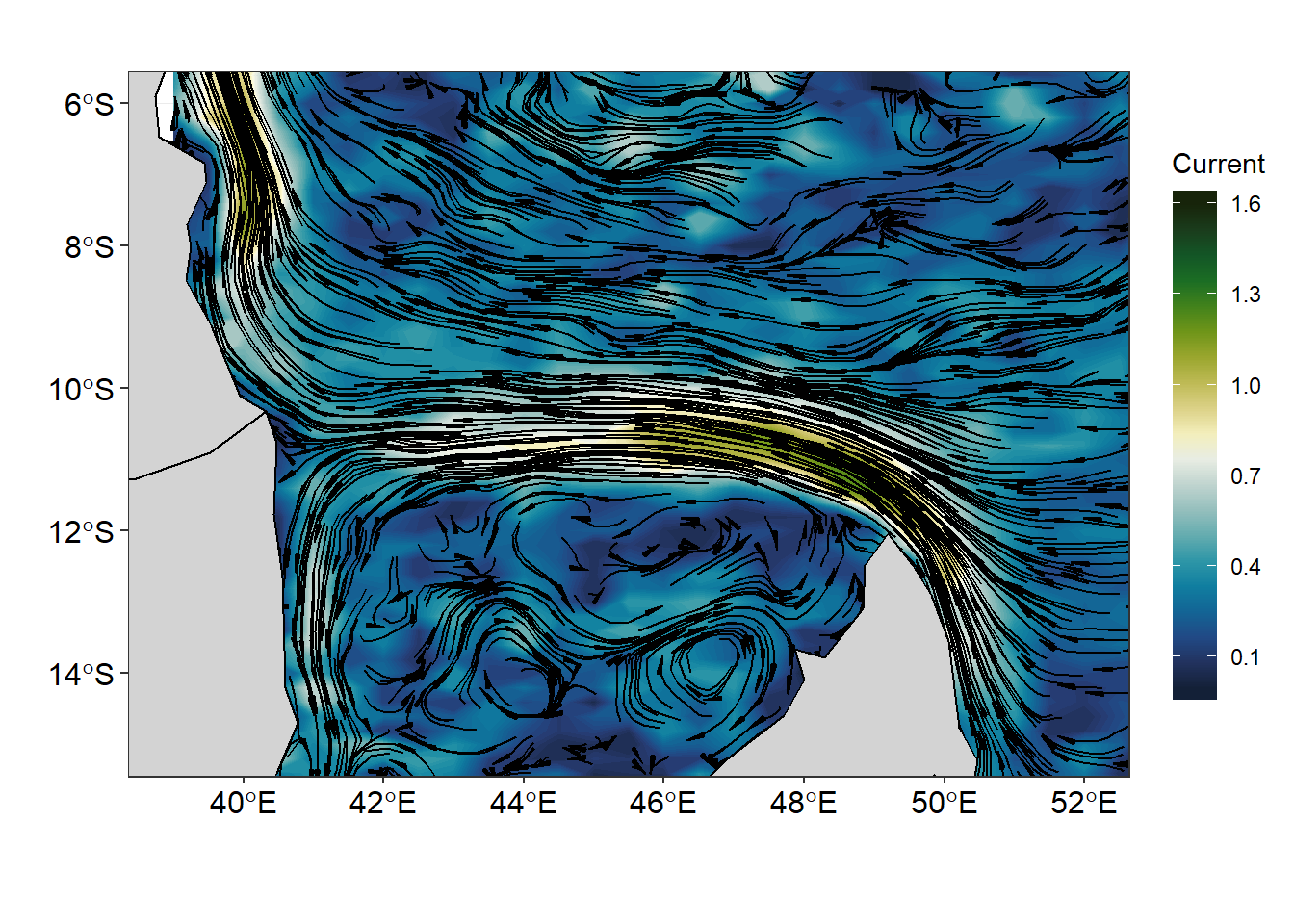
Figure 6: Streamline showing the flow of surface current superimposed on the current velocity
Conclusion
Many Oceanographic data are defined in a longitude–latitude grid and and though geom_raster() and geom_segment() plot these field well, but the function from metR package extend the use of ggplot to deal well with oceanographical data and produce graphics that meet the standard. The massless flow of surface current are much clear when stremline are used to plot the figure (figure 7). The eddies within the Mozambique channel that were not visible using in vector fields (figure 3 & 4) are quite clear in figure 7. The lines of codes used to make figure 7 are shown in the chunk below.
ggplot()+
metR::geom_streamline(data = uv.se,
                        aes(x = lon, y = lat, dx = u, dy = v,
                            color = sqrt(..dx..^2 + ..dy..^2),
                            alpha = ..step..),
                      L = 2, res = 2, n = 60,
                      arrow = NULL, lineend = "round")+
  geom_sf(data = wio,fill = "lightgrey", col = "black")+
  coord_sf(ylim = c(-15,-6), xlim = c(39, 52))+
  scale_color_viridis_c(guide = "none")+
  scale_size(range = c(0.2, 1.5), guide = "none") +
  scale_alpha(guide = "none") +
  theme_bw()+
  theme(legend.position = "right",
        legend.key.height = unit(1.4, "cm"),
        legend.background = element_blank(),
        axis.text = element_text(size = 12, colour = 1))+
  labs(x = "", y = "")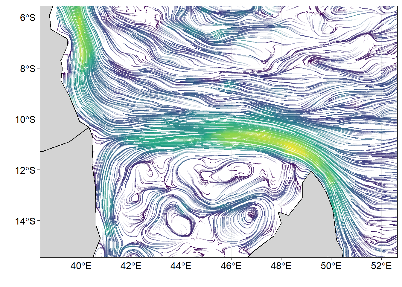
Figure 7: surface current flow from drifter observations
References
Campitelli, Elio. 2019. MetR: Tools for Easier Analysis of Meteorological Fields. https://CRAN.R-project.org/package=metR.
Wickham, Hadley. 2016. Ggplot2: Elegant Graphics for Data Analysis. Springer-Verlag New York. http://ggplot2.org.