Introduction
Shumway and Stoffer (2017) in the book with a title Time series analysis and its applications: with R examples clearly stated that when dealing with any time series analysis the first step you ought to do befure further investigation is careful examination of the recorded data. This means before looking more closely at the particular statistical methods, it is appropriate to plot the recorded data against time. This scrutiny often suggests the method of analysis as well as statistics that will be of use in summarizing the information in the data.
R has several packages to work with time series data and others for visualizing the outputs from time series process. For example, Horikoshi and Tang (2016) developed ggfortify package— an extension to ggplot2 that makes easy to plot time series objects. The package can handle the output of many time series packages, including: zoo::zooreg() (Zeileis and Grothendieck 2005), xts::xts() (Ryan and Ulrich 2018), timeSeries::timSeries(), tseries::irts() (Trapletti and Hornik 2018), forecast::forecast() (Hyndman et al. 2018), vars:vars().
Another interesting package is the ggpmisc package developed by Aphalo (2016), which provides two useful methods for time series object:
stat_peaks()finds at which x positions local y maxima are located, andstat_valleys()finds at which x positions local y minima are located.
In this post I will take you through the Here, we’ll show how to easily:
- process and visualize daily sea surface temperature for recorded between January 1997 and December 2017 near Chumbe Island in Unguja Island in the Indian ocean
- Identify shifts in mean and/or variance in a time series using the changepoint package (Killick, Haynes, and Eckley 2016).
- Identify shifts for non parametric time series object with the changepoint.np package
We first load the package into the workspace that we need for this process:
require(astsa)
require(ggfortify)
require(tidyverse)
require(ggpmisc)
require(strucchange)
require(changepoint)
require(lubridate)
require(oce)
Process sea surface temperature data
In this post we use the daily sea surface temperature collected near Chumbe Island in Unguja with a data logger for a period of 21 years —from January 01, 1997 to December 31, 2017. The data is in excel, therefore, we import the dataset into the workspace with the readxl package (Wickham and Bryan 2018).
all = readxl::read_excel("./Chumbe_SST_Temperature 1997-30Nov2017.xlsx")Once the dataset in the workspace we noticed that is in the wide format—multiple columns—each column represent a year (Table 1).
| day | 1997 | 1998 | 2001 | 2004 | 2007 | 2010 | 2013 | 2016 |
|---|---|---|---|---|---|---|---|---|
| 1997-08-02 | 25.66 | 26.00 | 24.89 | 25.30 | 25.74 | 25.48 | 25.28 | 26.35 |
| 1997-06-17 | 26.82 | 26.91 | 26.21 | 26.06 | 26.59 | 27.60 | 26.32 | 26.96 |
| 1997-02-12 | 27.19 | 28.59 | 28.29 | 28.14 | 28.60 | 28.98 | 29.02 | 27.90 |
| 1997-06-11 | 26.84 | 27.58 | 27.03 | 26.50 | 27.59 | 27.41 | 26.96 | 27.19 |
| 1997-04-25 | 28.57 | 29.95 | 28.66 | 28.68 | 28.60 | 29.30 | 28.96 | 29.49 |
| 1997-11-25 | 28.66 | 27.41 | 27.94 | NA | 28.13 | 27.61 | 28.36 | 28.35 |
| 1997-05-13 | NA | 30.19 | 28.15 | 27.95 | 28.60 | 28.50 | 28.13 | 28.62 |
| 1997-12-26 | 29.61 | 29.44 | 28.42 | 28.01 | 28.94 | 28.73 | 28.87 | 29.12 |
| 1997-07-28 | 25.63 | 25.93 | 25.36 | 25.32 | 25.92 | 25.80 | 25.75 | 26.36 |
| 1997-02-23 | 27.45 | 29.04 | 28.57 | 28.33 | 28.26 | 29.51 | 29.17 | 28.33 |
| 1997-08-05 | 25.87 | 26.08 | 25.17 | 25.36 | 25.97 | 25.45 | 25.36 | 26.37 |
| 1997-06-02 | 26.86 | 27.85 | 27.46 | 26.91 | 27.92 | 27.93 | 27.32 | 27.74 |
Time series requires the data arranged in long format, therefore, this dataset was tranformed from multiple columns format —wide format into a long format (Table 2) with a gather() function from dplyr package (Wickham et al. 2018).The chunk below highlight the transformation steps.
## change from wide form to long form with gather function
all = all %>% gather(key = "year", value = "sst", 2:22)| day | year | sst |
|---|---|---|
| 1997-01-18 | 2017 | 29.14 |
| 1997-12-07 | 1997 | 27.45 |
| 1997-01-10 | 2011 | 28.96 |
| 1997-06-21 | 1998 | 26.89 |
| 1997-01-03 | 2007 | 28.30 |
| 1997-04-11 | 2011 | 29.39 |
| 1997-04-21 | 2004 | 28.60 |
| 1997-03-31 | 2014 | 28.90 |
| 1997-07-07 | 2006 | 26.59 |
| 1997-08-01 | 2008 | 25.63 |
| 1997-10-03 | 2012 | 26.38 |
| 1997-12-18 | 2012 | 28.95 |
I noticed that the February month has been treated with 29 days for all the years. Some years are short with only 28 days. Table 1 highlight the wrongly entered temperature values for the 29th February for years which end on the 28th. Therefore all these values must be trimmed off.
index =which(all$sst> 35)

wrong.date = all %>% slice(index) | Date | Temperature |
|---|---|
| 29-02-1997 | 1000 |
| 29-02-1998 | 1000 |
| 29-02-1999 | 1000 |
| 29-02-2001 | 1000 |
| 29-02-2002 | 1000 |
| 29-02-2003 | 1000 |
| 29-02-2005 | 1000 |
| 29-02-2006 | 1000 |
| 29-02-2007 | 1000 |
| 29-02-2009 | 1000 |
| 29-02-2010 | 1000 |
| 29-02-2011 | 1000 |
| 29-02-2013 | 1000 |
| 29-02-2014 | 1000 |
| 29-02-2015 | 1000 |
| 29-02-2017 | 1000 |
To obtain the clean time series that range between January 1,1997 to December 31, 2017 and extra temperature values of wrongly entered date for short years without the 29th February were removed. This chunk below highlight code of lines that was used to clean the time series.
all.tb = all %>%
  filter(is.na(sst)) %>%
  bind_rows(all %>%
              filter(sst > 15 & sst < 40)) %>%
  separate(day, c("mwaka", "month", "siku"), sep = "-") %>%
  separate(siku, c("siku", "muda"), sep = " ") %>%
  mutate(date = make_date(year, month, siku)) %>%
  arrange(date) %>%
  select(date, sst)
When we plot the time series in heatmap showin in figure 1, I noticed missing temperature values for some years.
## define the total number of days in a year
days = 1:366
#define the total number of years as indicated by the data
years = 1997:2017


## make a matrix using the origin temperature values
all.mat = matrix(all.tb$sst, nrow = length(days))
## plot the matrix
imagep(x = years, y = days, z = all.mat %>% t(), filledContour = F,
       ylim = c(365,0),
       ylab = "Day",
       col = oceColors9A(120),
       zlab = expression(Temperature~(degree *C)))
## add contour
contour(x = years, y = days, z = all.mat %>% t(), add = TRUE, col = 1, nlevels = 3)
Figure 1: Heatmaps of daily sea surface temperature. Several days in year 1999,2000,2002,2003,2004 and 2005 miss temperature values
And since a ts() function that used to create time series object hates missing values—requires dataset with complete values, the missing values were filled with interpBarnes() function from oce packaage (Kelley and Richards 2018). The the output of interpolated temperature are shown in figure 2.
## define the total number of days in a year
days = 1:366
#define the total number of years as indicated by the data
years = 1997:2017

## create day and year variables from date
all.tb = all.tb %>% mutate(year = year(date), day.year = yday(date))

## interpolate the missing values
interpolated.temperature = interpBarnes(x = all.tb$day.year,
                                        y = all.tb$year,
                                        z = all.tb$sst,
                                        xgl = 366,
                                        ygl = 21)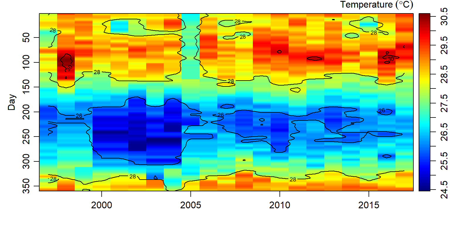
Figure 2: Temperature values interpolated sea surface temperature using the Barnes algorithm
Once we have filled the missing temperature values in the data set, we can now proceed with the creation of the time series object. Unfortunate the interpolated temperature values is in matrix format. Therefore, we convert it data frame and then remove again a day in years with only days in February. The chunk below contains the codes that was used for cleaning and transformation of the interpolated dataset.
## extracted the matrix of interpolated values
interpolated.sst.mat = interpolated.temperature$zg

## check the dimension if is 366 days and 21 years (1997:2017)
# dim(interpolated.sst.mat)

## tranform the matrix into the tabular form and combine the interpolated values with the raw
interpolated.sst.tb = interpolated.sst.mat %>%
  as.tibble()  %>%
  gather(key = "year", value = "sst",1:21)  %>%
  select(-year, sst.interp = sst)%>%
  bind_cols(all)

 ## make an index of short years of 28 days in february that appear with 29 days
 index = which(all$sst ==1000)

 ## check if the wrong days exist
 # interpolated.sst.tb %>% slice(index) ## uncomment if you want to observe those days

 ## trim off the dataset all short years with the wrong 29th February
 interpolated.sst.tb = interpolated.sst.tb %>% slice(-index)

 ## now the data is clean we can sequeance the number of days with
 interpolated.sst.tb = interpolated.sst.tb %>%
   mutate(date = seq(dmy(010197), dmy(311217), by = "day")) %>%
   select(date, sst.interp, sst.original =sst)
Visualization of Time seris
time series objects in R
To visualize time series we need first to create them. The ts() function convert a numeric vector into an R time series object. The format is ts(vector, start=, end=, frequency=) where start and end are the times of the first and last observation and frequency is the number of observations per unit time (1=annual, 4=quartely, 12=monthly,365.24=daily, etc.). Our dataset contain daily sea surface temperature observations from 1997-01-01 to 2017-12-31. The daily time series object was created with the line code in the chunk below
daily.ts = ts(data = interpolated.sst.tb$sst.interp,
                    start = c(1997,1),
                    frequency = 365.24)
We can visualize the plot with the base plot() function shwon in figure 3
daily.ts %>% plot(xlab = "", las = 1,
                  ylab = expression(Temperature~(degree*C)))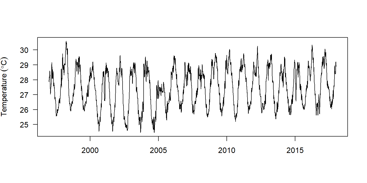
Figure 3: Daily time series plotted with the base function
We can also visualize the plot with the base tsplot() function from astsa package shwon in figure 4
daily.ts %>% tsplot(xlab = "", las = 1,
                  ylab = expression(Temperature~(degree*C)))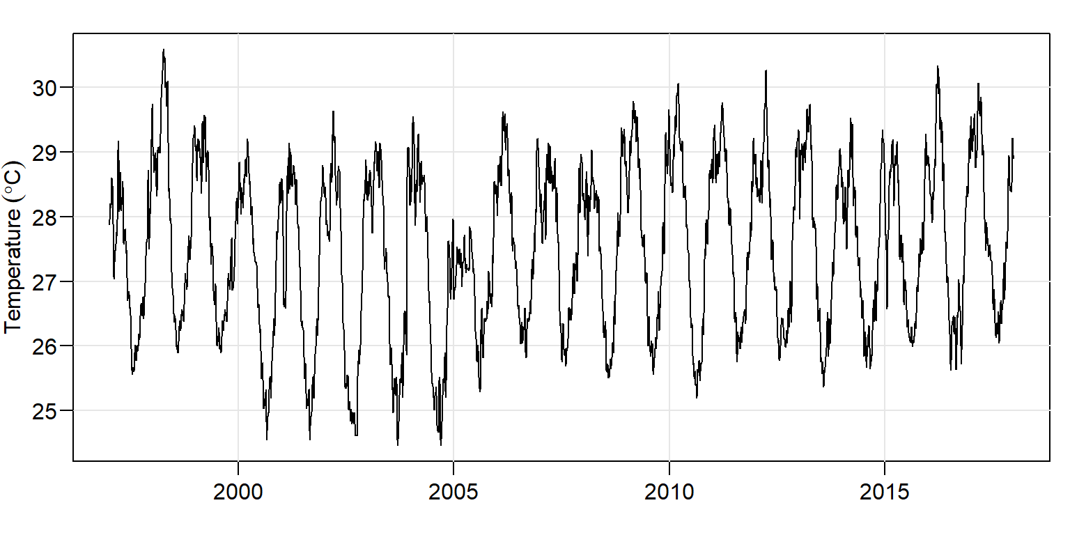
Figure 4: Daily time series plotted with the base function
The popular ggplot2 package also support direct plotting of time series object shown in figure 5 and the code for this figure is highlighted below;
ggplot(data = daily.ts)+
  geom_line()+
  theme(axis.text = element_text(size = 11, colour = "black"),
        axis.title = element_text(size = 14, colour = "black"),
        panel.border = element_rect(colour = "black", fill = NA),
        panel.background = element_rect(fill = "white"),
        panel.grid = element_blank(),
        panel.grid.major.y = element_line(colour = "grey70", size = 0.25, linetype = 3)) +
  scale_x_continuous(breaks = seq(1997,2017,2)) +
  scale_y_continuous(breaks = seq(24.5, 30.5,1.25)) +
  labs(x = "", y = expression(Anomaly~(degree*C)))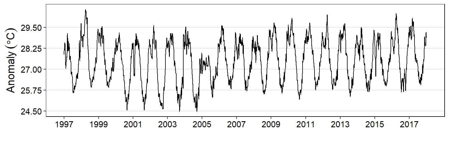
Figure 5: Daily time series plotted with the ggplot
Before ggplot2 support of time series plotting was implemented, this function was offered by the autoplot() function from ggpmisc package. The figure 6 was plotted with the autoplot() using the code in the chunk below.
autoplot(object = daily.ts) +
  theme(axis.text = element_text(size = 11, colour = "black"),
        axis.title = element_text(size = 14, colour = "black"),
        panel.border = element_rect(colour = "black", fill = NA),
        panel.background = element_rect(fill = "white"),
        panel.grid = element_blank(),
        panel.grid.major.y = element_line(colour = "grey70", size = 0.25, linetype = 3)) +
  scale_x_continuous(breaks = seq(1997,2017,2)) +
  scale_y_continuous(breaks = seq(24.5, 30.5,0.75)) +
  labs(x = "", y = expression(Temperature~anomaly~(degree*C)))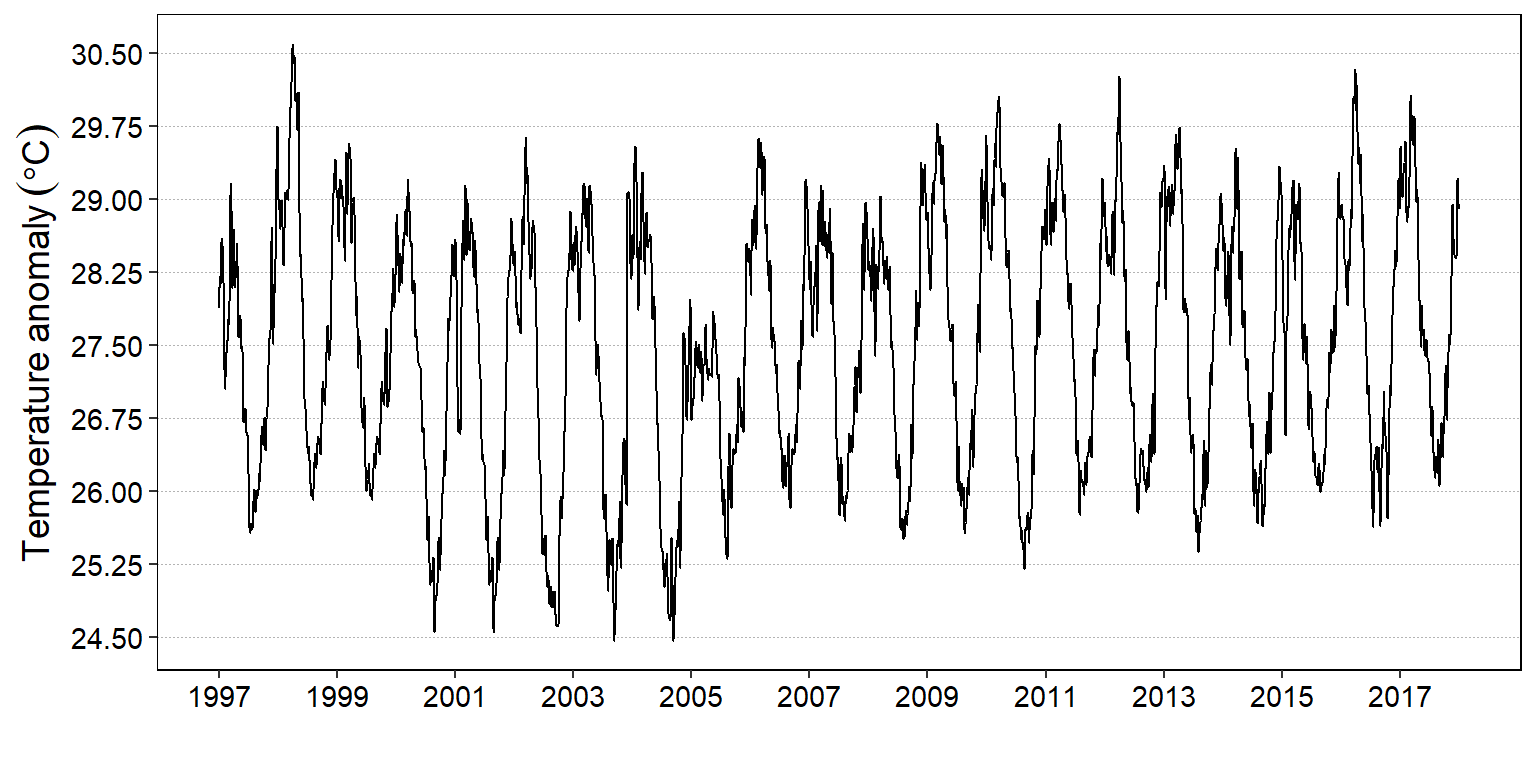
Figure 6: Daily time series plotted with the autoplot function
Identify shifts in mean and/or variance in a time series
Our second object is to identify the change in mean or variance of the time series. This phonmenon is widely referred as changepoints—an instance in time where the statistical properties before and after this time point differ. We can calculate the optimal position and number of changepoints for daily time series using the changepoint::cpt.meanvar() function and print the summary of the results as the chunk highlight
## Identify change point of daily sea surface temperature
daily.changepoints = daily.ts %>%
  changepoint::cpt.meanvar()

daily.changepoints %>% summary()
Created Using changepoint version 2.2.2
Changepoint type : Change in mean and variance
Method of analysis : AMOC
Test Statistic : Normal
Type of penalty : MBIC with value, 26.83522
Minimum Segment Length : 2
Maximum no. of cpts : 1
Changepoint Locations : 3249 The summary report indicate there are two segments with one change point. The change point occured on 2005-11-23. Table 4 show the first segment had a relatively lower mean surface temperature compared witht eh second segment, however, the variance of the first segment was relatively higher than the other. We can visualize these information graphically presented as in figure @ref(fig:cpt.daily) with a plot() function from changepoint package (Killick, Haynes, and Eckley 2016)
## all.tb$date[3249] # uncomment to get the date of change point

daily.changepoints %>%
  param.est() %>%
  data.frame() %>%
  mutate(segment = c("First", "Second")) %>% select(segment, mean, variance) %>%
  kableExtra::kable(format = "html", digits = 2,
                    caption = "Mean and variance of change point for daily sst",
                    col.names = c("Segment", "Mean", "Variance")) %>%
  kableExtra::column_spec(column = 1:3, width = "3cm") %>%
kableExtra::add_header_above(c("", "Parameters" = 2))| Segment | Mean | Variance |
|---|---|---|
| First | 27.24 | 1.85 |
| Second | 27.68 | 1.48 |
daily.changepoints %>%
  changepoint::plot(xlab = "", ylab = expression(Temperature~(degree*C)), las = 1)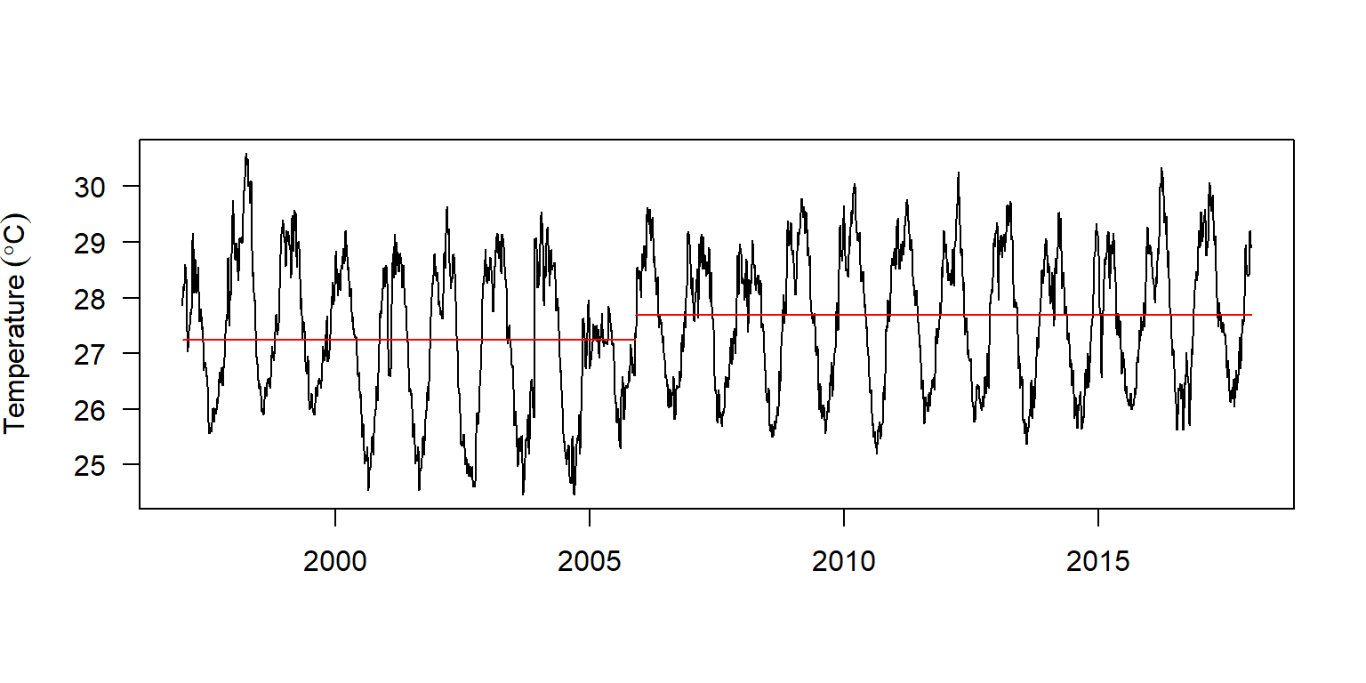
(#fig:cpt.daily)Location of the change point of sea surface temperature
Similar to changepoint::plot(), you can visualize the change point values with autoplot(). However, there subtle difference between the two plotting device. The change the means of the segements are solid line and horizontally drawn with changepoint::plot() (figure @ref(fig:cpt.daily)) contrary to dotted and vertically drawn with the autoplot() function (Figure @ref(fig:cpt.auto))
daily.changepoints %>%
  autoplot()+
  theme(axis.text = element_text(size = 11, colour = "black"),
        axis.title = element_text(size = 14, colour = "black"),
        panel.border = element_rect(colour = "black", fill = NA),
        panel.background = element_rect(fill = "white"),
        panel.grid = element_blank(),
        panel.grid.major.y = element_line(colour = "grey70", size = 0.25, linetype = 3)) +
  scale_x_continuous(breaks = seq(1997,2017,2)) +
  scale_y_continuous(breaks = seq(24.5, 30.5,0.75)) +
  labs(x = "", y = expression(Temperature~anomaly~(degree*C)))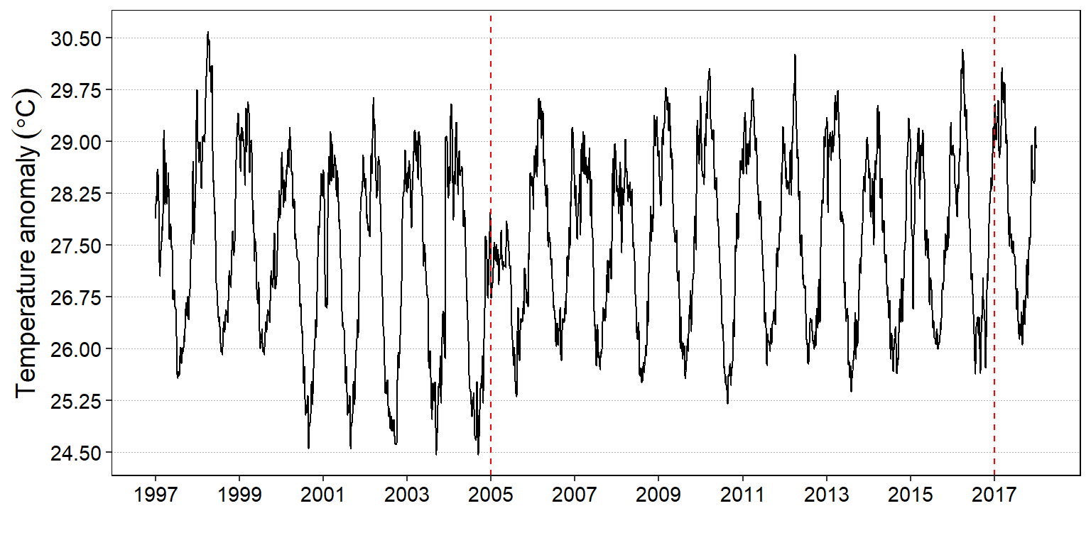
(#fig:cpt.auto)Location of the change point of sea surface temperature with autoplot
We have been visualizing the daily sea surface temperature time series object. This is the high frequency data. Let us now process and monthly average time series from this dataset. we need to create a week,month and year variables from the date in the dataset as shown in the chunk below;
interpolated.sst.split = interpolated.sst.tb %>%
  mutate(week = week(date) %>% as.integer(),
         month = month(date) %>% as.integer(),
         year = year(date) %>% as.integer()) %>%
  select(date, week, month, year, sst = sst.interp)
Then we compute the monthly and annual average sea surface temperature
## monthly mean temperature
monthly.temperature = interpolated.sst.split %>%
  group_by(month, year) %>%
  summarise(sst = median(sst, na.rm = T))%>%
  ungroup() %>%
  arrange(year, month)

## monthly ts
month.ts = ts(data = monthly.temperature$sst, start = c(1997,1), frequency = 12)

## annual mean temperature
annually.temperature = interpolated.sst.split %>%
  group_by(year) %>%
  summarise(sst = mean(sst, na.rm = T))%>%
  ungroup() %>%
  arrange(year)

# Annual ts
annual.ts = ts(data = annually.temperature$sst, start = c(1997,1), frequency = 1)
And present the monthly and annual time series of sea surface temperature graphically as in figure 7 with the tsplot() function of astsa package (D. Stoffer 2017).
par(mfrow = c(2,1))
month.ts%>% tsplot(las = 1, ylab = expression(Temperature~(degree*C)), xlab = "")
annual.ts%>% tsplot(las = 1, ylab = expression(Temperature~(degree*C)), xlab = "")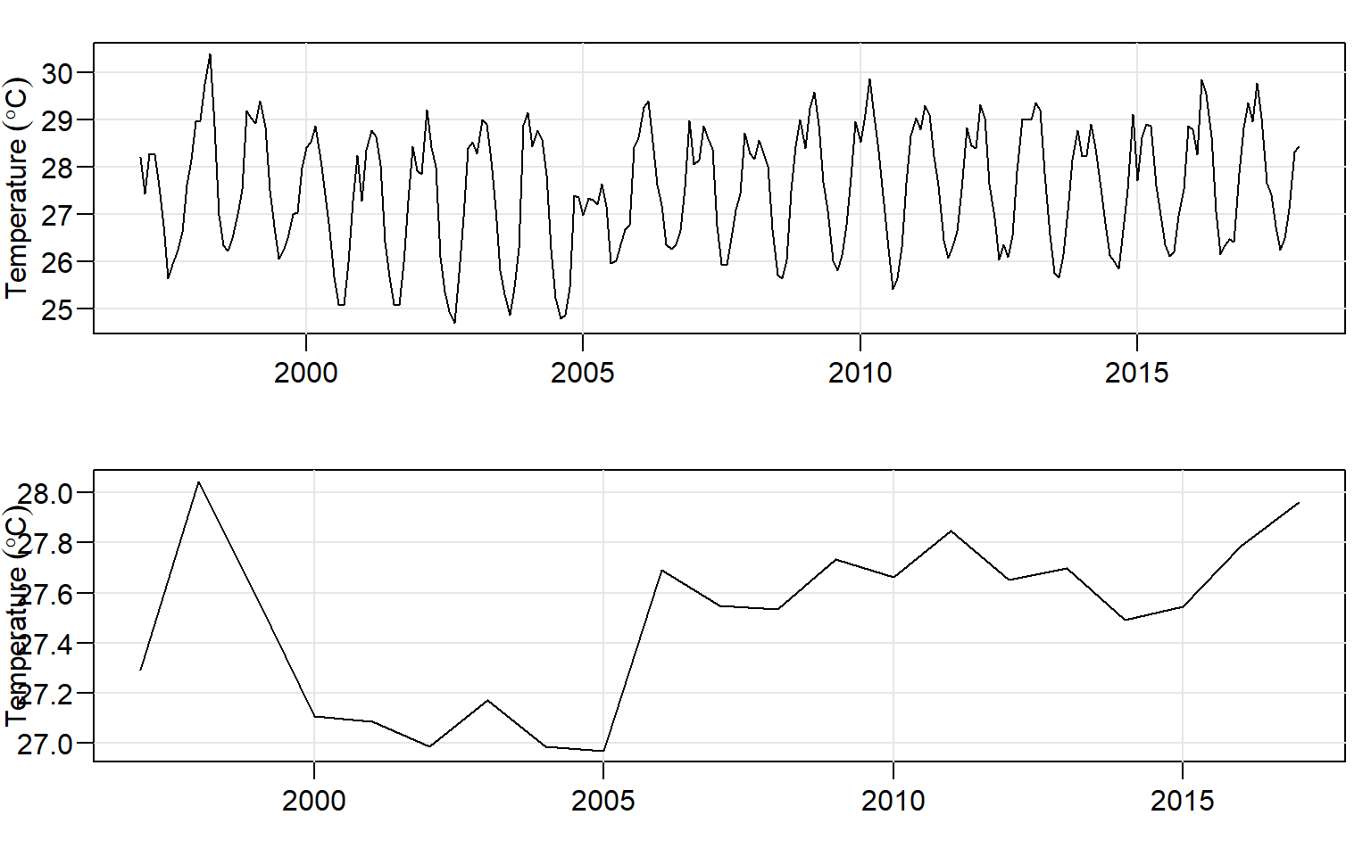
Figure 7: Average surface temperature for month (top) and year (bottom)
Figure figure 7 is similar to figure 8, however, while mongh and annual object figure 7 were plotted with the tsplot() function from astsa package and combined with par(mfrow = c(2,1)), figure 8 was plotted with ggplot2 and the annual and monthly object were combined with the plot_grid() function from cowplot package.
## plot monthly ts
monthly.fig = ggplot(data = month.ts)+
  geom_line()+
    theme(axis.text = element_text(size = 11, colour = "black"),
        axis.title = element_text(size = 14, colour = "black"),
        axis.text.x = element_blank(),
        panel.border = element_rect(colour = "black", fill = NA),
        panel.background = element_rect(fill = "white"),
        panel.grid = element_blank(),
        panel.grid.major.y = element_line(colour = "grey70", size = 0.25, linetype = 3)) +
  labs(x = "", y = expression(Temperature~(degree*C)))+
  scale_y_continuous(breaks = seq(25.5,30.50, length.out = 4) %>% round(2))+
  scale_x_continuous(breaks = seq(1997,2017,2))

## plot annual ts
annual.fig = ggplot(data = annual.ts)+
  geom_line()+
  theme(axis.text = element_text(size = 11, colour = "black"),
        axis.title = element_text(size = 14, colour = "black"),
        panel.border = element_rect(colour = "black", fill = NA),
        panel.background = element_rect(fill = "white"),
        panel.grid = element_blank(),
        panel.grid.major.y = element_line(colour = "grey70", size = 0.25, linetype = 3)) +
  labs(x = "", y = expression(Temperature~(degree*C)))+
  scale_y_continuous(breaks = seq(27.2,28.0, length.out = 4) %>% round(2))+
  scale_x_continuous(breaks = seq(1997,2017,2))

## combine month and annual ts with cowplot
cowplot::plot_grid(monthly.fig,
                   annual.fig,
                   nrow = 2, ncol = 1,
                   labels = c("Monthly", "Yearly"), label_size = 12,
                   label_fontface = "bold", label_x = 0.85, label_y = 0.98)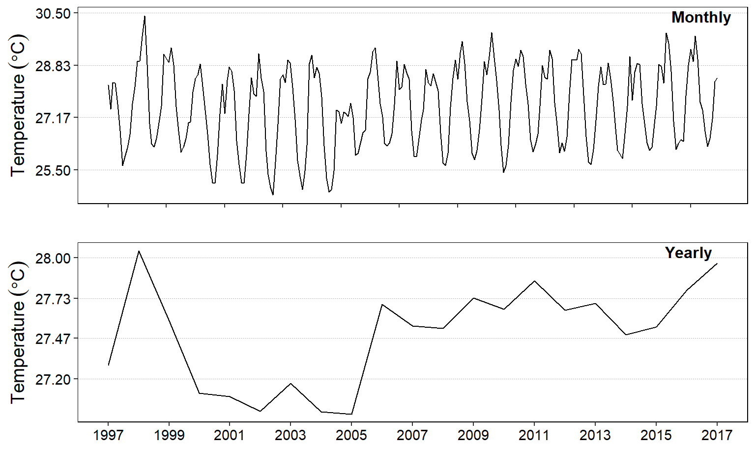
Figure 8: Average surface temperature for month (top) and year (bottom)
Detect the change pointpoints of monthly
month.cpts = month.ts %>% changepoint::cpt.meanvar()
month.cpts %>% param.est() %>% as.data.frame()
mean variance
1 27.49570 1.61604
2 28.43789 NAmonth.cpts %>% summary()Created Using changepoint version 2.2.2
Changepoint type : Change in mean and variance
Method of analysis : AMOC
Test Statistic : Normal
Type of penalty : MBIC with value, 16.58829
Minimum Segment Length : 2
Maximum no. of cpts : 1
Changepoint Locations : 251 month.cpts%>% changepoint::plot()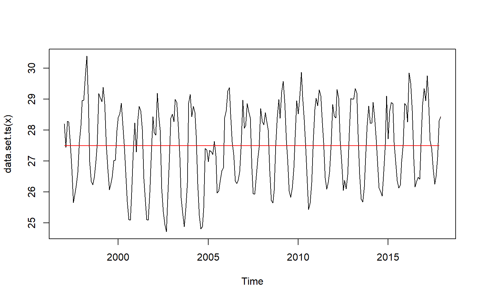
We notice that the change points using the changepoint package is unnoticable with the monthly and yearly time series (figure). Let try using a non parametric function as well to discover the change point for these time series (Haynes et al. 2016).
month.cpts.np = month.ts %>% changepoint.np::cpt.np()

month.cpts.np%>% changepoint::plot()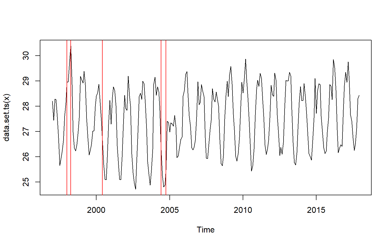
We notice that the change point occured at index 13,16,42,90, and 94. We can spot the month directyl by creating a monthly vector dataset from January 1997 to December 2017 and then those index to identify the month. the chunk below hightlight how to construct the month vector and extract the month with the index identified
analysis.month = seq(dmy(010197), dmy(311217), by = "month")
analysis.month[cpts(month.cpts.np)]
[1] "1998-01-01" "1998-04-01" "2000-06-01" "2004-06-01" "2004-10-01"We clearly now obtain the month in which the change occured. The first change occured between 1998-01-01 and 1998-04-01— A period of 1997/1998 El-Nino when the temperature rose above normal. This was followed with the low temperature in 2000-06-01 and then the other change occured between 2004-06-01 and 2004-10-01 when temperature rose sharply.
References
Aphalo, Pedro J. 2016. Learn R ...as You Learnt Your Mother Tongue. Leanpub. https://leanpub.com/learnr.
Haynes, Kaylea, Rebecca Killick, Paul Fearnhead, and Idris Eckley. 2016. Changepoint.np: Methods for Nonparametric Changepoint Detection. https://CRAN.R-project.org/package=changepoint.np.
Horikoshi, Masaaki, and Yuan Tang. 2016. Ggfortify: Data Visualization Tools for Statistical Analysis Results. https://CRAN.R-project.org/package=ggfortify.
Hyndman, Rob J, George Athanasopoulos, Christoph Bergmeir, Gabriel Caceres, Leanne Chhay, Mitchell O’Hara-Wild, Fotios Petropoulos, Slava Razbash, Earo Wang, and Farah Yasmeen. 2018. “Forecast: Forecasting Functions for Time Series and Linear Models.”
Kelley, Dan, and Clark Richards. 2018. Oce: Analysis of Oceanographic Data. https://CRAN.R-project.org/package=oce.
Killick, Rebecca, Kaylea Haynes, and Idris A. Eckley. 2016. Changepoint: An R Package for Changepoint Analysis. https://CRAN.R-project.org/package=changepoint.
Ryan, Jeffrey A., and Joshua M. Ulrich. 2018. Xts: EXtensible Time Series. https://CRAN.R-project.org/package=xts.
Shumway, Robert H, and David S Stoffer. 2017. Time Series Analysis and Its Applications: With R Examples. Book. Springer.
Stoffer, David. 2017. Astsa: Applied Statistical Time Series Analysis. https://CRAN.R-project.org/package=astsa.
Trapletti, Adrian, and Kurt Hornik. 2018. Tseries: Time Series Analysis and Computational Finance. https://CRAN.R-project.org/package=tseries.
Wickham, Hadley, and Jennifer Bryan. 2018. Readxl: Read Excel Files. https://CRAN.R-project.org/package=readxl.
Wickham, Hadley, Romain François, Lionel Henry, and Kirill Müller. 2018. Dplyr: A Grammar of Data Manipulation. https://CRAN.R-project.org/package=dplyr.
Zeileis, Achim, and Gabor Grothendieck. 2005. “Zoo: S3 Infrastructure for Regular and Irregular Time Series.” Journal of Statistical Software 14 (6): 1–27. doi:10.18637/jss.v014.i06.