Introduction
require(tidyverse)
require(oce)
require(highcharter)
require(lubridate)
files = dir("extracted/", pattern = "chl_", full.names = TRUE)chlorophyll-a
Chlorophyll-a is certainly the most commonly derived parameter in water quality mainly because of its use in determining the trophic status of waters. The Chla estimation allows forecasting of the phytoplankton concentration and is therefore an important component in the derivation of secondary products such as primary production.
Looping the files
There are four sites—The exclusive economic zone (EEZ) and three channels of Pemba, Zanzibar and Mafia. Each site has three files—primary productivity, chlorophyll-a and sea surface temperature—making a total of twelve files. Procesing each files is rather tedious! Its also inefficient—because repeating reading the files is boring and sometimes the mind can drop off to sleep more easily if you are not focusing on the process. Thankfully, most programming languages have what is called a for loop , which repeates reading the files over and over until it finish all the fires in the working directory. So using the loop actually save us from writing hundred kubes if code. The chunk below show the for loop that was used to read excell files that store the value of chlorophyll from the directory.
sites = c("EEZ", "Mafia", "Pemba", "Zanzibar")

chl = list()

for (i in 1:length(files)){

chl[[i]] = files[i] %>% readxl::read_excel()%>%
  rename(date = 1, year = 2, chl = 3) %>%
  mutate(month = month(date),
         day = 15,
         site = sites[i],
         date = make_date(year = year, month = month, day = day)) %>%
  arrange(date)
}

chl = chl %>% bind_rows()
In summary this chunk tell something like this: at line 1 we create a list object and assigned sites site names — EEZ, Mafia, Pemba and Zanzibar Channel. At line 2 The next line dummy list files that will store the data for each file is defined. The next line at line 3 sets up the for loop, which will run the command in the block. In this line we loop through the items by reading the excel file from the local directory and then assigned the file with i. Once the file is read, its variable names are replaced with meaningful names—date, year and chl. Then new variables—month, day,date, and name of the site i are created with mutate() function and the whole dataset is arrnged in ascending order using the date variable with the arrange() function. Since the list contain four data frame for each site, we bind them together with the bind_rows() function.
gg = ggplot()+
  geom_raster(data = chl, aes(x = year, y = month, fill =  chl), interpolate = T, na.rm = TRUE)+
  geom_contour(data = chl, aes(x = year, y = month, z =  chl), col = 1)+
  scale_y_reverse(breaks = 1:12)+
  scale_fill_gradientn(colours = oceColors9A(120))+
  facet_wrap(~site, scales = "free_y")

plotly::ggplotly(gg)
hchart(object = chl%>%filter(site == "Mafia"), "heatmap", hcaes(x = year, y = month, value = chl, group = site))Figure 1: Heatmap of chlorophyll-a concentration in Mafia channel
gb =ggplot(data = chl, aes(x = date, y = chl, col = site))+geom_line()
    plotly::ggplotly(gb)
hchart(object = chl, "line", hcaes(x = date, y = chl, group = site))Figure 2: monthly chlorophyll-a concentration
month = 1:12
year = 2003:2018

chl.array = array(data = chl$chl, dim = c(length(month),length(year),length(sites)))

par(mfrow = c(2,2))
for (j in 1:length(sites)){
imagep(year, month, chl.array[,,j]%>%t(),filledContour = T, col = oceColors9A(120),  flipy = T, main = sites[j])
contour(year, month,chl.array[,,j]%>%t() , add = T)
}
Figure 3: Hovmoller diagram of chlorophyll concentration
I created a function that convert matrix from array to data frame. I first load the file that contains the function from the directory
source("./Data Manipulation/semba_functions.R")## load the function I created for converting
month = 1:12
year = 2003:2018
chl.tb = list()
for (j in 1:length(sites)){
chl.tb[[j]] = matrix_tb(x = month, y = year, data = chl.array[,,j]) %>%
rename(month = x, year = y) %>% mutate(site = sites[j])
}
chl.tb = chl.tb %>% bind_rows()mafia = ggplot()+
metR::geom_contour_fill(data = chl.tb %>% filter(site == "Mafia"),
aes(x = year, y = month, z = value), na.fill = TRUE)+
coord_cartesian(expand = FALSE)+
scale_y_reverse(breaks = seq(2,11,2), label = c("February", "April", "June", "August", "October"))+
scale_x_continuous(breaks = seq(2004,2017,3))+
scale_fill_gradientn(colors = oce.colors9A(120), name = "Chl")+
theme_bw() %+replace%
theme(axis.text = element_text(size = 12, colour = 1),
legend.position = "right",
legend.text = element_text(size = 10),
legend.title = element_text(size = 11))+
guides(fill = guide_colorbar(title = expression(mgm^{-3}),
title.position = "top",
title.hjust = 0.5,
direction = "vertical",
reverse = FALSE,
barwidth = unit(.4, "cm"),
barheight = unit(4, "cm")))+
labs(x = "", y = "", title = "Mafia Channel")
zanzibar = ggplot()+
metR::geom_contour_fill(data = chl.tb %>% filter(site == "Zanzibar"),
aes(x = year, y = month, z = value), na.fill = TRUE)+
coord_cartesian(expand = FALSE)+
scale_y_reverse(breaks = seq(2,11,2), label = c("February", "April", "June", "August", "October"))+
scale_x_continuous(breaks = seq(2004,2017,3))+
scale_fill_gradientn(colors = oce.colors9A(120), name = "Chl")+
theme_bw() %+replace%
theme(axis.text = element_text(size = 12, colour = 1),
legend.position = "right",
legend.text = element_text(size = 10),
legend.title = element_text(size = 11))+
guides(fill = guide_colorbar(title = expression(mgm^{-3}),
title.position = "top",
title.hjust = 0.5,
direction = "vertical",
reverse = FALSE,
barwidth = unit(.4, "cm"),
barheight = unit(4, "cm")))+
labs(x = "", y = "", title = "Zanzibar Channel")
pemba = ggplot()+
metR::geom_contour_fill(data = chl.tb %>% filter(site == "Pemba"),
aes(x = year, y = month, z = value), na.fill = TRUE)+
coord_cartesian(expand = FALSE)+
scale_y_reverse(breaks = seq(2,11,2), label = c("February", "April", "June", "August", "October"))+
scale_x_continuous(breaks = seq(2004,2017,3))+
scale_fill_gradientn(colors = oce.colors9A(120), name = "Chl")+
theme_bw() %+replace%
theme(axis.text = element_text(size = 12, colour = 1),
legend.position = "right",
legend.text = element_text(size = 10),
legend.title = element_text(size = 11))+
guides(fill = guide_colorbar(title = expression(mgm^{-3}),
title.position = "top",
title.hjust = 0.5,
direction = "vertical",
reverse = FALSE,
barwidth = unit(.4, "cm"),
barheight = unit(4, "cm")))+
labs(x = "", y = "", title = "Pemba Channel")
eez = ggplot()+
metR::geom_contour_fill(data = chl.tb %>% filter(site == "EEZ"),
aes(x = year, y = month, z = value), na.fill = TRUE)+
coord_cartesian(expand = FALSE)+
scale_y_reverse(breaks = seq(2,11,2), label = c("February", "April", "June", "August", "October"))+
scale_x_continuous(breaks = seq(2004,2017,3))+
scale_fill_gradientn(colors = oce.colors9A(120), name = "Chl")+
theme_bw() %+replace%
theme(axis.text = element_text(size = 12, colour = 1),
legend.position = "right",
legend.text = element_text(size = 10),
legend.title = element_text(size = 11))+
guides(fill = guide_colorbar(title = expression(mgm^{-3}),
title.position = "top",
title.hjust = 0.5,
direction = "vertical",
reverse = FALSE,
barwidth = unit(.4, "cm"),
barheight = unit(4, "cm")))+
labs(x = "", y = "", title = "EEZ")
egg::ggarrange(mafia, zanzibar, pemba, eez, nrow = 2)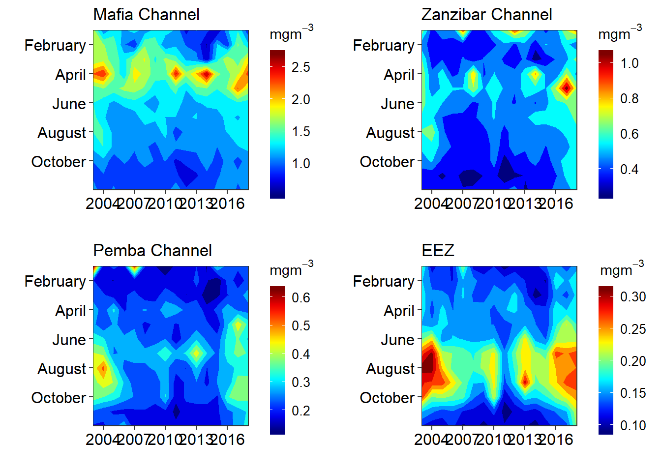
Primary productivity
files = dir("./extracted/", pattern = "pp_", full.names = TRUE, include.dirs = TRUE, recursive = T)
sites = c("EEZ", "Mafia", "Pemba", "Zanzibar")
pp = list()
for (i in 1:length(files)){
pp[[i]] = files[i] %>% readxl::read_excel()%>%
rename(date = 1, year = 2, pp = 3) %>%
mutate(month = month(date),
day = 15,
site = sites[i],
date = make_date(year = year, month = month, day = day)) %>%
arrange(date)
}
pp = pp %>% bind_rows()gg = ggplot()+
geom_raster(data = pp, aes(x = year, y = month, fill = pp), interpolate = T, na.rm = TRUE)+
geom_contour(data = pp, aes(x = year, y = month, z = pp), col = 1)+
scale_y_reverse(breaks = 1:12)+
scale_fill_gradientn(colours = oceColors9A(120))+
facet_wrap(~site, scales = "free_y")
plotly::ggplotly(gg)hchart(object = pp%>%filter(site == "Zanzibar"), "heatmap", hcaes(x = year, y = month, value = pp, group = site))Figure 4: Heat map of primary productivity in Mafia channel
gb =ggplot(data = pp, aes(x = date, y = pp, col = site))+geom_line()
    plotly::ggplotly(gb)
hchart(object = pp, "line", hcaes(x = date, y = pp, group = site))Figure 5: Monthly mean of primary production between 2003 and 2018
pp.array = array(data = pp$pp, dim = c(length(month),length(year),length(sites)))

par(mfrow = c(2,2))
for (j in 1:length(sites)){

  imagep(year,
         month,
         pp.array[,,j]%>%t(),
         filledContour = T,
         col = oceColors9A(120),
         flipy = T,
         main = sites[j])

contour(year, month,pp.array[,,j]%>%t() , add = T)
}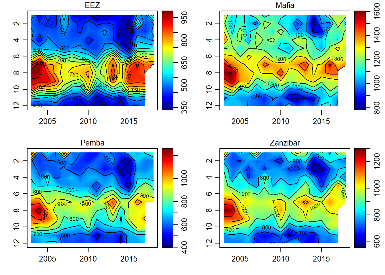
Figure 6: Hovmoller diagram of primary productivity
## load the function I created for converting
month = 1:12
year = 2003:2018

pp.tb = list()
for (j in 1:length(sites)){

pp.tb[[j]] = matrix_tb(x = month, y = year, data = pp.array[,,j]) %>%
  rename(month = x, year = y) %>% mutate(site = sites[j])

}
pp.tb = pp.tb %>% bind_rows()
mafia = ggplot()+
metR::geom_contour_fill(data = pp.tb %>% filter(site == "Mafia"),
aes(x = year, y = month, z = value), na.fill = TRUE)+
coord_cartesian(expand = FALSE)+
scale_y_reverse(breaks = seq(2,11,2), label = c("February", "April", "June", "August", "October"))+
scale_x_continuous(breaks = seq(2004,2017,3))+
scale_fill_gradientn(colors = oce.colors9A(120), name = "Chl")+
theme_bw() %+replace%
theme(axis.text = element_text(size = 12, colour = 1),
legend.position = "right",
legend.text = element_text(size = 10),
legend.title = element_text(size = 11))+
guides(fill = guide_colorbar(title = expression(Cm^{-3}~yr^{-1}),
title.position = "top",
title.hjust = 0.5,
direction = "vertical",
reverse = FALSE,
barwidth = unit(.4, "cm"),
barheight = unit(4, "cm")))+
labs(x = "", y = "", title = "Mafia Channel")
zanzibar = ggplot()+
metR::geom_contour_fill(data = pp.tb %>% filter(site == "Zanzibar"),
aes(x = year, y = month, z = value), na.fill = TRUE)+
coord_cartesian(expand = FALSE)+
scale_y_reverse(breaks = seq(2,11,2), label = c("February", "April", "June", "August", "October"))+
scale_x_continuous(breaks = seq(2004,2017,3))+
scale_fill_gradientn(colors = oce.colors9A(120), name = "Chl")+
theme_bw() %+replace%
theme(axis.text = element_text(size = 12, colour = 1),
legend.position = "right",
legend.text = element_text(size = 10),
legend.title = element_text(size = 11))+
guides(fill = guide_colorbar(title = expression(Cm^{-3}~yr^{-1}),
title.position = "top",
title.hjust = 0.5,
direction = "vertical",
reverse = FALSE,
barwidth = unit(.4, "cm"),
barheight = unit(4, "cm")))+
labs(x = "", y = "", title = "Zanzibar Channel")
pemba = ggplot()+
metR::geom_contour_fill(data = pp.tb %>% filter(site == "Pemba"),
aes(x = year, y = month, z = value), na.fill = TRUE)+
coord_cartesian(expand = FALSE)+
scale_y_reverse(breaks = seq(2,11,2), label = c("February", "April", "June", "August", "October"))+
scale_x_continuous(breaks = seq(2004,2017,3))+
scale_fill_gradientn(colors = oce.colors9A(120), name = "Chl")+
theme_bw() %+replace%
theme(axis.text = element_text(size = 12, colour = 1),
legend.position = "right",
legend.text = element_text(size = 10),
legend.title = element_text(size = 11))+
guides(fill = guide_colorbar(title = expression(Cm^{-3}~yr^{-1}),
title.position = "top",
title.hjust = 0.5,
direction = "vertical",
reverse = FALSE,
barwidth = unit(.4, "cm"),
barheight = unit(4, "cm")))+
labs(x = "", y = "", title = "Pemba Channel")
eez = ggplot()+
metR::geom_contour_fill(data = pp.tb %>% filter(site == "EEZ"),
aes(x = year, y = month, z = value), na.fill = TRUE)+
coord_cartesian(expand = FALSE)+
scale_y_reverse(breaks = seq(2,11,2), label = c("February", "April", "June", "August", "October"))+
scale_x_continuous(breaks = seq(2004,2017,3))+
scale_fill_gradientn(colors = oce.colors9A(120), name = "Chl")+
theme_bw() %+replace%
theme(axis.text = element_text(size = 12, colour = 1),
legend.position = "right",
legend.text = element_text(size = 10),
legend.title = element_text(size = 11))+
guides(fill = guide_colorbar(title = expression(Cm^{-3}~yr^{-1}),
title.position = "top",
title.hjust = 0.5,
direction = "vertical",
reverse = FALSE,
barwidth = unit(.4, "cm"),
barheight = unit(4, "cm")))+
labs(x = "", y = "", title = "EEZ")
egg::ggarrange(mafia, zanzibar, pemba, eez, nrow = 2)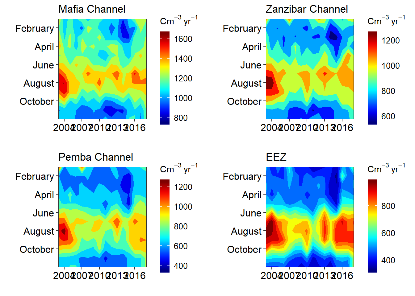
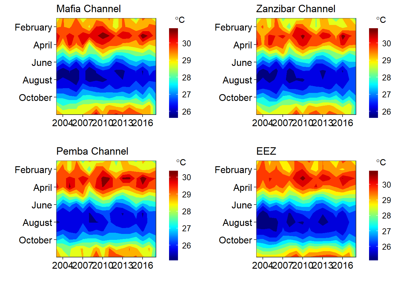
Temperature
files = dir("./extracted/", pattern = "sst_", full.names = TRUE)
sites = c("EEZ", "Mafia", "Pemba", "Zanzibar")
sst = list()
for (i in 1:length(files)){
sst[[i]] = files[i] %>% readxl::read_excel()%>%
rename(date = 1, year = 2, sst = 3) %>%
mutate(month = month(date),
day = 15,
site = sites[i],
date = make_date(year = year, month = month, day = day)) %>%
arrange(date)
}
sst = sst %>% bind_rows()gg = ggplot()+
geom_raster(data = sst, aes(x = year, y = month, fill = sst), interpolate = T, na.rm = TRUE)+
geom_contour(data = sst, aes(x = year, y = month, z = sst), col = 1)+
scale_y_reverse(breaks = 1:12)+
scale_fill_gradientn(colours = oceColors9A(120))+
facet_wrap(~site, scales = "free_y")
plotly::ggplotly(gg)hchart(object = sst%>%filter(site == "Mafia"), "heatmap", hcaes(x = year, y = month, value = sst, group = site))Figure 7: heatmap of sea surface temperature in Mafia channel
gb =ggplot(data = sst, aes(x = date, y = sst, col = site))+geom_line()
    plotly::ggplotly(gb)
hchart(object = sst, "line", hcaes(x = date, y = sst, group = site))Figure 8: monthly mean of sea surface temperature between 2003 and 2018
sst.array = array(data = sst$sst, dim = c(length(month),length(year),length(sites)))

par(mfrow = c(2,2))
for (j in 1:length(sites)){
imagep(year, month, sst.array[,,j]%>%t(),filledContour = T, col = oceColors9A(120),  flipy = T, main = sites[j])
contour(year, month,sst.array[,,j]%>%t() , add = T)
}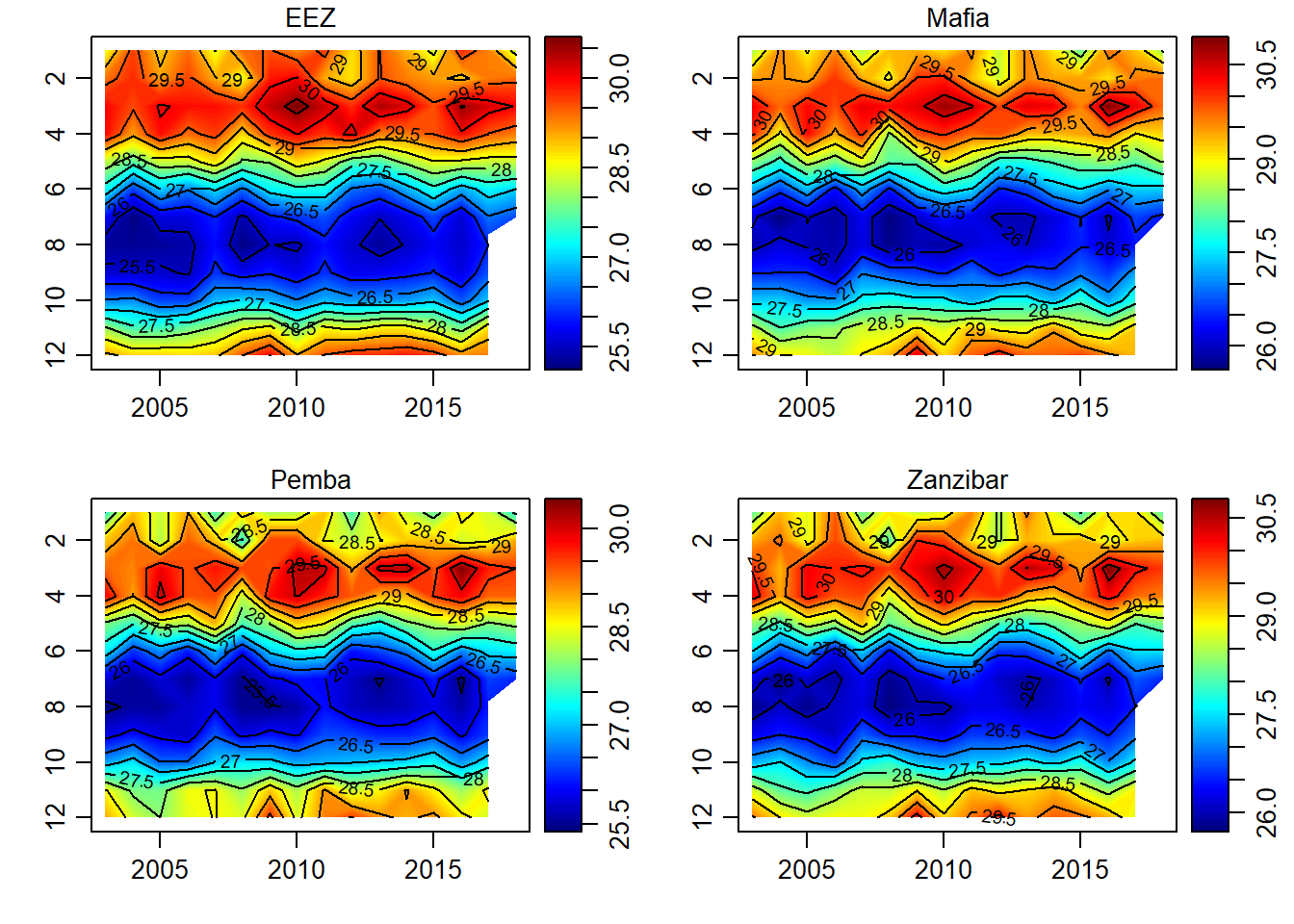
Figure 9: Hovmoller diagrams of sea surface temperature
## load the function I created for converting
month = 1:12
year = 2003:2018

sst.tb = list()
for (j in 1:length(sites)){

sst.tb[[j]] = matrix_tb(x = month, y = year, data = sst.array[,,j]) %>%
  rename(month = x, year = y) %>% mutate(site = sites[j])

}
sst.tb = sst.tb %>% bind_rows()
mafia = ggplot()+
metR::geom_contour_fill(data = sst.tb %>% filter(site == "Mafia"),
aes(x = year, y = month, z = value), na.fill = TRUE)+
coord_cartesian(expand = FALSE)+
scale_y_reverse(breaks = seq(2,11,2), label = c("February", "April", "June", "August", "October"))+
scale_x_continuous(breaks = seq(2004,2017,3))+
scale_fill_gradientn(colors = oce.colors9A(120), name = "Chl")+
theme_bw() %+replace%
theme(axis.text = element_text(size = 12, colour = 1),
legend.position = "right",
legend.text = element_text(size = 10),
legend.title = element_text(size = 11))+
guides(fill = guide_colorbar(title = expression(degree*C),
title.position = "top",
title.hjust = 0.5,
direction = "vertical",
reverse = FALSE,
barwidth = unit(.4, "cm"),
barheight = unit(4, "cm")))+
labs(x = "", y = "", title = "Mafia Channel")
zanzibar = ggplot()+
metR::geom_contour_fill(data = sst.tb %>% filter(site == "Zanzibar"),
aes(x = year, y = month, z = value), na.fill = TRUE)+
coord_cartesian(expand = FALSE)+
scale_y_reverse(breaks = seq(2,11,2), label = c("February", "April", "June", "August", "October"))+
scale_x_continuous(breaks = seq(2004,2017,3))+
scale_fill_gradientn(colors = oce.colors9A(120), name = "Chl")+
theme_bw() %+replace%
theme(axis.text = element_text(size = 12, colour = 1),
legend.position = "right",
legend.text = element_text(size = 10),
legend.title = element_text(size = 11))+
guides(fill = guide_colorbar(title = expression(~degree*C),
title.position = "top",
title.hjust = 0.5,
direction = "vertical",
reverse = FALSE,
barwidth = unit(.4, "cm"),
barheight = unit(4, "cm")))+
labs(x = "", y = "", title = "Zanzibar Channel")
pemba = ggplot()+
metR::geom_contour_fill(data = sst.tb %>% filter(site == "Pemba"),
aes(x = year, y = month, z = value), na.fill = TRUE)+
coord_cartesian(expand = FALSE)+
scale_y_reverse(breaks = seq(2,11,2), label = c("February", "April", "June", "August", "October"))+
scale_x_continuous(breaks = seq(2004,2017,3))+
scale_fill_gradientn(colors = oce.colors9A(120), name = "Chl")+
theme_bw() %+replace%
theme(axis.text = element_text(size = 12, colour = 1),
legend.position = "right",
legend.text = element_text(size = 10),
legend.title = element_text(size = 11))+
guides(fill = guide_colorbar(title = expression(~degree*C),
title.position = "top",
title.hjust = 0.5,
direction = "vertical",
reverse = FALSE,
barwidth = unit(.4, "cm"),
barheight = unit(4, "cm")))+
labs(x = "", y = "", title = "Pemba Channel")
eez = ggplot()+
metR::geom_contour_fill(data = sst.tb %>% filter(site == "EEZ"),
aes(x = year, y = month, z = value), na.fill = TRUE)+
coord_cartesian(expand = FALSE)+
scale_y_reverse(breaks = seq(2,11,2), label = c("February", "April", "June", "August", "October"))+
scale_x_continuous(breaks = seq(2004,2017,3))+
scale_fill_gradientn(colors = oce.colors9A(120), name = "Chl")+
theme_bw() %+replace%
theme(axis.text = element_text(size = 12, colour = 1),
legend.position = "right",
legend.text = element_text(size = 10),
legend.title = element_text(size = 11))+
guides(fill = guide_colorbar(title = expression(~degree*C),
title.position = "top",
title.hjust = 0.5,
direction = "vertical",
reverse = FALSE,
barwidth = unit(.4, "cm"),
barheight = unit(4, "cm")))+
labs(x = "", y = "", title = "EEZ")
egg::ggarrange(mafia, zanzibar, pemba, eez, nrow = 2)