There are many different things that requires oceanographers to code and write scripts that automate routinely analytical frameworks. However, there is one common use amongst almost all every report, research project or paper will need to have—map indicating to a study area. There are many packages that are often used to make maps in R. And heaps of blog posts, books and tutorials that illustrate different ways to visualize spatial data in R.
However, this post use an oce package, which sound unfamilir to most people, but very powerful package in R. The oce package written by Kelley and Richards (2018) is dedicated for drawing plots and maps that meets oceanographic standards. A wide group of functions is provided for plotting maps in oce package. The first step is to call mapPlot() to construct the map, after which points can be added with mapPoints(), lines with mapLines(). The packages needed for the exercise are first loaded into the workspace.
require(oce)
require(ocedata)
require(ncdf4)
require(tidyverse)
require(lubridate)
Kelley (2015) developed the ocedata package that comes with several Oceanographic datasets including the world coastline at three levels.
- coastlineWorld: low resolution suitable for global-scale maps plotted at a small size, e.g. inset diagrams
- coastlineWorldMedium: moderate resolution suitable for global- or regional-scale maps, and
- coastlineWorldFine: high resolution suitable for shelf-scale maps
We load the three datasets from the oce package with the data() function as highlighted in this chunk
data("coastlineWorld")
data("coastlineWorldMedium")
data("coastlineWorldFine")
For example, the chunk below highlight the code used to make the map in figure 1.
par(mar=c(2, 2, 1, 1))
lonlim <- c(35, 55)
latlim <- c(-35, 2)


mapPlot(coastlineWorldFine,
        projection="+proj=moll",
        col="lightgray",
        longitudelim=lonlim,
        latitudelim=latlim)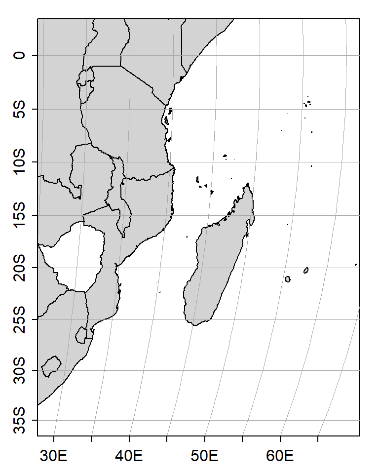
Figure 1: The Western Indian Ocean Region
Like other software, a map must start with a baseline and for oce package the base is initiated with the mapPlot(). This mapPlot() define the extent of the map from which other layers are added on it. For example, the chunk below show the points in figure 2 were added on the base with a mapPoints() function.
## create points name with their respective locations
stations = data.frame(name = c("Stn1", "Stn2", "Stn3"),
                      lon = c(45,41.2,41.3),
                      lat = c(-25,-11,-3))

## define the margin of the plot
par(mar=c(2, 2, 1, 1))

## make a base
mapPlot(coastlineWorldFine,
        projection="+proj=moll",
        col="lightgray",
        longitudelim=lonlim,
        latitudelim=latlim)
## ## overlay the point layer
mapPoints(longitude = stations$lon,
          latitude = stations$lat,
          pch = 20,
          cex = 1.75)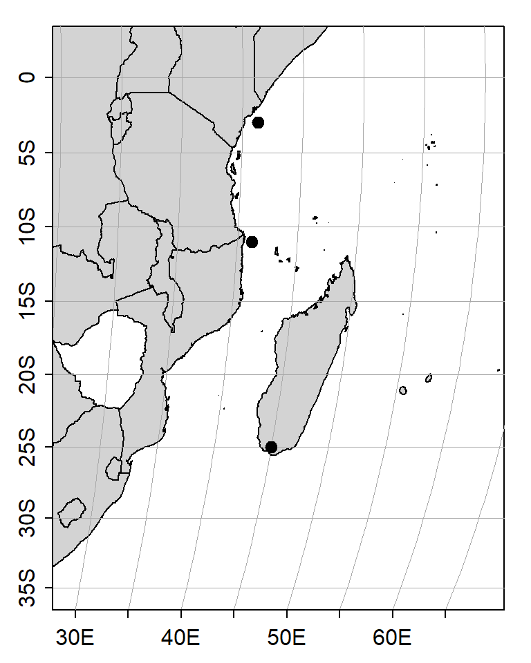
Figure 2: Map of the Western Indian Ocean region showing experimental sites
The text on the map for example the station name in figure 3 was added on the map with mapText() function as shown in the chunk below.
## create points name with their respective locations
stations = data.frame(name = c("Stn1", "Stn2", "Stn3"),
                      lon = c(45,41.2,41.3),
                      lat = c(-25,-11,-3))

## define the margin of the plot
par(mar=c(2, 2, 1, 1))

## make a base
mapPlot(coastlineWorldFine,
        projection="+proj=moll",
        col="lightgray",
        longitudelim=lonlim,
        latitudelim=latlim)
## ## overlay gridded sst layer
mapPoints(longitude = stations$lon,
          latitude = stations$lat,
          pch = 20,
          cex = 1.75)
## add station name on the map
mapText(longitude = stations$lon+1.5,
          latitude = stations$lat+1.5,
        labels = stations$name)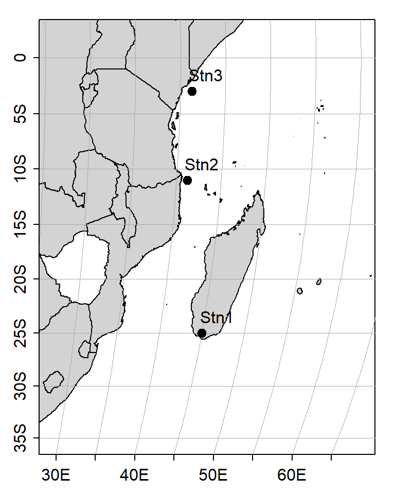
Figure 3: Map of the Western Indian Ocean region showing experimental sites
The sea surface temperature data were download from the GHRSST website at (ftp://podaac.jpl.nasa.gov/allData/ghrsst/data/L4/GLOB/NCDC/AVHRR_OI/) link. You can access the daily SST as well from this website. for this case I download three files of global level for January 2015. This dataset comes in Netcd format and you can import it with the ncdf4 package (Pierce 2017) highlighted in chunk below. Load the netcdf SSF data using the nc_open() function.
nc = nc_open("e:/MatlabWorking/GHRSST/20150101.nc")The loaded file contain several files and we need to separate three variables—longitude, latitude and temperature. But until now we know nothing about the structure of these variables. Figure 4 is screen shot of the metadata that shows how the variables are written.
knitr::include_graphics("ghrsst.png")
Figure 4: Metadata of the netcdf file
# cowplot::draw_image("ghrsst.png")The you can use the metadata information in figure 4 to extract these variables. Also the information in the metadata is used to calibrate the temperature values—from Kelvin to degree Celcius scale. The chunk below highlight how to get variables and calibrate the sst.
## extract the longitude varibale
lon = ncvar_get(nc, "lon")
## extract the latitude varibale
lat = ncvar_get(nc, "lat")
## extract sst variable
sst = ncvar_get(nc, "analysed_sst")

## Kelvin to Degree celcius and calibrate
sst = sst-273.149993896484
Once the variables are in the workspace, then, the sst layer is added on a map as image on base map created with mapPlot(). For instance, figure 5 that shows the distribution of sea surface temperature was plotted by simply adding sst layer with mapImage() functions. The draw back of adding the image layer is that it mask the layers below it, a mapPolygon() function is added to add the country boundary. The country’s boundary data that fits the regional is the low resolution coastlineWorld—it is clear for large scale map as in figure 5.
par(mar=c(2, 2, 1, 1))
Zlim = c(15,30)

## make a base
mapPlot(coastlineWorld,
        projection="+proj=moll",
        col="lightgray",
        longitudelim=lonlim,
        latitudelim=latlim,
        clip = TRUE)
## overlay gridded sst layer
mapImage(longitude = lon,
         latitude = lat,
         z = sst,
         zlim = Zlim,
         col = oceColorsJet(120))
## add polygon
mapPolygon(coastlineWorld,
        col="lightgray")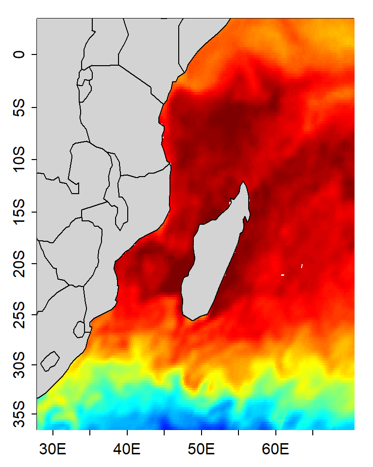
Figure 5: Map of the Western Indian Ocean region showing distribution of sea surface temperature
However, you notice that in figure 5 legend for sea surface temperature is missing. The scalebar in figure 6 was added with drawPalette() function as shown in the chunk below.
par(mar=c(2, 2, 1, 1))
Zlim = c(15,30)

## draw scalebar
drawPalette(zlim = Zlim,
            col=oce.colorsJet,
            at = seq(16,30,2),
            pos = 4,
            drawTriangles = FALSE)
## make a base
mapPlot(coastlineWorld,
        projection="+proj=moll",
        col="lightgray",
        longitudelim=lonlim,
        latitudelim=latlim,
        clip = TRUE)
## ## overlay gridded sst layer
mapImage(longitude = lon,
         latitude = lat,
         z = sst,
         zlim = Zlim,
         filledContour = TRUE,
         col = oceColorsJet(120))
## add polygon
mapPolygon(coastlineWorld,
        col="lightgray")
Figure 6: Map of the Western Indian Ocean region showing distribution of sea surface temperature
Contour of gridded seas surface temperature can be added as a layer on a map with mapContour() function. The contour (dotted lines) in figure 7 is drawn using the code in the chunk below.
par(mar=c(2, 2, 1, 1))
Zlim = c(15,30)

## draw scalebar
drawPalette(zlim = Zlim,
            col=oce.colorsJet,
            at = seq(16,30,2),
            pos = 4,
            drawTriangles = FALSE)
## make a base
mapPlot(coastlineWorld,
        projection="+proj=moll",
        col="lightgray",
        longitudelim=lonlim,
        latitudelim=latlim,
        clip = TRUE)
## ## overlay gridded sst layer
mapImage(longitude = lon,
         latitude = lat,
         z = sst,
         zlim = Zlim,
         filledContour = TRUE,
         col = oceColorsJet(120))
## ## overlay gridded sst layer
mapContour(longitude = lon,
         latitude = lat,
         z = sst,
         levels =  seq(15,30,2),
         col = "black",
         lwd = .85,lty = 1)
## add polygon
mapPolygon(coastlineWorld,
        col="lightgray")
Figure 7: Map of the Western Indian Ocean region showing distribution of sea surface temperature. solid line are contours
The grid on the map like in figure 8 can be added with the mapGrid() function as shown in chunk below.
par(mar=c(2, 2, 1, 1))
Zlim = c(15,30)

## draw scalebar
drawPalette(zlim = Zlim,
            col=oce.colorsJet,
            at = seq(16,30,2),
            pos = 4,
            drawTriangles = FALSE)
## make a base
mapPlot(coastlineWorld,
        projection="+proj=moll",
        col="lightgray",
        longitudelim=lonlim,
        latitudelim=latlim,
        clip = TRUE)
## ## overlay gridded sst layer
mapImage(longitude = lon,
         latitude = lat,
         z = sst,
         zlim = Zlim,
         filledContour = TRUE,
         col = oceColorsJet(120))
## ## overlay gridded sst layer
mapContour(longitude = lon,
         latitude = lat,
         z = sst,
         levels =  seq(15,30,2),
         col = "black",
         lwd = .85,lty = 1)
## add polygon
mapPolygon(coastlineWorld,
        col="lightgray")
## adding grid
mapGrid(dlongitude = 8,
        dlatitude = 8,
        lty = 3, lwd = .5)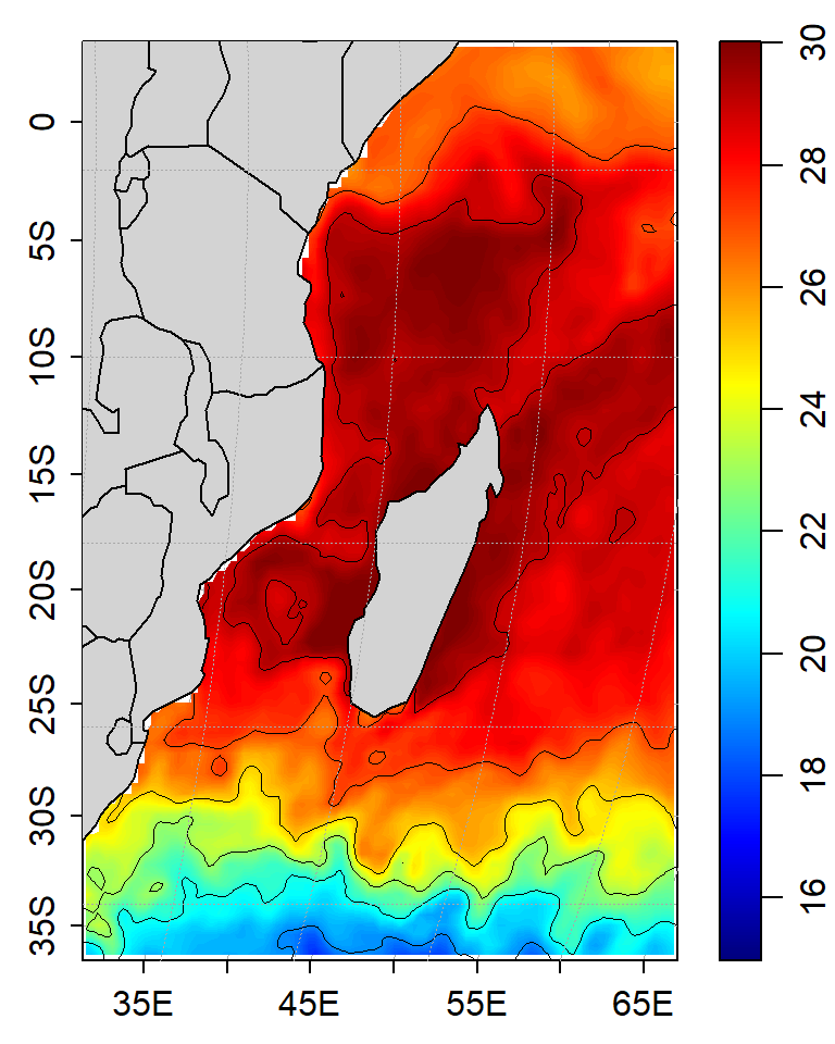
Figure 8: Map of the Western Indian Ocean region showing distribution of sea surface temperature. solid line are contours
The scale on the map, for instance in figure 9 the word Indian ocean can be added with the mapScalebar() function as shown in chunk below.
par(mar=c(2, 2, 1, 1))
Zlim = c(15,30)

## draw scalebar
drawPalette(zlim = Zlim,
            col=oce.colorsJet,
            at = seq(16,30,2),
            pos = 4,
            drawTriangles = FALSE)
## make a base
mapPlot(coastlineWorld,
        projection="+proj=moll",
        col="lightgray",
        longitudelim=lonlim,
        latitudelim=latlim,
        clip = TRUE)
## ## overlay gridded sst layer
mapImage(longitude = lon,
         latitude = lat,
         z = sst,
         zlim = Zlim,
         filledContour = TRUE,
         col = oceColorsJet(120))
## ## overlay gridded sst layer
mapContour(longitude = lon,
         latitude = lat,
         z = sst,
         levels =  seq(15,30,2),
         col = "black",
         lwd = .85,lty = 1)
## add polygon
mapPolygon(coastlineWorld,
        col="lightgray")
## adding grid
mapGrid(dlongitude = 8,
        dlatitude = 8,
        lty = 3, lwd = .5)
## add text on map
mapScalebar(x = "topleft", y = NULL, length = 1000, col = "black")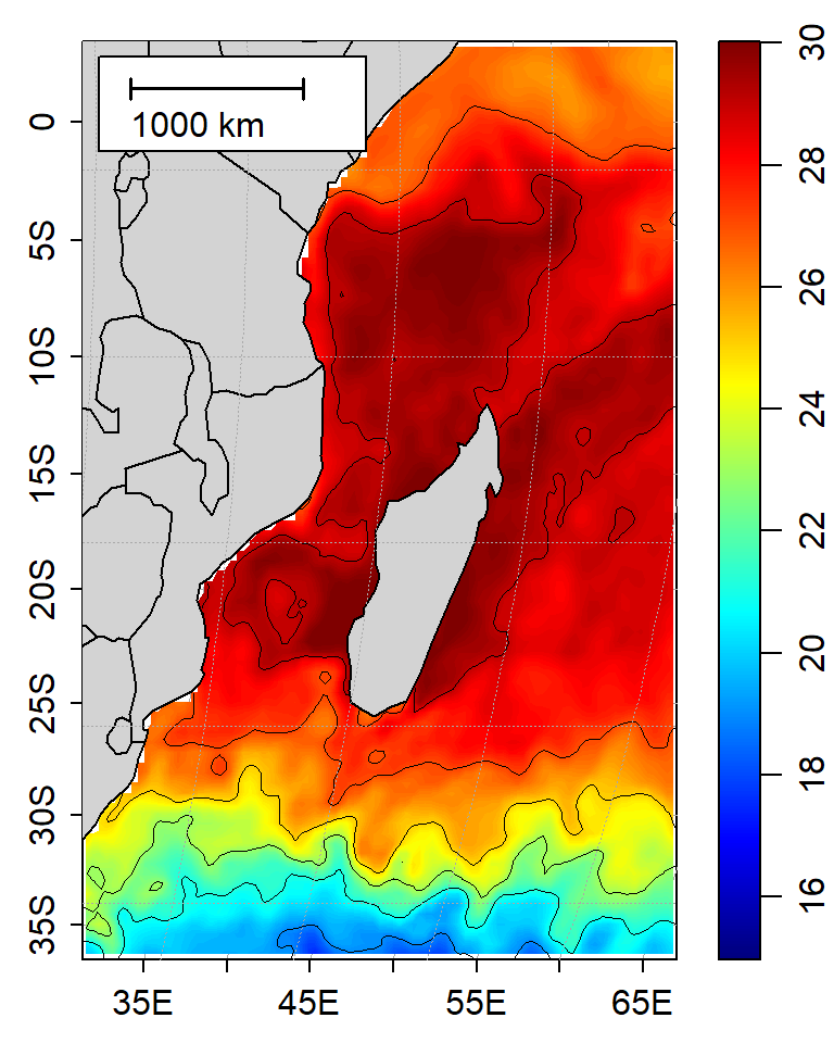
Figure 9: Map of the Western Indian Ocean region showing distribution of sea surface temperature. solid line are contours
One thing that is great about R is the ability to create reproducible code—for instance the chunk below show how simple you can make local area mapp (Figure 10) from regional map (Figure 7) by simply adjusting the limit of longitude and latitude and Zlim—for palette.
## adjust the spatial extent to local area
lonlim = c(38.0, 41)
latlim = c(-7,-4)
Zlim = c(27,30)

par(mar=c(2, 2, 1, 1))

## draw scalebar
drawPalette(zlim = Zlim,
            col=oce.colorsJet,
            at = seq(27,30,0.5),
            pos = 4,
            drawTriangles = FALSE)
## make a base
mapPlot(coastlineWorld,
        projection="+proj=moll",
        col="lightgray",
        longitudelim=lonlim,
        latitudelim=latlim,
        clip = TRUE)
## ## overlay gridded sst layer
mapImage(longitude = lon,
         latitude = lat,
         z = sst,
         zlim = Zlim,
         filledContour = FALSE,
         col = oceColorsJet(120))
## ## overlay gridded sst layer
mapContour(longitude = lon,
         latitude = lat,
         z = sst,
         levels =  seq(27,30,.5),lty = 3,
         col = "black",
         lwd = 1.25)
## add polygon
mapPolygon(coastlineWorldFine,
        col="lightgray")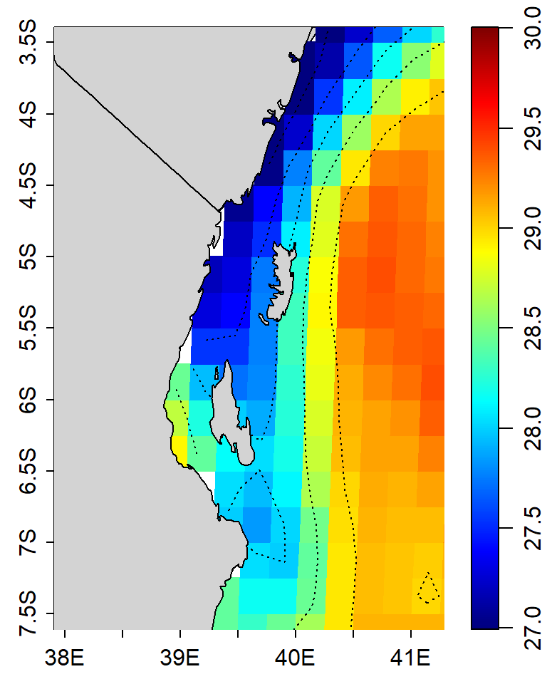
Figure 10: Map showing distribution of sea surface temperature within the Pemba and Zanzibar channels. Dotted line are contours
Sometimes you might have wish to show the transect of the sampling on the map like in figure 11. Just add a line layer with mapLines() function and parse the longitude and latitude arguments with the geographical location stored in the dataset.
## fictious transect
transect = data.frame(lon = seq(38, 43, length.out = 15),
                      lat = seq(-5.2, -6.52, length.out = 15))

## adjust the spatial extent to local area
lonlim = c(38.0, 41)
latlim = c(-7,-4)
Zlim = c(27,30)

par(mar=c(2, 2, 1, 1))

## draw scalebar
drawPalette(zlim = Zlim,
            col=oce.colorsJet,
            at = seq(27,30,0.5),
            pos = 4,
            drawTriangles = FALSE)
## make a base
mapPlot(coastlineWorld,
        projection="+proj=moll",
        col="lightgray",
        longitudelim=lonlim,
        latitudelim=latlim,
        clip = TRUE)
## ## overlay gridded sst layer
mapImage(longitude = lon,
         latitude = lat,
         z = sst,
         zlim = Zlim,
         filledContour = FALSE,
         col = oceColorsJet(120))
## ## overlay gridded sst layer
mapContour(longitude = lon,
         latitude = lat,
         z = sst,
         levels =  seq(27,30,.5),lty = 3,
         col = "black",
         lwd = 1.25)
## add transect
mapLines(longitude = transect$lon,
         latitude = transect$lat,
         col = "black", lwd = 2)
## add point
mapPoints(longitude = transect$lon,
          latitude = transect$lat,
          col = "black", pch = 20, cex = 1.75)
## add polygon
mapPolygon(coastlineWorldFine,
        col="lightgray")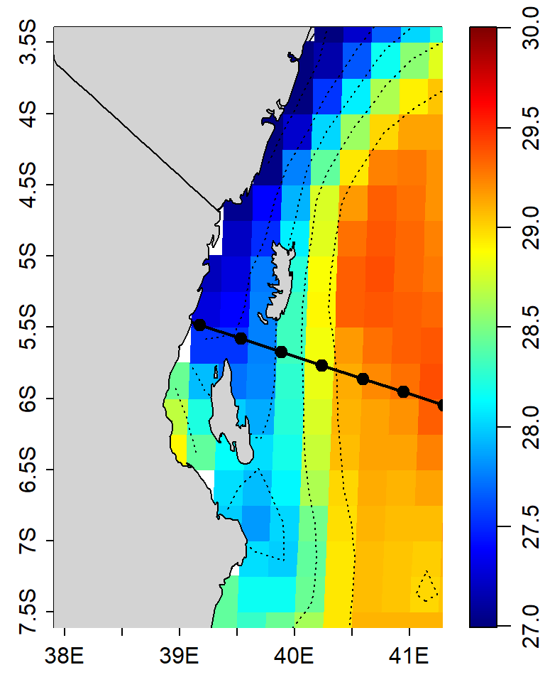
Figure 11: Map showing distribution of sea surface temperature within the Pemba and Zanzibar channels. Dotted line are contours
load("wind_quikscat_grid.RData")
wind = wind.quik$data
wind.jan =  wind %>% filter(time == dmy(160100))
## adjust the spatial extent to local area
lonlim = c(39.0, 40)
latlim = c(-5.7,-4.1)
Zlim = c(27,29)
par(mar=c(2, 2, 1, 1))
## draw scalebar
drawPalette(zlim = Zlim,
col=oce.colorsJet,
at = seq(27,30,0.5),
pos = 4,
drawTriangles = FALSE)
## make a base
mapPlot(coastlineWorldFine,
projection="+proj=moll",
col="lightgray",
longitudelim=lonlim,
latitudelim=latlim,
clip = TRUE)
## ## overlay gridded sst layer
mapImage(longitude = lon,
latitude = lat,
z = sst,
zlim = Zlim,
filledContour = TRUE,
# zclip = TRUE,
col = oceColorsJet(120))
## ## overlay wind vector
mapDirectionField(longitude =wind.jan$lon,
latitude = wind.jan$lat,
u = wind.jan$y_wind,
v = wind.jan$x_wind,
scale = 0.02,
length = 0.1)
## add polygon
mapPolygon(coastlineWorldFine,
col="lightgray")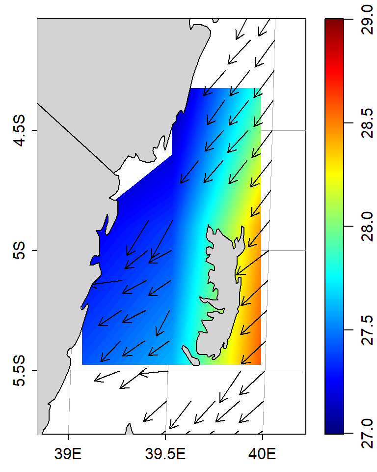
Figure 12: Map showing distribution of sea surface temperature within the Pemba and Zanzibar channels. Arrows are vector showing the speed and direction of wind
Figure 13 show the bathmetry within the Western Indian Ocean region (WIO) for which the steps are summarized in the chunk below
## set the extent
lonlim = c(45.0, 55)
latlim = c(-35,2)
Zlim = c(-6000,0)

par(mar=c(2, 2, 1, 1))


## draw scalebar
drawPalette(zlim = Zlim,
            col=oce.colorsGebco(120),
            at = seq(-6000,0,1000),
            pos = 4,
            drawTriangles = FALSE)
## make a base
mapPlot(coastlineWorld,
        projection="+proj=mill",
        col="lightgray",
        longitudelim=lonlim,
        latitudelim=latlim,
        clip = TRUE)
## ## overlay gridded sst layer
mapImage(longitude = Lon,
         latitude = Lat,
         z = etopo.mat,
         zlim = Zlim,
         filledContour = TRUE,
         # zclip = TRUE,
         col = oceColorsGebco(120))
## add polygon
mapPolygon(coastlineWorldFine,
        col="lightgray")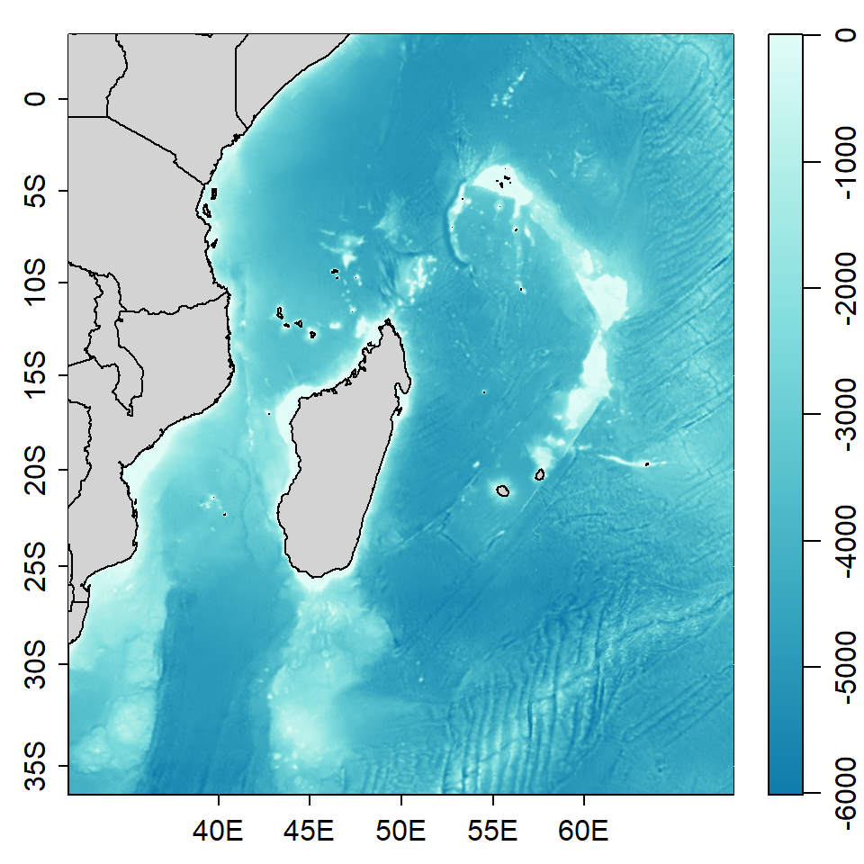
Figure 13: Bathmetry of the Western Indian Ocean Region
Conclusion.
In this post I have taken time illustrating on making maps with oce package in R environment (R Core Team 2018). But take it from me! I have just touch the surface of this package. oce is a powerful tool with tons of functions for handling, processing and analyzing different format of oceanographic data. The package also comes with specialized function for visualizing and plotting graphics that meets oceanographic standard.
References
Kelley, Dan. 2015. Ocedata: Oceanographic Datasets for Oce. https://CRAN.R-project.org/package=ocedata.
Kelley, Dan, and Clark Richards. 2018. Oce: Analysis of Oceanographic Data. https://CRAN.R-project.org/package=oce.
Pierce, David. 2017. Ncdf4: Interface to Unidata netCDF (Version 4 or Earlier) Format Data Files. https://CRAN.R-project.org/package=ncdf4.
R Core Team. 2018. R: A Language and Environment for Statistical Computing. Vienna, Austria: R Foundation for Statistical Computing. https://www.R-project.org/.