Introduction
The recent contagious 2019-nCoV Wuhan coronavirus outbreak in China has brought shocks and triggered panic among the general population around the world. This noval coronavirus (nCoV) is a new strain that has never been identified in humans before. The risk associated with this virus to human led the World Health Organization (WHO) of United Nations to declare 2019-nCoV as global health emergency.
While trying to get the data for this contagious virus, I landed on Wikipedia page that provides a timeline of corona virus outbreak at Wuhan province in China. With this source of data I face a double challenge. The first challenge is the data I need is not in a tabular form and ready to read in R. The other challenge is that the data is kept in html table and constantly updated, which make copying and format the table manually a daunting task. Therefore, this post focus taking you through the procedure to access that data from html table, structure and organize it in tidy format that make further analysis easier.
As I have introduced, the post focus on the citizen data generated in Wuhan province because of a contagious coronavirus. The number of people died with corona virus has skyrocket from one person on January 10, 2020 to 1523 on February 14, 2020. Just on single day of February 14, 2020, coronavirus killed 143 people in China alone. Globally, the virus has infected more 66492 people across 28 countries and territories (Figure 1).
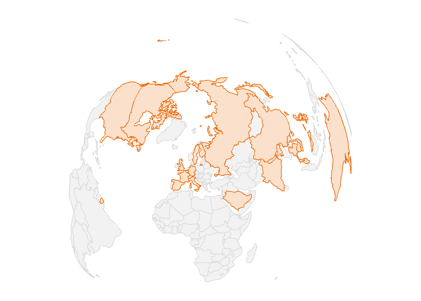
Figure 1: The map showing the countried infected with coronavirus
Data
The data for this analysis was obtained from the Wikipedia page that provide updates of people died with coronavirus in Wuhan province. Once you open this page, you the html page will appear with a list of tables. Unfortunately, tables on the web are primarily designed for displaying and consuming data, not for analytical purposes. But, Christian Rubba (2016) developed a htmltab package that has htmltab() function, enabled working with HTML tables from webpages easier and less time-consuming. We need to load the package that I use for the session
require(tidyverse)
require(modelr)
require(magrittr)
require(gam)
require(sf)Transform the data
Once the data is downloaded, it is still untidy and hence require some further processing and organizing. I selected the column of interest and change their names to the meaningful ones. Then all variables that were imported as structure they were converted back to integer and change the date to a format that is machine compatible. I also used the lubridate::yday function to create a new variable that contains days in number from 01 January 2020. The chunk below summaries the main steps involved to tidy the data.
## create a function that replace comma in numbers or integers
replaceCommas<-function(x){
  x<-as.numeric(gsub("\\,", "", x))
}

corona = wuhan.coronavirus %>%
  select(date = 1, suspected = 2, confirmed = 5, serious = 7,
         death = 9, recovered = 10, death.recovered = 11)  %>%
  as_tibble() %>%
  # slice(-nr) %>%
  mutate(date = as.Date(date), day = lubridate::yday(date),
         suspected = replaceCommas(suspected),
         confirmed = replaceCommas(confirmed),
         serious = replaceCommas(serious),
         death = replaceCommas(death),
         recovered = replaceCommas(recovered),
         death.recovered = replaceCommas(death.recovered)) %>%
  filter(!is.na(date))


## identify the last row that will be chopped off
nr = nrow(corona)
Once we have organized and structured the data in a format that facilitate analysis, we can first visualize the data to see effect of coronavirus overtime. Figure 2 indicate that the number of people die by coronavirus has grown exponentially over the last 30 days.
ggplot(data = corona ,
       aes(x = date, y = death)) +
  geom_point()+
  scale_x_date(date_breaks = "8 days" , date_labels = "%d %b")+
  cowplot::theme_minimal_grid()+
  theme(panel.grid = element_line(linetype = 3), legend.position = "none")+
  labs(x = "", y = "Cumulative Death")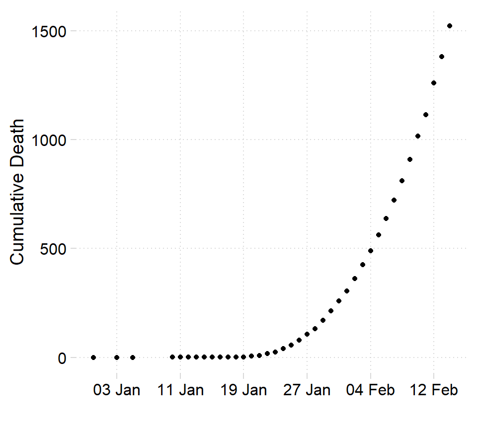
Figure 2: Toll death at Wuhan
Looking on figure 2 you notice that there are couple of days with unreported death. Then we need to trim off all observation before January 10,2020. We use the filter function from dplyr package (Wickham et al. 2018)
corona = corona %>%
  filter(date >= lubridate::dmy(100120))
Modelling
Although figure 2 clearly indicates that number of people dying with coronavirus is growing exponentially over time, I still use linear model for modelling this growth. In addition to linear modelling, I will model the growth of number of people dying with corona virus using three other models—quadratic, cubic and gam. The chunk below show the line of codes for the four modelling algorithms
## Linear model
linear =  corona %$%
  lm(death~day)

## Quadratic model
quadratic =  corona %$%
  lm(death~poly(day,2))

## Cubic model
cubic =  corona %$%
  lm(death~poly(day,3))

## GAM model
gam =  corona %$%
  gam::gam(death~s(day))
Once the modelling is complete, we can assess the model to choose the best fit one. glance function from broom packages (Robinson and Hayes 2020) that construct a single row summary of the model with all the model parameters including the coefficients, statistics and accuracy parameters. Table 1 show the parameters that help the analyst to choose the model that best fit the data. In this case, all model except GAM showed a significant positive correlation that account for above 75 percent, but cubic show the correlation of 99 percent. With the highest correlation coefficient and low values of BIC and AIC compared to other models, the cubic model is the best algorithm for fitting this kind of data.
| model | r.squared | statistic | p.value | AIC | BIC |
|---|---|---|---|---|---|
| Linear | 0.7889 | 127.0985 | 0 | 491.5378 | 496.2883 |
| GAM | NA | NA | NA | 307.6503 | 312.4008 |
| Quadratic | 0.9920 | 2052.5275 | 0 | 375.6083 | 381.9424 |
| Cubic | 0.9998 | 64559.3213 | 0 | 238.0397 | 245.9573 |
Predictions
Once we have fitted the data to our model, we can predict the values. Its better to grid the data first before we grid. the modelr package contains data_grid function that bins the datapredictor` variable to the same interval. The chunck below indicate the binning process of the predictor variable
bins = corona %>%
  modelr::data_grid(day = modelr::seq_range(day, n = 30))
We then predict the response variable—death of people with corona virus. Instead of using the original dataset, we use the gridded (binned) predictor variable to predict the response variable. I used modelr::gather_predictions function to tidy the predicted values from each model and arrange the values in long–format. Table 2 is a sample of the predicted values.
predictions = bins%>%
modelr::gather_predictions(linear, quadratic, cubic, gam)| model | day | pred |
|---|---|---|
| gam | 18.45 | -1.64 |
| linear | 34.14 | 604.87 |
| quadratic | 24.48 | 29.45 |
| linear | 42.59 | 927.73 |
| quadratic | 19.66 | -45.49 |
| gam | 35.34 | 522.77 |
| cubic | 42.59 | 1200.55 |
| linear | 12.41 | -225.35 |
| gam | 25.69 | 74.64 |
| linear | 32.93 | 558.75 |
| quadratic | 16.03 | -37.79 |
| cubic | 13.62 | -1.35 |
ggplot(data = corona,
       aes(x = day, y = death)) +
  geom_point( shape = 1, size = 2.2) +
  geom_line(data = predictions,
            aes(x = day, y = pred, col = model), size = .95)+
  scale_x_continuous(breaks = seq(9,40,4))+
  scale_y_continuous(breaks = seq(200,2000,200))+
  cowplot::theme_minimal_grid()+
  theme(panel.grid = element_line(linetype = 3), legend.position = "none")+
  labs(x = "Days since January 1, 2020", y = "Cumulative Death") +
  ggsci::scale_color_d3()+
  facet_wrap(~model)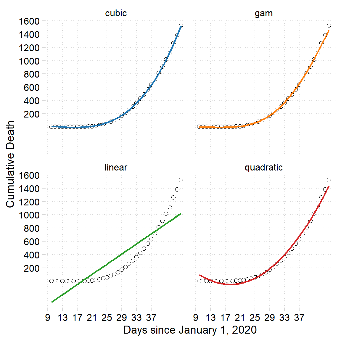
Figure 3: Fitted data from various modelling algorithms
Future predictions
We can predict for the next ten more days to see how the death toll will behave, we use the function predict from stats package. First we create a data frame of the ten days begin from 40 day and end at day 50. Once we have the future days data frame, we can parse along with the cubic model to predict the future toll number of the coronavirus.
nra = nrow(corona)
start.predict.day = corona$date[nra] %>% lubridate::yday()
begin = start.predict.day+1
end = start.predict.day+6

new.day = data.frame(day = begin:end)

future.deaths = predict(cubic, new.day) %>%
  tibble::enframe(name = NULL) %>% # use enframe instead of as_tibble()
  bind_cols(new.day) %>%
  mutate(model = "future") %>%
  select(model, day, pred=value)
Then we combine the predicted and the future value of the death and assign the data as new.data that was used to generate figure 4. We see that on the 50 day the projected toll number of people dying with coronavirus may reach to 2500 people.
new.data = predictions%>%
  filter(model == "cubic") %>%
  bind_rows(future.deaths)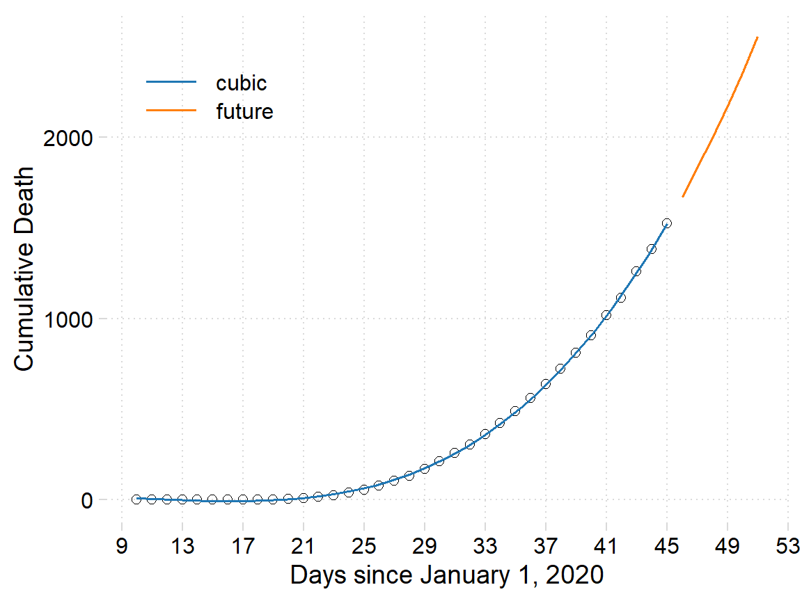
Figure 4: The number of people died with coronavirus in the Wuhan province. The points are cumulative death, the blue line is the fitted death using cubic polynomial algorithims and the red line show the projected number of people over the next ten days
Figure 5 only projected the death toll from the cubic polynomial, what if we want to compare the number of people that coronavirus will continue to affect in the next ten days from other algorithms. first we need to predict the value for each model. The chunk below show the lines of codes for each algorithm
cubic.future = predict(cubic, new.day) %>%
  as_tibble()%>%
  mutate(model = "Cubic")  %>%
  bind_cols(new.day) %>%
  select(model, day, pred=value)

linear.future = predict(linear, new.day) %>%
  as_tibble()%>%
  mutate(model = "Linear")  %>%
  bind_cols(new.day) %>%
  select(model, day, pred=value)

gam.future = predict(gam, new.day) %>%
  as_tibble()%>%
  mutate(model = "GAM")  %>%
  bind_cols(new.day) %>%
  select(model, day, pred=value)

quadratic.future = predict(quadratic, new.day) %>%
  as_tibble()%>%
  mutate(model = "Quadratic")  %>%
  bind_cols(new.day) %>%
  select(model, day, pred=value)
Join the projected death tolls from the four algorithms with bind_rows() function from dplyr package (Wickham et al. 2018). Once the dataset was tidy, was used to visually compare the projection of the coronavirus as shown in figure 5
death.proj = cubic.future %>%
  bind_rows(
    linear.future, gam.future, quadratic.future
  )
pred = ggplot(data = corona ,
aes(x = day, y = death)) +
geom_point(shape = 1, size = 2.2) +
geom_line()+
geom_line(data =death.proj,
aes(x = day, y = pred, col = model), size = .6)+
scale_x_continuous(breaks = seq(9,60,4)) +
cowplot::theme_minimal_grid()+
theme(panel.grid = element_line(linetype = 3), legend.position = c(.05,.85),
legend.key.width = unit(1.2,"cm"), legend.title = element_blank())+
labs(x = "Days since January 1, 2020", y = "Cumulative Death") +
ggsci::scale_color_d3()
pred %>% plotly::ggplotly() %>%
plotly::layout(legend = list(orientation = "h", x = 0.4, y = 1.1))Figure 5: The number of people died with coronavirus in the Wuhan province. The points are cumulative death, the blue line is the fitted death using cubic algorithims and the red line show the projected number of people over the next ten days from four different algorithms
Summaries
In this post I illustrated how to extract data from html table using the htmltab function. I then processed and organized the data for easy analysis and plotting. I modeled the number of people die with corona virus using linear, quadratic, cubic and gam functions. I then used the fitted value to predict the effect of corona virus to the people of Wuhan for ten days. In a nutshell, the cubic polynomial algorithm fitted better to the trend of the data and is supported with the low BIC and AIC (Table 1), which are used to assess models accuracy.
References
Robinson, David, and Alex Hayes. 2020. Broom: Convert Statistical Analysis Objects into Tidy Tibbles. https://CRAN.R-project.org/package=broom.
Rubba, Christian. 2016. Htmltab: Assemble Data Frames from Html Tables. https://CRAN.R-project.org/package=htmltab.
Wickham, Hadley, Romain François, Lionel Henry, and Kirill Müller. 2018. Dplyr: A Grammar of Data Manipulation. https://CRAN.R-project.org/package=dplyr.